Ars forum updates are now here!

fyo

Ars Tribunus Militum
1,724
The site could use a bit of a cleanup in terms of font usage. Firefox has a nice option to show all the fonts being rendered on a page and at least on Linux there is quite a smattering. Some elements have a rather long "font-family" list which is causing different fonts to be used on different browsers, even on the same system. And some of those fonts are also causing problems with alignment. For instance, in Firefox/Linux the "-> Jump to latest", "+ Follow", and "<- Reply" text isn't aligned properly with the preceding icons. The "new" tag (on new posts) is also misaligned, with almost no padding over the text compared to under it.

Yes, really minor detail that likely only affects a minority of an already very small minority of users.

But standardizing on a few fonts would make everything just that bit more clean, in terms of both visuals and code.
 
  • Like
Reactions: NetMage

koolraap

Ars Tribunus Militum
2,236
I tried to paste, but the image was too large. Uploading instead. Note the oranges don't match.

Orange is the best colour ever, but make it the same orange.
 

Attachments

  • xyz.png
    xyz.png
    119.5 KB · Views: 13
  • xyz.png
    xyz.png
    58.2 KB · Views: 14
On Firefox on Android, the keyboard keeps immediately closing

I originally wanted to post how much I dislike the changes.

The articles on Ars are nice, but the real reason I keep coming back is the quality of the comments section

The current change is deep in "I don't think I can come here any more" territory

Also if you could move the up vote button further from the side of the screen it would be a God send for those of us with curved touch screens.
 
Last edited:
  • Like
Reactions: NetMage

leet

Ars Praefectus
3,064
Subscriptor++
Adding another login bug. I'm not sure if this has come up before, I'm only halfway through the thread; but this one seems pretty serious as things go.

Yesterday I had to log in in on my iPad after the upgrade, and everything seemed ok. This morning I opened Ars on my Mini for the first time since the upgrade and was greeted by this:
Screenshot 2022-11-10 at 6.29.18 AM.png

I'm most definitely not malor. Logged out and was able to log back in as myself.
Edit: Safari 16.1 on MacOS 13.0.1
 
Last edited:
I’m using dark mode. The colours look to be so bright now to border on fluorescent.

The international orange combined with lime green accents makes for it feeling like an 8 bit colour combo. Subtle it is not and combined with some of the other UI elements it looks like it is from a way back machine twenty years ago,

The green person icon with #y and green speech bubble with number of posts above every post just looks cluttered and adds to an ugly look to the comments section.
 
  • Like
Reactions: Zak

koolraap

Ars Tribunus Militum
2,236
ARS SHOWS DOB.

I do not recall opting in. Did I opt in? The rest of my rant assumes I did not, and Shirely a world-leading security conscious site of exemplary journalism doesn't assume its volunteer unpaid content creators (AKA members) want their birthdates displayed.

Why is it even an option?

To repeat myself. Why is this even an option? Give me one good, security-reviewed reason.
 

invertedpanda

Ars Tribunus Militum
2,860
Subscriptor
On Firefox on Android, the keyboard keeps immediately closing

I originally wanted to post how much I dislike the changes.

The articles on Ars are nice, but the real reason I keep coming back is the quality of the comments section

The current change is deep in "I don't think I can come here any more" territory

Also if you could move the up vote button further from the side of the screen it would be a God send for those of us with curved touch screens.
I'm using FF on Android (Samsung Galaxy S21 Ultra) myself and can't reproduce the keyboard issue; could you do a screen capture of it?

(I'm actually a frontend dev who worked on this).
 

Zak

Ars Tribunus Angusticlavius
7,545
I’m using dark mode. The colours look to be so bright now to border on fluorescent.

The international orange combined with lime green accents makes for it feeling like an 8 bit colour combo. Subtle it is not and combined with some of the other UI elements it looks like it is from a way back machine twenty years ago,

The green person icon with #y and green speech bubble with number of posts above every post just looks cluttered and adds to an ugly look to the comments section.
Yup, these colors are too bright in the dark mode.
 

Zak

Ars Tribunus Angusticlavius
7,545
ARS SHOWS DOB.

I do not recall opting in. Did I opt in? The rest of my rant assumes I did not, and Shirely a world-leading security conscious site of exemplary journalism doesn't assume its volunteer unpaid content creators (AKA members) want their birthdates displayed.

Why is it even an option?

To repeat myself. Why is this even an option? Give me one good, security-reviewed reason.
I don't remember: was this option ticked on by default? I think it was, I had to uncheck it. Pretty much all options under Privacy should be ticked off by default. Luckily, I never entered my DOB anywhere in the site settings before.
 

Hichung

Ars Praetorian
599
Subscriptor++
I don't remember: was this option ticked on by default? I think it was, I had to uncheck it. Pretty much all options under Privacy should be ticked off by default. Luckily, I never entered my DOB anywhere in the site settings before.
I saw this as well. It was pre-checked (both month/day + year) when I came across it this morning. Thankfully I had nothing entered.
 
  • Like
Reactions: koolraap

Wheels Of Confusion

Ars Legatus Legionis
75,744
Subscriptor
Please when reporting issues like this include your browser etc. I can't duplicate this one, so that kind of detail helps.
Latest Firefox on Windows 10. Every keystroke in the Search box causes a small, discrete upwards scroll.

Also unclear on what the limit is for a comment being hidden when it's downvoted. First comment on the Twitter thread about Musk ripping off workers is at -54, it was nice having that stuff hidden.
Came here to ask about this too.

And to throw my name on the pile of those having issues with the random "Your post in Thread has 65 Trillion Upvotes" notifications even though I've tried to disable all of those in my profile.


Really makes one appreciate how much work went into the old forum to add those quality of life improvements on a clunky system, now that they have to be re-implemented in a newer and more flexible one!
 
  • Like
Reactions: Papewaio

PhaseB

Ars Praetorian
438
Subscriptor++
Sorry, I don't have the time to look over 26 pages of other people's Feedback currently, so no idea if some of this has already been posted, but wanted to give my own because I have some problems.

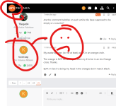
First, the commenting section under articles is currently broken for me. Not broken in doesn't work, but broken in can't do what it needs to do.

What I need it to do: Pick up around the comments where I left off reading, even if the browser is closed and reopened later.
What it does currently: Always starts at page 1 of the comments. The URL doesn't change from "/?comments=1" to any other value, no matter on what page of comments I am on or how far I have read. I assume this is supposed to do something more, else =1 would be superfluous.

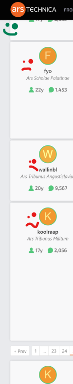
Is there a way to set the layout of the comment section for each device? Currently on my Tablet if has the names and things on a huge block on the left that is wasting a lot of space. This would be fine if I were reading in landscape mode, but as I almost always read in portrait mode this is not a good use of screen real-estate.

A nice to have: Is there a way to disable showing how long people have been on the site? It's not something I care about so is just visual clutter to me and I prefer to have less visual clutter.

Thanks

Edit: I would also like an option to auto expand quoted comments. Especially on my tablet, always having to move my hand to "click" is very annoying.
 
Is it possible to make automatic media embeds when pasting a link optional? When the backend detects a pasted link with video, it tends to automatically use the [ MEDIA ] tags on it, instead of [ URL ] or just plaintext. Often I don't want to embed media when posting video links (it adds to clutter), especially as I am having big problems with Telegram videos (even the embedded ones!) in some browsers (the whole tab just freezes and I had to edit it out in another browser).
 
Last edited: