That was Apple’s tagline for iOS 8 when the software was announced at the company’s Worldwide Developers Conference back in June. Overuse of hyperbole is a pet peeve of mine, but after using iOS 8 for a couple of months, I have to say that it’s warranted in this case. iOS 7 was a comprehensive makeover for an operating system that needed to reclaim visual focus and consistency. iOS 7.1 improved stability and speed while addressing the new design’s worst shortcomings and most egregious excesses. And iOS 8 is the update that turns its attention from the way everything looks to the way it works.
Just as iOS 6’s look had begun to grow stale by the time 2013 rolled around (six years is a pretty good run, though), iOS’ restrictions on third-party applications and UI customization now feel outdated. Sure, back in 2007, slow processors and small RAM banks required a strict, Spartan approach to what apps could do and the ways they could interact. But now, our smartphones and tablets have become powerful mini-computers in their own right. Competing platforms like Android, Windows, and Windows Phone have all demonstrated that it’s possible to make these little gadgets more computer-y without tanking performance or battery life.
Apple still holds the keys to many aspects of the iPhone and iPad user experience, but compared to past versions of the software iOS 8 represents an opening of floodgates. Don’t like Apple’s software keyboard? Replace it. Want sports scores and updates on your eBay auctions in your Notification Center? Here’s a widget, throw ’em in there. Want to use a social network or a cloud storage service that Apple hasn’t explicitly blessed and baked into the OS? Cool. Here are some APIs for that.
We’re going to give you a thorough rundown of iOS 8’s new features today, but the most important thing to know about the software is that you’re now in the driver’s seat. Well, maybe not quite the driver’s seat; there’s still quite a bit you can’t customize or change. But Apple is definitely letting you reach over and steer the car.
In this review, we’ll be talking mostly about features available to all iOS 8 devices, and to hardware that you already have in your hands right now. Several software features in the new operating system are exclusive to the new iPhone 6 and iPhone 6 Plus, and discussion of those features will wait until we review those devices. Outlets that received pre-release hardware from Apple have already run their iPhone 6 reviews, but we’ll be picking them up at retail along with everybody else—look for ours to go up sometime early next week.
iOS 8 runs on almost all of the hardware that runs iOS 7, with the exception of the iPhone 4 and the second-generation Apple TV. Both of those devices used Apple’s A4 SoC, a single-core chip introduced in the first-generation iPad all the way back in 2010. It had about half the CPU performance and one-seventh the GPU performance of the Apple A5 that replaced it, and if you ever used an iPhone 4 with iOS 7.0 or even 7.1 you won’t be surprised that the device didn’t make the cut for iOS 8. Here’s the complete list of supported hardware:
The iPhone 4S, 5, 5C, 5S, 6, and 6 Plus.
The iPad 2, the third- and fourth-generation Retina iPads, the iPad Air, and both the Retina and non-Retina iPad Mini.
The fifth-generation iPod Touch.
Both revisions of the third-generation Apple TV (as “Apple TV Software” version 7.0).
The base hardware for iOS is now the dual-core Apple A5 with 512MB of RAM. Even though it’s still significantly slower than the A6, A7, and A8 chips that have superseded it, A5-powered devices still feel fairly snappy and should ease at least a little pain for developers who were struggling to support the older A4. We’ll be examining performance on the iPhone 4S and iPad 2, two of the oldest-supported devices, in separate articles.
If you buy an iOS device when it’s new, it’s still reasonable to expect three to four years of software updates. That’s quite a bit longer than most Android devices as even Nexus phones and tablets are often dropped from the support list more aggressively. That said, older phones and tablets do miss out on some hardware-dependent features introduced in newer devices. You get all the newest APIs, app updates, and design changes regardless of what you use, but there’s some small amount of “fragmentation” even on Apple’s side of the fence. This should be a comprehensive list of what hardware supports what features.
Siri doesn’t work on the iPad 2 or the third-generation iPad.
Transparency/translucency effects aren’t supported on the iPad 2 or third-generation iPad.
The Health app is available only on iPhones and iPod Touches, not iPads. Step-tracking without external hardware is only available on the iPhone 5S, iPhone 6, and iPhone 6 Plus.
Burst photos, slow-mo video, and related features are available on iPhone 5S, iPhone 6, and iPhone 6 Plus.
App Handoff is available on iPhone 5 and later, iPad (4th generation) or later, any iPad mini, and iPod Touch (5th generation). Handoff for phone calls will work with the iPhone 4S as well.
AirDrop is available on iPhone 5 or later, iPad (4th generation) or later, any iPad mini, and iPod touch (5th generation).
Support for OpenGL ES 3.0, the Metal graphics API, and 64-bit ARMv8 apps is available on iPhone 5S or later, the iPad Air, and the Retina iPad Mini.
That’s a much shorter list of exceptions than last year. Almost everything now supports Siri, and everything is now powerful enough to support 3D effects in Maps and iOS’ various transparency and translucency effects. As the technology in our phones and tablets improves less from generation-to-generation, this kind of hardware-based feature fragmentation should continue to decline.
Installation and setup
You can grab iOS 8 using either iTunes or iOS’ automatic software updater, just as with the last few versions of the software; newly registered or purchased devices will need to be connected to the Internet or to iTunes to be activated. The first-time install process that we documented last year is unchanged aside from a couple of text and icon tweaks—you’ll still be prompted to create a passcode by default or to register a fingerprint with TouchID on the devices that support it.
Compared to a clean install of iOS 7.1.2 on the same device, iOS 8 appears to take yet another small chunk out of your storage space. These numbers were all taken from brand-new iOS installations on every iOS device—we tapped through the first-time setup wizard and went right to the Settings app without setting up any accounts or adding any applications.
Device
Space available (iOS 7.1.2)
Space available (iOS 8.0 GM)
32GB iPhone 4S (AT&T)
27.4GB
26.6GB
32GB iPhone 5 (VZW)
27.3GB
26.7GB
32GB iPhone 5C (AT&T)
27.2GB
26.5GB
64GB iPhone 5S (AT&T)
56.0GB
55.1GB
32GB iPod Touch 5
27.3GB
26.6GB
16GB iPad Mini (Wi-Fi)
13.0GB
12.1GB
32GB iPad 4 (Wi-Fi)
27.0GB
26.1GB
16GB Retina iPad Mini (Wi-Fi)
12.3GB
11.0GB
Ouch. Both the listed capacity and available space on all of our devices went down, sometimes by a significant amount. On average, it looks like you’ll give up around 740MB on iPhones and 1.03GB on iPads just to install the update. Such is the price of progress.
Entry-level 16GB iPhones and iPads already feel restrictive once you’ve installed some apps and taken some pictures, and the problem is even worse for the 8GB devices Apple sells as base models. The iPhone 6 and 6 Plus give you more storage at the middle-end—64GB instead of 32GB—but the low end has remained the same for years. Once apps begin including the “3x” assets they’ll need to support the new iPhone 6 Plus alongside existing devices, they’ll begin taking up even more space. We realize it would be damaging to Apple’s average selling prices to boost base iDevice storage up to a more-comfortable 32GB, but at what point does limited storage begin to get in the way of Apple’s much-emphasized user experience?
A quick tour of the iOS 8 setup screens. This should all be very familiar to iOS 7 users.
Andrew Cunningham
A quick tour of the iOS 8 setup screens. This should all be very familiar to iOS 7 users.
Andrew Cunningham
Andrew Cunningham
Andrew Cunningham
Andrew Cunningham
Andrew Cunningham
Andrew Cunningham
Andrew Cunningham
Andrew Cunningham
Andrew Cunningham
Andrew Cunningham
Andrew Cunningham
The iOS 8 setup process on an iPhone 5.
Andrew Cunningham
Andrew Cunningham
Andrew Cunningham
Andrew Cunningham
Andrew Cunningham
Andrew Cunningham
A design refined, not rethought
iOS 8 continues the work that started in iOS 7.1, tweaking some of iOS 7’s design decisions without completely reversing course on any of them. The changes this time around are, if anything, even more subtle. A few more fonts and lines have gotten thicker, and a couple of animations feel faster than they did. Common sticking points (the ambiguous Shift key behavior, occasionally blurry or blocky fonts, and readability issues on non-Retina displays) are still the same as they were before. If you don’t like or haven’t gotten used to the new look by now, you’re going to have to make your peace with that or move on to another platform.
Spotlight, multitasking, and other general changes
Changes are typically functional rather than aesthetic. Let’s begin with Spotlight, still accessed by swiping down on any of your Home screens. It picks up the same context-sensitive search suggestions we saw in our look at the OS X Yosemite Public Beta, pulling in information from the App Store, iTunes, Wikipedia, Rotten Tomatoes, and the Internet alongside all of your local content. The older version of Spotlight on iOS would provide Web and Wikipedia search links but wouldn’t actually go out and get any information automatically. Though Safari’s default search engine remains Google, it’s telling that this Spotlight search function is powered by Bing. The “suggested websites” and iTunes search features also join your standard search engine suggestions when you type in Safari’s address bar.
Spotlight in iOS 8 can pull data from a bunch of different sources.
Andrew Cunningham
Spotlight in iOS 8 can pull data from a bunch of different sources.
Andrew Cunningham
Searching for a movie will return results from iTunes, Wikipedia, and other sources.
Andrew Cunningham
Searching for a movie will return results from iTunes, Wikipedia, and other sources.
Andrew Cunningham
The same search on an iPad.
Andrew Cunningham
The same search on an iPad.
Andrew Cunningham
Searching for a movie will return results from iTunes, Wikipedia, and other sources.
Andrew Cunningham
The same search on an iPad.
Andrew Cunningham
When you’re not searching for media, Spotlight can also return results from the Internet and the App Store.
Andrew Cunningham
A few different privacy disclaimers explain how Apple intends to use your data.
Andrew Cunningham
Safari can use Spotlight suggestions too.
Andrew Cunningham
Apple is increasingly playing up the fact that it doesn’t rely on collecting information about you (anonymized or otherwise) to fund its operations, and so even though Spotlight’s search suggestions are sent to Apple the company has included a small privacy disclaimer that says the data is only used to provide Apple services and the suggestions themselves. Search hits from your local device—contacts, e-mails, apps, and so on—don’t leave your device. The details are given in a small privacy pop-up dialog you can find in Spotlight’s Settings, and links to more privacy information can be found throughout the Settings app in areas where they’re applicable. If you still don’t want any data about your searches going anywhere, turning off “Spotlight Suggestions” and “Bing Web Results” in the Settings app effectively reverts Spotlight to its iOS 7-era, local-search-only behavior.
The multitasking switcher is different too, though not in ways that have anything to do with multitasking. The previously empty strip of real estate across the top of the screen is now populated by a scrollable list of your recent contacts with pictures. Tap the circles to see a short list of ways you can communicate with them, normally by calling them via cellular or FaceTime or by messaging them. We can’t say it’s a feature we’ve used a lot since using iOS 8 early in the developer beta cycle, but it’s generally inoffensive. It’s occasionally proven more convenient than diving into the Messages or Phone apps or searching in Spotlight to bring up someone’s contact information. If you think it makes the multitasking UI too busy, like many of iOS 8’s other new features it can be disabled in the Settings (it’s buried in an odd location, under a “Mail, Contacts, Calendars” setting called “Show In App Switcher”).
The Recents menu takes a previously empty strip of screen space and puts your recent contacts in it.
Andrew Cunningham
The Recents menu takes a previously empty strip of screen space and puts your recent contacts in it.
Andrew Cunningham
The same multitasking switcher in iOS 7. Note the empty space.
Andrew Cunningham
The same multitasking switcher in iOS 7. Note the empty space.
Andrew Cunningham
The Recents menu takes a previously empty strip of screen space and puts your recent contacts in it.
Andrew Cunningham
The same multitasking switcher in iOS 7. Note the empty space.
Andrew Cunningham
The menu on an iPad.
Andrew Cunningham
The menu on an iPad.
Andrew Cunningham
You can disable the Recents list from the Mail, Contacts, and Calendars menu in the Settings.
Andrew Cunningham
You can disable the Recents list from the Mail, Contacts, and Calendars menu in the Settings.
Andrew Cunningham
The menu on an iPad.
Andrew Cunningham
You can disable the Recents list from the Mail, Contacts, and Calendars menu in the Settings.
Andrew Cunningham
Speaking of the Settings app, Apple continues to shuffle its settings around. What used to be the “Wallpapers & Brightness” screen is now two separate screens, one called “Display & Brightness” and another called “Wallpaper.” The former screen gives you a brightness slider, the option to turn the auto-brightness sensor on and off, and some text size options that used to be buried in the “General” screen alongside the Accessibility Options.
Attentive users will spot a couple of trends in all of these changes. On the one hand, many of iOS 8’s new features can be turned off by people who don’t care for them or don’t want their data being shared, and for power users this kind of configurability is generally a good thing. On the other hand, the Settings screen has become so packed with stuff that it’s beginning to become unruly, and it’s not always clear where people are supposed to go to adjust all of these things. The cure for this problem is so simple that Apple has actually already figured it out—the System Preference panes in OS X are searchable both within the System Preferences window itself and via system-wide Spotlight searches. The Settings app is just housing so much stuff these days that making it searchable could eliminate some of the blind tapping that goes on when you’re trying to figure out how to toggle something.
Built-in keyboard
The standard iOS keyboard with typing suggestions.
Andrew Cunningham
The standard iOS keyboard with typing suggestions.
Andrew Cunningham
The dark iOS keyboard with typing suggestions.
Andrew Cunningham
The dark iOS keyboard with typing suggestions.
Andrew Cunningham
The standard iOS keyboard with typing suggestions.
Andrew Cunningham
The dark iOS keyboard with typing suggestions.
Andrew Cunningham
We’ll be examining third-party iOS keyboards here in a bit, but there’s still some stuff to discuss about Apple’s built-in keyboard, the one that the vast majority of iOS users are likely to stick with simply because it’s the default. The keyboard itself hasn’t changed except to incorporate the Emoji keyboard by default, something that previously needed to be enabled manually. You can still disable that if you’d like, but why would you want to?
The biggest change is the addition of predictive typing suggestions, which as in Google’s default Android keyboard appear in a bar above the keys in text fields where they make sense (they’ll show up when you’re typing the body of an e-mail, for instance, but not when you’re addressing it to someone). Our experience has been that the suggestions are the most useful when typing one-handed—if one of the three words displayed doesn’t match up with what you want to say, typing a couple of letters usually brings up the desired word.
The new iOS keyboard doesn’t support gesture-based, Swype-style typing—Apple has left it to third parties, including Swype itself, to create keyboards that enable this functionality. Shift key behavior, a common bugaboo since the early days of iOS 7, remains unchanged from iOS 7.1. If you don’t know exactly what to look for, it’s still not easy to tell whether Shift is on or off just by looking at the button. Still, it’s nice to see the iOS software keyboard evolve. It remained essentially the same from the first iPhone OS release all the way up until iOS 6, and it changed in iOS 7 only to accommodate the new flat aesthetic. Any evolution of the default keyboard is welcome, especially since we can now rely on third parties to address any more serious problems.
Control Center, the Today View, and Notifications
The iPhone Control Center in iOS 8.
Andrew Cunningham
The iPhone Control Center in iOS 8.
Andrew Cunningham
The iPhone Control Center in iOS 7.
Andrew Cunningham
The iPhone Control Center in iOS 7.
Andrew Cunningham
The iPad Control Center in iOS 8.
Andrew Cunningham
The iPad Control Center in iOS 8.
Andrew Cunningham
The iPhone Control Center in iOS 7.
Andrew Cunningham
The iPad Control Center in iOS 8.
Andrew Cunningham
The iPad Control Center in iOS 7.
Andrew Cunningham
The Today view in iOS 7. Note the three-tab setup at the top of the screen.
Andrew Cunningham
The new Today View in iOS 8. The “All” and “Missed” tabs have been condensed into one.
Andrew Cunningham
Notifications in iOS 7.
Andrew Cunningham
The “clear” button in iOS 7.
Andrew Cunningham
Notifications in iOS 8. Not much has changed at first glance.
Andrew Cunningham
The Clear button is more contrasty than before.
Andrew Cunningham
Swiping on individual notifications will expose an individual Clear button.
Andrew Cunningham
Some apps allow you to respond directly from the notification itself, rather than diving into an app.
Andrew Cunningham
Among these cosmetic changes are a few things that show Apple is still striving to improve iOS’ usability, however. Take the Control Center, for example. It picks up no new functions in iOS 8, though it has gotten a redesign that uses higher contrast and fewer lines. The behavior of the brightness slider has been tweaked, though—when you pull up the Control Center, what you were looking at is dimmed to make it more obvious that the Control Center is the active element on the screen. However, if you were trying to adjust the screen’s brightness, that dimness made it harder to gauge just how bright the content you were looking at would be when you dismissed the Control Center. Now, that dim slip of screen lights back up when you’re interacting with the brightness slider. Nice to see that someone is paying attention.
More extensive changes have been visited upon the Notification Center. Like Control Center, it has gained contrast and lost lines throughout, and the specific wording of Today and Tomorrow notifications has been tweaked a little. More significantly, the redundant “All” and “Missed” notifications tabs we complained about in iOS 7 last year have been combined into one Notifications tab that shows you everything simultaneously. All the notifications from individual apps can still be dismissed at once by tapping the button (which is now subtly animated—the “x” rolls out to “clear” when you tap it), but the removal of the third tab frees up the right-to-left swiping motion for use in clearing away individual notifications. You’ve got to swipe the notification and then tap the “x” button that appears to get rid of them, though. Unlike the new Mail app, you can’t simply clear things away with a single swipe. This should be easier.
Scroll to the bottom of the new Today view and you’ll find an Edit button embedded at the bottom—this is where you enable, disable, and rearrange first- and third-party widgets. This used to be done in the Notifications section of the Settings app, but the existence of third-party Notification Center widgets in iOS 8 prompted Apple to make it easier to do. The Notifications section of the Settings app again controls only your notifications, as it did back in iOS 6. We’ll talk more about the Notification Center when we discuss Extensions, but even if you never use third-party widgets the tweaks here serve to streamline and declutter the Notification Center a bit.
Notifications themselves have changed to allow for more rapid responses, at least for certain kinds of apps. If you get an iMessage or a calendar invite, tapping the notification banner at the top of the screen will boot you to the app just like it did before. For certain apps, pulling downward on the notification will open up a quick reply interface that will let you quickly interact with and then dismiss the notification without ever needing to open the app. This is best suited to messaging apps and others where quick responses are useful, and developers will need to update their apps to take advantage of it—pulling down on a notification from an app that doesn’t support quick replies won’t do anything.
UI takeaways
In both the screenshots above and the ones that will follow, you’ll notice that iOS 8 tries to fit a whole lot more stuff onto a single screen than iOS 7 did. The operating system was clearly developed in anticipation of iPhones with larger screens—nothing here looks bad or overly cluttered on a 4-inch iPhone 5-class screen, but it’s going to have more room to breathe on a 4.7 or 5.5-inch screen. (As we’ll discuss, it begins to feel claustrophobic on the iPhone 4S’ 3.5-inch screen.) Today View widgets can cram a near-infinite amount of information into a previously limited part of the OS; the typing suggestions consume a strip of screen space that has previously been used only for applications; adding recent contacts to the multitasking switcher makes it denser than before. Bigger screens can show more information, and Apple is taking advantage of it even if it makes the operating system look and feel busier than it did before.
Extensions
Extensions are, without question, the biggest and most important thing in iOS 8. This is the addition that makes iOS 8 feel the most different from iOS 7. Let’s talk about them in theory and practice.
Some of this will be familiar information if you’ve already read our earlier explainer on Extensions, so we’ll try to keep it brief. Older versions of iOS limited what third-party applications could do to communicate with external services and other third-party applications. For example, it was easy to post text or pictures directly to Facebook or Twitter from pretty much any app, because Apple had built support for those platforms into the OS. If you wanted to post to Google+ or Tumblr or some other platform, though, you normally had to do it through those specific apps, and you were limited in the kinds of data you could post.
The different kinds of extensions available to iOS developers.
Credit:
Apple
The different kinds of extensions available to iOS developers.
Credit:
Apple
Extensions remove some (but not all) of those barriers. Apple has defined six different “extension points” in iOS 8, areas where developers are allowed to add functionality. If you’re creating an iOS extension in Xcode, these are your options:
Today extensions, also called widgets, are used to deliver glanceable information in the Today view in the Notification Center. Think of them as an answer to Windows Phone’s Live Tiles or Android’s home screen widgets.
Share extensions allow for the posting of photos, links, or other files from one app to an online service. This will enable things like posting pictures to Pinterest or uploading files from an app into Dropbox or OneDrive. Older versions of iOS support posting to Facebook and Twitter, and Share extensions open up the doors to others.
Action extensions “manipulate or view content within the context of another app.” In English, that means editing a photo embedded in a text document or, as Apple showed onstage in the WWDC keynote, using something like Bing Translate to translate the text in a Safari window.
Photo Editing extensions can be used to take a picture you’re viewing in Photos and call upon features from another app to edit it (Apple showed off a VSCO Cam extension in its WWDC keynote). Photos keeps both the edited image and the unedited original, though this isn’t true for video files.
Storage Provider extensions will let productivity apps open documents from a variety of cloud services. One could, for example, use Dropbox to store documents that you can then open and edit in Office for iPad or Pages.
Custom keyboard extensions replace the default Apple software keyboard with a new third-party one. Apple does place some limitations on what these keyboards can do, though.
There are still some pretty big areas of the operating system that third-parties can’t extend. Most notably, there’s no option for replacing Apple’s default, built-in apps with others that perform the same task. Your default browser will always be Safari; addresses you tap will always open up in Apple Maps; your default camera app will always be Apple’s camera app. Even though Apple’s extensions aren’t as flexible as what you’ll find in Android or even OS X, they address the most common iOS pain points and make it much easier for people to customize certain things about the way their iPhones and iPads work.
The biggest restriction on iOS extensions is that they must come bundled in a standard app (a “containing app,” in Apple’s words), and that application actually has to do something. In other words, developers can’t release an extension that is just an extension. The containing app doesn’t have to be particularly elaborate—the third-party keyboards we used came in containing apps that were mostly just basic text editors along with some keyboard settings—but it can’t just be a function-free splash screen or something.
Each extension is something of a mini-app unto itself, and containing apps can harbor multiple extensions. If a developer wants to include a widget, a Share extension, and an Action extension all within the same app, that’s perfectly fine. Developers can define the kinds of data that their extensions can work with, so if a person taps the Share button on a text document they get a list of apps that can work with text documents, not audio or image editors.
Extensions are intended to be resource-light quick-hit apps.
Credit:
Apple
Extensions are intended to be resource-light quick-hit apps.
Credit:
Apple
Extensions are designed to have a short life-cycle—they open, do their job, and then close almost immediately afterward to conserve system resources (a necessity for low-end devices with 512MB of RAM, which are already pretty resource-starved). If your extension does something like upload a file, an activity that could potentially take several minutes depending on your file’s size and connection speed, developers are encouraged to have their extensions pass that task to the system so that the extension can be closed more quickly. Apple is also imposing fairly strict memory usage limitations on extensions—its developer documentation doesn’t put a number on it, but the “limits for running app extensions are significantly lower than the memory limits imposed on a foreground app,” and “some extensions may have lower memory limits than others.”
There’s more to talk about on the developer side of things, especially pertaining to how extensions can share data with their containing apps and with other extensions, but you can read our original piece for more information on the way that process works. We’d like to move beyond the theoretical stuff Apple talked about at WWDC and in its developer documentation and see some actual extensions in action.
Extensions in practice
This isn’t going to be an exhaustive look at every application with extensions, rather it’s a look at a few specific examples that show how extensions work and the kinds of problems they solve for developers. A few generous iOS developers generously agreed to share their pre-release app code with us, and we’ll be giving them shoutouts as we go.
Widgets feel like a natural choice for the Notification Center, which has always suffered a bit because of its inability to incorporate third-party data. Scroll to the bottom of the Today View and you’ll find an Edit button that will show you a list of every widget installed on your device. Tap the Plus button to add widgets to your list, and tap the Minus button and then Remove to hide them from view. With the exception of the Today and Tomorrow summaries, all widgets can be rearranged depending on your preference.
Every Today extension you install shows up in this list. They’re disabled by default to prevent new extensions from overrunning your phone.
Andrew Cunningham
Every Today extension you install shows up in this list. They’re disabled by default to prevent new extensions from overrunning your phone.
Andrew Cunningham
Widgets display data but they usually won’t let you manipulate it much. Most of the time you’ll tap the information you want, which will open it up in the main app.
Andrew Cunningham
Widgets display data but they usually won’t let you manipulate it much. Most of the time you’ll tap the information you want, which will open it up in the main app.
Andrew Cunningham
A widget up and running on the iPad’s more expansive screen.
Andrew Cunningham
A widget up and running on the iPad’s more expansive screen.
Andrew Cunningham
Widgets display data but they usually won’t let you manipulate it much. Most of the time you’ll tap the information you want, which will open it up in the main app.
Andrew Cunningham
A widget up and running on the iPad’s more expansive screen.
Andrew Cunningham
Once you begin installing widgets you’ll notice that they’re all hidden from view by default—this goes for other kinds of extensions too. It’s a smart move. We have several dozen apps installed on our iPhones and iPads at any given time, and if even a fraction of them get a day-one update for iOS 8 we could quickly be buried in new widgets never seen before. For longtime iOS users with no Android experience, this could be confusing. Most extensions will need to be enabled before you can use them, cutting down on clutter and making sure that you’re only seeing the extensions you want to use. Android’s Intents system, on the other hand, works automatically, so every time you install an application that can handle a certain type of data you’ll automatically see its (unhideable) icon in the Share menu whether you want to or not.
Apple intends widgets to be a quick way to glance at part of an app’s data—most widgets shouldn’t give you the ability to manipulate that data outside of simple “swipe to delete” style actions. Take Instapaper’s widget, shown above. It shows you a few headlines and synopses your three most recently saved articles, and you can tap to open those articles in the main app. That’s all the widget does and it’s all most widgets will be able to do, but it finally helps to cure the dearth of glanceable information on iOS. Just remember that the Today View is still visible when your phone is locked—if you’re uncomfortable exposing these extra snippets of info to potential attackers, remember to disable Notification Center access from the lock screen in the Settings.
Like other kinds of extensions, Share extensions must be toggled on by default.
Andrew Cunningham
Like other kinds of extensions, Share extensions must be toggled on by default.
Andrew Cunningham
Turning on Instapaper and rearranging it to show up before some of iOS 8’s built-in options.
Andrew Cunningham
Turning on Instapaper and rearranging it to show up before some of iOS 8’s built-in options.
Andrew Cunningham
Like other kinds of extensions, Share extensions must be toggled on by default.
Andrew Cunningham
Turning on Instapaper and rearranging it to show up before some of iOS 8’s built-in options.
Andrew Cunningham
The Instapaper Share extension now shows up in most browser and Webview windows.
Andrew Cunningham
The Instapaper Share extension now shows up in most browser and Webview windows.
Andrew Cunningham
If you’re manipulating an image or some other kind of data where Instapaper isn’t applicable, the extension icon doesn’t show up.
Andrew Cunningham
If you’re manipulating an image or some other kind of data where Instapaper isn’t applicable, the extension icon doesn’t show up.
Andrew Cunningham
The Instapaper Share extension now shows up in most browser and Webview windows.
Andrew Cunningham
If you’re manipulating an image or some other kind of data where Instapaper isn’t applicable, the extension icon doesn’t show up.
Andrew Cunningham
Let’s continue on with Instapaper, since it also demonstrates how much easier this makes it for apps to access and share data amongst themselves. Installing Instapaper in older versions of iOS was a multi-step process that involved creating a “bookmarklet” that you would then tap any time you were on a page you wanted to save for later. It was irritating on iOS in particular because it involved lots of tapping and copy-pasting, not the most painful process in the entire world but not particularly user-friendly, either. In iOS 8, Instapaper becomes a Share extension. Enable it, and from then on the button is ready and waiting for you whenever you tap iOS’ Share button on a page. If you’ve got another browser like Google Chrome installed on your iDevice (or if you’re using a Twitter client or something that uses WebView to show pages), there’s no need to re-configure an Instapaper bookmarklet. The Share extension is automatically usable, and it’s as helpful for developers as it is for users.
“There’s definitely custom solutions that have been built around sharing between different services and applications,” Brian Donohue, general manager and mobile engineer for Instapaper, told Ars. “I’ve had people reach out and ask if we’re planning on having a Share extension on day one, and if they can kill their [custom] Instapaper integration. I’ve been reaching out to people that we integrated with, because everyone wants to clean up their code now, right? So there’s no reason for us to have, like, custom Tumblr integration, because Tumblr’s going to have a Share extension that can do it better than we can.”
Action extensions and Share extensions are enabled and used in the same way.
Andrew Cunningham
Action extensions and Share extensions are enabled and used in the same way.
Andrew Cunningham
Action extensions are generally grey silhouettes rather than full-color icons, which distinguishes them from Share extensions in the menu here—see the bottom row of icons.
Andrew Cunningham
Action extensions are generally grey silhouettes rather than full-color icons, which distinguishes them from Share extensions in the menu here—see the bottom row of icons.
Andrew Cunningham
Action extensions and Share extensions are enabled and used in the same way.
Andrew Cunningham
Action extensions are generally grey silhouettes rather than full-color icons, which distinguishes them from Share extensions in the menu here—see the bottom row of icons.
Andrew Cunningham
Action extensions are enabled, sorted, and called up in the same way as Share extensions, but they’re typically used to manipulate the content you’re looking at and not to export that content somewhere else. We’ve gotten to spend some time with the iOS 8 version of the 1Password password manager, which has become simpler and drastically more useful in iOS 8. Say you’re browsing in Safari and you come upon a login screen. If you have credentials for that page stored in 1Password, tap the Share button, select the 1Password Action extension, authenticate, and tap the saved credential you want to use. No time-consuming copy-pasting involved.
Custom keyboards
Wonder of wonders, third-party keyboards have come to iOS!
Credit:
Andrew Cunningham
Wonder of wonders, third-party keyboards have come to iOS!
Credit:
Andrew Cunningham
Next, let’s look at third-party keyboards. Apple’s software keyboard has a number of small quirks and annoyances that you just have to live with if you’re using iOS—the most commonly cited problems are the Shift key behavior and the fact that the letters are always upper-case, even if you’re typing in lower-case. The absence of features like gesture-typing, long since a staple in Google and Microsoft’s default mobile keyboards, is also frustrating for people who prefer typing that way. Third-party keyboards are the cure for all of these problems.
As with other types of extensions, Apple imposes some limitations on just what third-parties can do here. Every keyboard must include a key that facilitates switching between keyboards. Third-party keyboards cannot type into secure text fields—tapping one will bring up the system keyboard instead of your selected third-party keyboard. Third-party keyboards will not respect system-wide settings for the standard keyboard. Third-party keyboards cannot be used to replace the alternate number pad-style keyboard, usually brought up in fields where phone numbers are being typed. And if an app developer doesn’t want to allow usage of third-party keyboards in their app, they can mandate the usage of Apple’s keyboard instead.
Even with these limitations, developers are quickly hopping on board, and you should already be able to try a wide variety of third-party keyboards in iOS 8 if you dislike Apple’s. There’s the more conventional stuff like Swype, SwiftKey, and Fleksy; more customizable and specialized keyboards like KuaiBoard, which can give you custom keys with entire sentences or commonly used addresses in them; and just plain weird stuff like PopKey, which replaces your keyboard with a customizable panel of animated GIFs. It’s not every day that Apple opens the floodgates to an entirely new type of app, and companies are looking to capitalize on it before people can find and get used to any one keyboard.
Once you’ve downloaded some new keyboards, you can enable them in the Settings under Keyboards, the same place you go if you need to enable or disable keyboards for emoji or other languages. Enabling the keyboards is the first step, but to use all of their features you may need to toggle “allow full access.” A privacy pop-up lets you know what’s going on here—if keyboards want to “learn” things about you as you type, they’ll need to be able to send data to third-party servers. You can still use the keyboards with full access toggled off, but you may not be seeing the full benefits of the keyboards that way.
Once enabled, you jump between your enabled keyboards by tapping the globe icon, same as you would do to jump between different keyboard languages (as we mentioned above, all third-party keyboards must include this button somewhere obvious to make it easy for people to jump between keyboards). It can occasionally be jarring when you go to enter a password somewhere and you get the default Apple keyboard instead of your third-party selection, but obviously Apple wants to make absolutely sure your passwords aren’t transmitted to those third parties, whether you have enabled full access or not.
Of the keyboards that are available, the one we’ve gotten the most facetime with is SwiftKey, which is offering a few features aside from gesture-typing that show what developers can do in iOS 8. It offers to learn as you type so it can provide better predictions, and opening the containing SwiftKey app and signing into SwiftKey Cloud can sync that data across all of your iOS 8 and Android devices. The keyboard isn’t as flexible as its Android counterpart, both because of Apple’s restrictions and because the iOS version is only a few months old, but it supports both light and dark themes out of the gate. SwiftKey Chief Marketing Officer Joe Braidwood pointed out to us that the keyboard sticks with the standard iOS layout to make jumping between the two easy for new users.
These are just a handful of the extensions that are going to hit the App Store on day one, and we’ll be spending time with some more later in this review and other articles. These do a good job of illustrating how transformative they’ll be for iOS users and just how much freedom Apple is giving its users relative to what they’ve had in the past. Things that have been managed solely by Apple for years—Notification Center widgets, the system keyboard, what social and cloud services you can and can’t post to or store things in—are being opened up, and the end result is going to be much more interesting than iOS 7’s Great Flattening ever was.
Trouble in paradise
Extensions have a lot of promise, but these are brand-new APIs, and as with anything new there are going to be situations where expectations don’t match up with reality. There’s one example from an application we’ve already looked at—SwiftKey doesn’t currently support gesture-based “Flow” typing on iPads, specifically because extensions have such a low memory ceiling that the feature can’t be implemented.
Bryan Irace, iOS developer for Tumblr, wrote a long and illustrative post yesterday detailing all the problems they ran into while developing extensions. It’s worth taking the time to read the whole thing, but it looks like there were plenty of functional and cosmetic issues. Among the more serious problems were that passing file uploads to the system (as Apple recommends, to keep your extension’s lifecycle short) didn’t actually work, and the extension and its containing app had a difficult time synchronizing data. The feature that hides extensions that can’t work with certain kinds of data are a double-edged sword. Irace mentioned an example where selecting a photo in the Tumblr app might also include a text description and a URL, all of which could be shared individually or independently based on what the user wants. However, only extensions that explicitly say they can handle all three of those elements—images, URLs, and text—will be shown, hiding any extensions that can only deal with one or two kinds of data.
Cosmetic issues included the inability to use the extension before the Tumblr containing app had been opened; inability to make iOS’ status bar match the color of an extension even though this is no problem in standard apps; and that your app’s own extension shows up in the Share menu from your app even though there’s no need for an app to be able to share data with itself.
It’s still the early days for extensions and these are just a couple examples of individual developers’ experiences, but we’re inclined to trust the people who are actually implementing Apple’s vision here. Extensions are a really promising way to get stuff done; hopefully both Apple and third-party developers can make everything work as intended in the coming weeks and months. The company has already made changes to its new Swift programming language in response to developer feedback, so hopefully this new, more flexible, and accommodating Apple will do the same thing here.
Continuity
A number of other big iOS 8 features will only be obvious if you have multiple Macs and iDevices in your life—they all fall under a broad banner called Continuity, and like extensions we’ve already discussed them at length in another article. While OS X Yosemite isn’t actually out yet, we’ll be using Public Beta 3 to show you what those features will look and work like on your desktop and laptop—just keep in mind that thing could change between now and Yosemite’s final release.
Today, you get three of the promised features on Apple’s Continuity page: Handoff, which can pass data between the same app running on different devices; the ability to answer iPhone calls on your iPad or a Mac running the Yosemite Public Beta; and Instant Hotspot, which pairs your iPhone to your other iDevices and Macs so you can automatically share its cellular data connection with them. To use the full range of these features, your device typically needs to support both Bluetooth 4.0 and Wi-Fi Direct—this list includes most iPhones, iPads, and Macs made in or after 2012 or so. Using your iPhone to make and receive calls appears to be the only feature that works on any combination of iOS 8 and OS X Yosemite devices as of this writing—they just need to be on the same network.
The feature that will let you read SMS messages from your iPhone on your other devices apparently isn’t ready yet. It was present in earlier betas but a little buggy. For example, using an iPhone running iOS 8 beta 5 and a Mac running the second Public Beta build of Yosemite, texts sent to other smartphones would come through fine, but texts sent to one of my dumbphone using friends would come through completely unreadable. The feature has been stripped from the final iOS 8 build and Apple’s Continuity page currently says it’s coming in October, presumably in some minor iOS update that lands the same day as Yosemite does.
Handoff
On an iOS device, apps available for Handoff will show up in the lower-left hand corner. Swipe up to activate them, just as you would the camera icon.
Andrew Cunningham
On an iOS device, apps available for Handoff will show up in the lower-left hand corner. Swipe up to activate them, just as you would the camera icon.
Andrew Cunningham
Handoff apps also appear to the left of the Home screen in the multitasking switcher. You can see the app and the device it’s coming from, but no preview of the data.
Andrew Cunningham
Handoff apps also appear to the left of the Home screen in the multitasking switcher. You can see the app and the device it’s coming from, but no preview of the data.
Andrew Cunningham
On an iOS device, apps available for Handoff will show up in the lower-left hand corner. Swipe up to activate them, just as you would the camera icon.
Andrew Cunningham
Handoff apps also appear to the left of the Home screen in the multitasking switcher. You can see the app and the device it’s coming from, but no preview of the data.
Andrew Cunningham
On the Mac, apps show up to the left of (or above) your Dock. Handoffs coming from your iPhone will have a small-screened icon overlaid…
Andrew Cunningham
On the Mac, apps show up to the left of (or above) your Dock. Handoffs coming from your iPhone will have a small-screened icon overlaid…
Andrew Cunningham
…while data from an iPad includes a large-screened icon overlay.
Andrew Cunningham
…while data from an iPad includes a large-screened icon overlay.
Andrew Cunningham
On the Mac, apps show up to the left of (or above) your Dock. Handoffs coming from your iPhone will have a small-screened icon overlaid…
Andrew Cunningham
…while data from an iPad includes a large-screened icon overlay.
Andrew Cunningham
As we’ve covered previously, Handoff can transfer information from an application on one of your Apple devices to the same app on another device—from Safari on OS X to Safari on your iPhone, or from Mail on your iPad to Mail on your desktop. Signing into iCloud while using iOS 8 and Yosemite automatically pairs your devices to one another via Bluetooth, and they take advantage of Bluetooth LE’s low-power “advertising” mode to keep each other abreast of what they’re all doing.
So let’s say you’ve got an iPhone, and you’re scrolling down a page in Safari. If your phone and your Mac are within range of each other, you’ll see an app icon pop up to the left of your Dock (or above, for you left- and right-side Dock people). This icon tells you the app that’s currently open, and a small icon overlay indicates whether it’s coming from an iPhone (a small-screened icon) or an iPad (a large-screened icon). When you click the icon, the corresponding app will open, and the relevant data will be transmitted from device to device. Apple allows developers to define different “user activities” to dictate what data gets transferred. For example, reading an e-mail is a different kind of activity than writing an e-mail, and the Handoff APIs are flexible enough to let developers make those broad distinctions.
If you’re using Handoff to move information from iDevice to iDevice or from a Mac to an iDevice, the way the backend works is identical but the interface is different. If you’ve got an app open on another device, a small icon for that app will appear in the lower-left corner of your device’s lock screen, opposite the camera shortcut. Swipe up on that icon and unlock your phone and the data will be handed off. You’ll also find available Handoff data to the left of the Home screen in the multitasking switcher. On both OS X and iOS, you won’t be shown Handoff data from multiple devices at once. If, for example, you open a Safari page on your phone and then a Calendar invite on your iPad, your Mac will just display the Calendar icon since that app was opened the most recently. The same is true in iOS. We can’t imagine a real-world scenario in which this would cause problems, but it’s something to keep in mind if you’re not seeing the app you want to get Handoff data from.
Our testing experience has been limited mostly to Apple’s built-in applications, but those seem to be working much more consistently and reliably than they did in early iOS 8 betas. It used to be easy to confuse the devices by rapidly opening and closing apps, and sometimes the Bluetooth connection would get so upset at you that you’d need to restart one or both devices to get it all working again. In both iOS 8 and the second and third Yosemite public betas, those wrinkles seem to have been ironed out. You may occasionally run into other small problems—Safari Handoff is supposed to pass both the page’s URL and your scrolling position between your devices, but switching between mobile and desktop sites usually messes this up—but by and large the feature appears to be working as advertised. It should only get more useful as third parties begin building Handoff support into their apps.
Handoff’s biggest failing is one we discussed in our previous article: it can only pass data between applications signed by the same developers. That is to say, Safari can pass data to Safari, or the Microsoft Office app for the iPhone could pass data to Word or Excel on the desktop, but Safari on iOS can’t pass data to Chrome on the desktop. Mail on iOS can’t pass data to Outlook. It’s a limitation you won’t even notice if you use the same apps to do everything on both your Mac and your iDevices, but for people who prefer (or are required to) run different apps on their desktops than they do on their phones, it definitely feels restrictive.
Phone calls
An incoming phone call on an iPad looks just like it does on an iPhone. Just, you know, gigantic.
Andrew Cunningham
An incoming phone call on an iPad looks just like it does on an iPhone. Just, you know, gigantic.
Andrew Cunningham
Once you pick up you get the same controls you’d have on your phone.
Andrew Cunningham
Once you pick up you get the same controls you’d have on your phone.
Andrew Cunningham
That extends to the dialer, too.
Andrew Cunningham
That extends to the dialer, too.
Andrew Cunningham
Once you pick up you get the same controls you’d have on your phone.
Andrew Cunningham
That extends to the dialer, too.
Andrew Cunningham
Incoming calls on the Mac use the same basic UI as FaceTime Audio calls.
Andrew Cunningham
You can respond to calls with messages, but you don’t get all of the phone controls you get on an iOS device.
Andrew Cunningham
A call in progress.
Andrew Cunningham
When your iPads, iPod Touches, and Macs are on the same network as your iPhone, you can receive and make phone calls from your other devices even if your phone isn’t within reach.
The feature mostly works well, at least in a basic sense. On iPads and iPod Touches, you get the same phone dialer UI that you’re used to on the iPhone. In OS X, you get a version of the FaceTime Audio UI. Calls consistently showed up on both our test iPad and our test Mac within a couple of rings, so you shouldn’t have much of a problem with latency-related hangups or timeouts. If you want to make a call, things are just a bit more confusing—you do it by entering a phone number or dialing a contact using the FaceTime app on both your Mac or your iPad, not a dedicated phone dialer app like the iPhone has. If your contacts happen to use FaceTime, the way you dial seems to imply that you ought to use FaceTime Audio to make these calls directly rather than passing them through your phone if you can help it.
And when you hear the call quality through your iPad or Mac, you’ll understand why. Audio, while usually clear enough to understand, is obviously inferior to what you’d get if you just picked up the phone itself. You’ll hear just a bit of extra latency, and speech is more staticky and muffled when you’re speaking or listening through your Mac or your iPad (we used the same Apple EarPods in all three devices, just to make sure we were using the same headphone and mic hardware to compare). The other problem is that the Yosemite version of the feature doesn’t provide you with a keypad that you can use while you’re on the phone, limiting the feature’s usefulness if I wanted to call a number that required me to punch in an extension or something. Third-parties are tackling this problem already, and hopefully Apple will work in its own solution at some point too.
Apple’s intent here is good. Along with the still-to-come SMS forwarding feature, Apple wants to bring the relative ubiquity and seamlessness of iMessage and FaceTime Audio to all of your devices even if some of your friends aren’t using Apple hardware. The implementation is about as good as it needs to be, but if you can actually reach out and pick up your phone when your friends are calling you’ll still have a better experience.
iCloud and iCloud Drive
Enabling iCloud Drive is a one-way trip. If you have Macs, we suggest waiting for Yosemite.
Enabling iCloud Drive is a one-way trip. If you have Macs, we suggest waiting for Yosemite.
iCloud Drive is a big update to the service that will eventually encompass both OS X and Windows, but as of this writing is an iOS-only affair. First, some iCloud history.
Cloud storage solutions like Dropbox and OneDrive are essentially big folders that keep data in sync across multiple devices and platforms. Those companies put no restrictions on what kind of data you store, or what kind of hierarchy you use to store it. Whether you create and maintain a complex folder tree or just dump all of your files into one folder and trust the Search box to keep it all straight, it’s all the same to those services.
The original version of iCloud differed in that individual apps were given individual folders on Apple’s servers; apps were restricted to data contained in their folders. One text editor couldn’t look at the data stored in iCloud by another text editor, and there was no way for users to see the file structure and move things around. This was, arguably, a simpler way to do things—don’t make people worry about where their files are, just make it seamless—but it had awkward and undesirable side effects. If you wanted to export a photo or document from one app to another, storing it in the two iCloud “sandboxes” for those apps would double the amount of space you were using. Some Mac apps that featured iCloud sync, most notably TextEdit and Preview, never had iOS counterparts. iDevices were incapable of accessing data stored in either app’s iCloud folder.
iCloud Drive keeps the concept of application-specific folders for data, but it allows users (and other applications) to see the filesystem and access data stored in multiple app folders. People who don’t care to know where their files are can continue to ignore it, but power users are going to be able to manage data like they’ve wanted to since iCloud was introduced.
In iOS 8, you’ll be given the opportunity to upgrade from standard iCloud to iCloud Drive once you sign into your account, but you should tread lightly here—converting your account to use iCloud Drive is a one-time deal and it can’t be reversed. iOS 8 still supports “Documents & Data” sync, the old-style iCloud syncing method that will continue to work with Mavericks and older iOS versions. If you still use Macs running OS X 10.9 and you want to sync data between them, don’t turn iCloud Drive on. If you’ve upgraded to the Yosemite Public Beta and are using it exclusively or if you’re from the Future and Yosemite is already out, turn it on. If you only use devices that run iOS 8, turn it on. Just don’t click through those upgrade prompts without thinking about it first.
iCloud Drive, accessed through iCloud.com. The interface will be similar no matter which platform you access it from.
Credit:
Andrew Cunningham
iCloud Drive, accessed through iCloud.com. The interface will be similar no matter which platform you access it from.
Credit:
Andrew Cunningham
Apps that support old-style iCloud syncing won’t automatically support iCloud Drive—they’ll have to be updated for that first. Once they are, though, files can be saved, opened, and otherwise managed just as they would be if they were on your local hard drive. The filesystem can be accessed through iOS apps that support iCloud Drive, through a shortcut in the “Favorites” sidebar in OS X Yosemite, or by visiting iCloud.com (as I write this it’s accessible only through the beta site at beta.icloud.com, but by the time you read this that may well have changed).
We have two problems with iCloud Drive: one is that the base 5GB storage capacity is very small—I fill most of mine with backups from the two iOS devices I use regularly plus the documents I have synced. The second is that upgrade pricing isn’t competitive with the likes of Dropbox, Google Drive, and OneDrive, at least not at the high end. All of those services will charge you $10 a month for a terabyte of storage, half of what Apple wants for the same capacity. Smaller storage buckets are a bit more palatable; 20GB can be had for $1 a month, an amount hardly anybody will miss, and 200GB will run you $3.99 a month. Google wants $2 a month for 100GB, so Apple isn’t being too outlandish there.
One nice thing about cloud storage in iOS 8 is that the Storage Provider extension is going to make it much, much easier to open and save data stored in third-party cloud services. If iCloud isn’t to your taste, you can use it solely for device backups or ignore it entirely and just use other services to store all your data. It’s not as transformative as some of the other, more obvious extensions we’ve already looked at, but it’s a further loosening of the restrictions Apple has always placed on iOS devices.
App Store
When your phone picks up on a “suggested app,” it puts a little icon in the bottom-left corner of the screen.
Andrew Cunningham
When your phone picks up on a “suggested app,” it puts a little icon in the bottom-left corner of the screen.
Andrew Cunningham
In our experience, the suggested apps were rarely as useful as they wanted to be. I was flying US Airways.
Andrew Cunningham
In our experience, the suggested apps were rarely as useful as they wanted to be. I was flying US Airways.
Andrew Cunningham
When your phone picks up on a “suggested app,” it puts a little icon in the bottom-left corner of the screen.
Andrew Cunningham
In our experience, the suggested apps were rarely as useful as they wanted to be. I was flying US Airways.
Andrew Cunningham
The “Near Me” section of the App Store is expanded upon in an effort to make apps more discoverable.
Andrew Cunningham
The “Near Me” section of the App Store is expanded upon in an effort to make apps more discoverable.
Andrew Cunningham
Occasionally, searches will return results for built-in apps.
Andrew Cunningham
Occasionally, searches will return results for built-in apps.
Andrew Cunningham
The “Near Me” section of the App Store is expanded upon in an effort to make apps more discoverable.
Andrew Cunningham
Occasionally, searches will return results for built-in apps.
Andrew Cunningham
The App Store itself hasn’t been changed a whole lot aside from some UI tweaks, but the “Near Me” section of the app has been renamed to “Explore” and expanded to help people find popular or big-name apps in a number of categories. The location-based list of applications that are popular with other users in your area is still there at the top of the screen if you want it—living near New York City means my popular apps list includes a travel guide, a subway app, and a Citi Bike app—but below that you have the option to dive down into multiple categories and sub-categories to see popular apps from different genres. It’s probably not going to fix the App Store’s discoverability problem, but if the new sorting mechanism helps anyone then it’s a better use of the space.
Another addition is the inclusion of built-in iOS apps in some search results—searching for “Internet” returns a full-page result for the built-in Safari browser, for example. We weren’t able to make this happen for every app, strangely—searching for “podcasts” and “e-mail” and “calendar” didn’t return search results for those built-in applications, for whatever reason. We’d throw this change into the “mostly harmless” category, though if you’re a developer competing with Apple’s built-in apps this might give people one less opportunity to find your app and give it a try.
Finally, the App Store includes a strange new feature called “Suggested Apps.” When you have it enabled and you walk into a store, hotel, airport, or some other location that corresponds with an app in the App Store, you’ll see a small icon appear in the lower-left corner of your lock screen. Swipe up on it, and it will take you to the App Store listing for that particular application.
We can’t figure out what the proposed use case for this feature is. In theory, it might be useful to see a Starbucks app if you’re standing in a Starbucks. Maybe the app will give you a coupon code, let you check out more easily, or fill some other app-shaped hole in your life. In practice, if a user wants to have an app however, the user usually has it. Living in a densely populated area also makes the feature much less accurate. Often we’d be standing in one store and given the option to download an app for a neighboring store, or we’d be fiddling with my phone in the security line at the airport and see a recommendation for an airline we weren’t actually flying on. The fact that it uses the same UI as Handoff, another, genuinely useful feature, adds to the potential confusion.
At any rate, it’s easy to turn off in the settings. For more casual users, maybe it will help them discover an app they otherwise wouldn’t have found. But as iOS 8’s changes go, it’s pretty superfluous.
Family Sharing
Gather ’round, and we’ll walk you through the basics of setting up a Family Sharing account.
Andrew Cunningham
Gather ’round, and we’ll walk you through the basics of setting up a Family Sharing account.
Andrew Cunningham
The Family Organizer has the most control over the group, though designated parent/guardians come close.
Andrew Cunningham
The Family Organizer has the most control over the group, though designated parent/guardians come close.
Andrew Cunningham
Family Sharing allows you to share app and media purchases with other Apple IDs.
Andrew Cunningham
Family Sharing allows you to share app and media purchases with other Apple IDs.
Andrew Cunningham
The Family Organizer has the most control over the group, though designated parent/guardians come close.
Andrew Cunningham
Family Sharing allows you to share app and media purchases with other Apple IDs.
Andrew Cunningham
Family members can share their locations with one another, too.
Andrew Cunningham
Once you’ve set the account up and configured the payment method, you can invite or create other Apple IDs.
Andrew Cunningham
A Family Sharing invitation.
Andrew Cunningham
Creating an account for a child under 13.
Andrew Cunningham
First you set the birthday…
Andrew Cunningham
…and then you set the name and the Apple ID.
Andrew Cunningham
One big happy family.
Andrew Cunningham
Individual and family purchases are all listed in the App and iTunes Stores.
Andrew Cunningham
If a kid with “Ask to Buy” enabled on their account tries to download an app, even a free one, they’ll need to get parental permission.
Andrew Cunningham
Parent/guardians will get a notification on their devices alerting them to the request.
Andrew Cunningham
They can then review the app and accept or decline the request.
Andrew Cunningham
Family Sharing does a bunch of different things, but it primarily exists to make sure you don’t have to buy games, other apps, and media twice if you’ve got a multiple-device, multiple-Apple-ID household. You could skirt around this before by using a single Apple ID on all of your devices to log into the App Store, but different IDs for iCloud and iMessage and whatever other Apple services you wanted to sign in to.
Setting up Family Sharing requires one Apple ID with one credit card number to act as the “family organizer.” The organizer’s payment information can be used by any of the other five members of the Family Sharing group to purchase apps and media and in-app purchases, so bear that in mind when deciding which of your cards to use—other accounts with gift cards attached to them spend that balance first before using the card, though.
We’ve included pretty detailed screenshots that will walk you through the setup process for a new Family Sharing account, which includes entering said credit card information and electing whether to share your location with other family members using the same technology that drives the “Find My Friends” app (this is opt-in, and can be turned on for some family members but not others). Family organizers can then add other members in one of three ways—passing your phone or tablet to them so they can enter their login information, sending an invitation to family members’ Apple IDs (they’ll receive a notification on their devices), or creating a new account specifically for children too young to have a standard Apple ID.
For kids’ accounts, Family Sharing adds an optional feature called Ask To Buy that puts a barrier up between the child and whatever app or song he or she wants to buy. When that child goes to the App Store and attempts to buy an app (or make an in-app purchase, anything that would cost money basically), they will need to ask somebody with the credit card’s security number to enter it on their device. Notifications can also be sent remotely to anyone marked as a parent or guardian (this group includes the organizer by default, but can also be enabled for any other adults in the Family Sharing group), who can then approve or decline the purchase on their own device—this process works even for free apps, keeping kids from downloading things you don’t want them to.
Once you’ve got Family Sharing set up, by default all purchases made by any individual account in the list will automatically become available to all other accounts on the list. When you head into the purchased apps screen in the App Store, you’ll be given a list of all names attached to the account. Tap an individual account to see and download all of its apps. If adult family members have made purchases they don’t want the other family members to know about (shh, we won’t tell), hiding purchases will also hide them from other family members. The Family Sharing settings also has a big switch you can use to totally disable sharing of all of your apps, if you want. Our only request here would be a little more granularity when it comes to what kinds of media to hide. If you want other people in your family to be able to see your apps and movies but not your library of filthy, explicit music, it’s an all-or-nothing proposition right now.
Most of the benefits of Family Sharing involve sharing purchases, but there are a few other things it does aside from the optional location sharing. Family members are automatically added to a shared Photo Stream called “Family” that can be used to share photos or videos with everyone in the group, and a Family calendar and Reminders list is shared via iCloud with all family members as well. Finally, if family members are sharing their devices’ location, family members can also use Find My iPhone to locate any family member’s device, not just their own.
Update: Developers are free to mark individual applications as “not shareable,” or to forbid sharing based on the date on which the apps were purchased. That information can be found in application descriptions, and also in your purchase history as shown below.
This app is only shareable if purchased after a certain date.
Andrew Cunningham
This app is only shareable if purchased after a certain date.
Andrew Cunningham
Some previously purchased apps may not be shareable.
Andrew Cunningham
Some previously purchased apps may not be shareable.
Andrew Cunningham
This app is only shareable if purchased after a certain date.
Andrew Cunningham
Some previously purchased apps may not be shareable.
Andrew Cunningham
Mobile Safari
The address bar in Safari picks up Spotlight’s contextual search suggestions.
Andrew Cunningham
The address bar in Safari picks up Spotlight’s contextual search suggestions.
Andrew Cunningham
They work for movies and other media as well as Web sites.
Andrew Cunningham
They work for movies and other media as well as Web sites.
Andrew Cunningham
Mobile Safari picks up a universal “request desktop site” option.
Andrew Cunningham
Mobile Safari picks up a universal “request desktop site” option.
Andrew Cunningham
They work for movies and other media as well as Web sites.
Andrew Cunningham
Mobile Safari picks up a universal “request desktop site” option.
Andrew Cunningham
The desktop user agent is the same one used in OS X Yosemite.
Andrew Cunningham
Private mode is no longer an all-or-nothing affair. Opening Private tabs won’t close or switch your public tabs, but there’s no easy way to move individual tabs back and forth.
Andrew Cunningham
Crashes in Safari tabs are now less likely to bring down the whole browser.
Andrew Cunningham
On the iPhone, Safari looks and acts mostly the same way it did in iOS 7. You’d be forgiven for thinking things hadn’t changed, but the browser has actually picked up quite a few new tricks (and it retains the space-saving UI maneuvers it learned last year). The address bar borrows the “Suggested Website” entry from Spotlight and slots it in atop your history and bookmarks as you type, and if it looks like you’re searching for a movie or some other media it will give you some context-sensitive information about it. Based on your history and your bookmarks, Safari can also begin to preload sites before you’re finished typing, speeding up load times for frequently visited sites. Both of these options can be disabled in Safari’s settings.
Safari in iOS 8 picks up a handy “request desktop site” option too, something that the Android and iOS versions of Chrome have supported for a long time now. It changes your tab’s user agent string to the same one used by the OS X Yosemite version of Safari, useful if a mobile site is missing something crucial that’s present on the full site (or if the mobile site is just terrible, a common occurrence). As in the mobile version of Chrome, this setting is buried a little—you’ll have to load your page, tap the address bar, and then pull downward to see the button for desktop site viewing. It doesn’t always succeed in loading the full version of the page (and Ars is one of the sites that doesn’t do it), but it’s a helpful last resort if you can’t find a “view full site” button embedded somewhere in the page itself.
Existing features are tweaked and shuffled around a bit to make them more useful. iOS 7 un-buried Private Browsing mode from the settings menu in which it languished in older iOS versions, but iOS 8 makes it so that you can have private tabs that are separate from your standard tabs. Safari in iOS 7 would give you the option to keep or discard your standard tabs when switching to Private mode, but it was still all-or-nothing, and you couldn’t keep private tabs open in the background if you wanted to switch back to standard mode. The only downside here is that if you happen to want to kick a tab from Private mode to standard mode, there’s no elegant way to do so. You’ll have to switch to the other mode and open the tab again.
The iPad version of Safari gets all of the iPhone version’s tweaks plus a substantially redesigned interface. There were some areas in iOS 7 where Apple simply applied its new “flat” theme on the existing app and moved on, and Safari for iPad was one of the casualties. It worked pretty much as Safari in iOS 6 did, and Safari for iPad in iOS 6 was more-or-less the Mac version blown up to full screen.
The bookmarks bar in Safari for iPad now opens up alongside the page you’re reading.
Andrew Cunningham
The bookmarks bar in Safari for iPad now opens up alongside the page you’re reading.
Andrew Cunningham
Safari for iPad looks like it did in iOS 7 when you’re at the top of the page…
Andrew Cunningham
Safari for iPad looks like it did in iOS 7 when you’re at the top of the page…
Andrew Cunningham
But the address bar shrinks when you’re scrolling.
Andrew Cunningham
But the address bar shrinks when you’re scrolling.
Andrew Cunningham
Safari for iPad looks like it did in iOS 7 when you’re at the top of the page…
Andrew Cunningham
But the address bar shrinks when you’re scrolling.
Andrew Cunningham
The Share menu appears as an overlay now, as does the address bar UI.
Andrew Cunningham
The bird’s-eye tab switcher is a cross between the iPhone’s and Yosemite’s.
Andrew Cunningham
In iOS 8, Safari gets a nice facelift that makes better use of the iPad’s screen space and brings it in line with the iPhone version. The new tab page houses your favorites by default, but it supplements them with your bookmarked sites, your Reading List, and your Shared Links. These can be toggled on and off if you preferred the iOS 7 view, but we think it’s a smart way to make the new tab screen more useful without really damaging the functionality that was there before. Tapping the Bookmarks button when you’re viewing a page pulls up this sidebar, too, slightly shrinking the page you were browsing before but still allowing you to interact with it. In iOS 7, this menu was a pop-over speech bubble-style menu that kept you from doing anything else while you had it open.
Like the iPhone version of Safari, the iPad version in iOS 8 makes better use of vertical pixels by shrinking and expanding the address bar and tab switcher at the top of the screen as you scroll down a page—briefly scroll back up to re-expand the address bar so you can interact with it. Finally, Safari for iPad gets a new tab view that acts like a cross between the Safari tab switcher on the iPhone and the “bird’s-eye” tab view included in OS X Yosemite, albeit without the ability to group tabs by domain. Your tabs show up in a searchable grid, and iCloud tabs from other devices will show up below them. All in all, the new version of Safari for iPad is much better-suited to the iPad’s larger screen.
The UI changes are supplemented by a shotgun blast of additional under-the-hood additions. On all devices, Safari in iOS 8 handles individual tab crashes much better than it did before. In iOS 7 and older versions, a malfunctioning or slow-to-load tab that crashed would usually bring the whole browser down, kicking you back to the Home screen and forcing a re-launch of the app. Now a crash causes the individual tab to be reloaded, something the browser will tell you about after the fact—we ran into this while trying to run the Google Octane benchmark on Apple A5 devices, something they couldn’t successfully do in iOS 8.
A new feature called Safari Password Sharing will allow developers to share credentials between sites they own and apps they own, which may cut down on the number of times you need to type in your credentials (useful if you go to a mobile site to try to do something and discover that the app is the better way to do it, or vice versa). Speaking of apps, the new Safari will also block that annoying thing that certain ad-riddled sites do when they attempt to open an App Store link that you haven’t actually tapped. Mobile Safari also picks up support for WebGL, an API that has been supported in recent mobile versions of Chrome and Internet Explorer for a while now.
Finally, something that’s not directly related to Safari itself but will have a big impact on third-party browsers and apps that make heavy use of the iOS WebView. Apple doesn’t allow third-party apps to use their own rendering engines to view pages, and instead the company mandates that they use the same engine that powers Mobile Safari. However, until now, the version of that engine available to developers was much slower than the version used by Safari itself, mostly because the speed-boosting “Nitro” JavaScript engine wasn’t available to them. This was done, ostensibly, in the name of security.
Third-party browsers in iOS 8 still can’t bring their own rendering engines along, but developers should now be able to use the full-speed Safari rendering engine in their apps. That means if you happen to prefer Chrome for iOS (or if you use Chrome on the desktop and want to be able to use Handoff when and if Google implements it), you will no longer have to take a big speed hit to get the features you want. Our preliminary testing (read: running some JavaScript benchmarks in Chrome for iOS) suggests that app developers will need to update their apps to get the speed improvements, but once they do it should provide users with a nice “free” performance upgrade.
Mail, Calendar, Contacts, and Reminders
Mail in iOS 8 picks up two new sort options, “Today” and “Thread Notifications.”
Andrew Cunningham
Mail in iOS 8 picks up two new sort options, “Today” and “Thread Notifications.”
Andrew Cunningham
Individual threads can be added to Thread Notifications to make sure you know about it when you get a reply you care about.
Andrew Cunningham
Individual threads can be added to Thread Notifications to make sure you know about it when you get a reply you care about.
Andrew Cunningham
In iOS 7, you could swipe to see some controls, but you had to tap a button to delete.
Andrew Cunningham
In iOS 7, you could swipe to see some controls, but you had to tap a button to delete.
Andrew Cunningham
Individual threads can be added to Thread Notifications to make sure you know about it when you get a reply you care about.
Andrew Cunningham
In iOS 7, you could swipe to see some controls, but you had to tap a button to delete.
Andrew Cunningham
You can keep doing this in iOS 8…
Andrew Cunningham
…or you can swipe all the way to the left to get rid of the offending message.
Andrew Cunningham
Swiping from the left does the same thing for “mark as read/unread.”
Andrew Cunningham
You get a couple of swipe controls in the Settings.
Andrew Cunningham
If you want to stop writing an e-mail for a second to go read some other ones, you can “minimize” the compose “window” to the bottom of the screen.
Andrew Cunningham
Mail will search your message for contact information and offer to add people to your Ignore or Contacts lists.
Andrew Cunningham
Of Apple’s existing built-in apps, Mail is the one that feels like it’s been changed the most. It’s mostly for the better, though some of the gestures and interactions have changed enough and added enough extra complexity that you’ll probably need a little time to get used to them.
Let’s start with the basics. The Mail app adds two new inbox sort options to help you deal with the flood of mail hitting your phone or tablet every day. The “Today” view just shows you e-mail messages you’ve received during the current calendar day, helpful for sorting what’s new from what’s old. The Thread Notifications option is more interesting—you can tap “Notify Me” in the menu for any given important e-mail thread, and now you’ll know exactly when you get replies to those threads. Along with the VIP Inbox, it’s a nice way to filter out messages and senders you care about from messages and senders you don’t.
The swipe gesture gets a workout when you’re reading your mail. In iOS 7, you could swipe from right to left to see a delete or archive button and a “more” button that let you reply to, forward, flag, or otherwise manipulate the message. Left-to-right swipes weren’t used for anything. Swiping from right to left in iOS 8 now brings up a version of the iOS 7 menu that has added a “flag” button, but if you swipe all the way to the edge of the screen you’ll just delete or archive the message without having to tap. Left-to-right swipes now uncover a button you can use to mark the message as read or unread, or you can swipe all the way to the right edge of the screen to toggle the message’s status without tapping the button. Some swipe options in the Settings let you customize this behavior to some small degree.
The Contacts and Reminders apps aren’t changed in any substantive way, except to pick up Handoff support. The Calendar app picks up the option (off by default) to display week numbers and display alternate Chinese, Hebrew, and Islamic calendars, but otherwise it too is mostly unchanged since it re-added the agenda view in iOS 7.1.
Messages
Recording an audio clip to send.
Andrew Cunningham
Recording an audio clip to send.
Andrew Cunningham
The interface for recording a video clip is very similar.
Andrew Cunningham
The interface for recording a video clip is very similar.
Andrew Cunningham
The “details” page, on which you can enable Do Not Disturb for specific message threads and see, send, and share locations.
Andrew Cunningham
The “details” page, on which you can enable Do Not Disturb for specific message threads and see, send, and share locations.
Andrew Cunningham
The interface for recording a video clip is very similar.
Andrew Cunningham
The “details” page, on which you can enable Do Not Disturb for specific message threads and see, send, and share locations.
Andrew Cunningham
Scroll down to see attachments in a particular thread. My fiancée and I share many cat pictures.
Andrew Cunningham
Clearing out old messages can now be done automatically.
Andrew Cunningham
The Messages app hasn’t changed a whole lot since iMessage was first introduced way back in iOS 5, but iOS 8 makes it possible to communicate through a wider range of formats. This release gives you more control over when messages get deleted, what message threads send you notifications, and how much space all of those messages are allowed to take up on your phone.
Open up a message thread and you’ll see a couple of new things, first and foremost a small microphone button to the right of the standard text entry field. Tap and hold this button and it will begin to record an audio clip—when you’re done, swipe up to the arrow button to send the clip or left to the X button to delete it. You can lift your finger from the mic button to stop recording and preview your message before send it, if you’d like. When your recipient receives and listens to the message, by default he or she has two minutes to decide whether to keep the clip or let it expire.
Sending video clips works the same way—tap and hold the camera button to take a video or picture with the front-facing camera, swipe up to the arrow button to send or right to the X button to cancel. Once watched, you have two minutes to elect to keep the video before it’s deleted. These new features apply only to iMessages—when you’re texting someone with a non-Apple phone number, the app still looks and works mostly like it did before.
In both iMessage and SMS threads, tapping the Details button in the upper-right corner of the screen reveals even more options. From here, you can elect to toggle Do Not Disturb exclusively for that message thread, and if you scroll down you can see all photos, audio, and videos attached to the conversation. iMessage users get a few extra things here as well. You can opt to send your current location to the message recipient, or you can share your location to show them exactly where you are for an extended period of time (either one hour, for the rest of the day, or until you opt to turn it off—Family Sharing account members who have turned location sharing on automatically see this information about each other). If the person on the other end of the thread is sharing his or her location with you, it will show up at the top of that Details screen.
Strangely, Messages will also give you the option to send and share your location to people using standard SMS messaging, but it usually doesn’t come through properly. Sharing our location with a test Android phone didn’t do anything, and sending our location sent over a contact card with an Apple Maps URL in it that we couldn’t open from the Hangouts app. Your mileage may vary here, but like all of Messages’ best features this one appears to be restricted mostly to iMessage users.
Finally, diving down into the settings for the Messages app shows you a few new options related to how long messages stay on your phone. This is where you can change those two-minute default limits for keeping audio and video messages, and instead of keeping all iMessages and texts you receive forever and ever, you can elect to delete them automatically after 30 days or one year.
The changes to the Messages app attempt to move it beyond basic texting, making sure that it’s sufficiently feature-rich and distinctive compared to the standard phone call and SMS passthrough that iOS 8 will eventually support. I usually prefer to communicate via text rather than with audio and video clips, but for those times when it’s easier to say or show something than to write it, iOS 8 has you covered.
Phone and FaceTime: Mostly minor changes
The new FaceTime interface has been streamlined and now separates audio and video calls.
The new FaceTime interface has been streamlined and now separates audio and video calls.
The Phone app itself doesn’t change, but its underlying capabilities do—certain iPhones will now be able to support Wi-Fi calling and Voice over LTE (VoLTE) on mobile carriers that support the feature. T-Mobile is going to be the first of the US carriers to offer Wi-Fi calling and AT&T has pledged to introduce it in 2015, while the VoLTE rollout is beginning to happen in a few places on a few carriers already. iOS 8 is bringing the software support; mobile phone operators just have to bring the network support. As Apple discussed during its keynote last week, both Wi-Fi calling and VoLTE promise improved call quality and simultaneous voice and data.
One small question we haven’t been able to answer is exactly what hardware is going to support all of this stuff. Both Wi-Fi calling and VoLTE are definitely coming on the iPhone 6 and 6 Plus, but its compatibility with older iPhones is up in the air. We’ve seen reports that Wi-Fi calling support will extend to the iPhone 5S and 5C but not the 5 or 4S. In theory, all of the LTE-capable iPhones (everything but the iPhone 4S, basically) should support VoLTE. We’ve contacted Apple for comment on this but received no response, so we’ve been limited mostly to secondhand reports and comments from people who have been using the iOS 8 betas for a while already. The situation will likely become more clear once the software is widely released.
Update: One Ars reader has contacted us to say that Wi-Fi calling is not available on his T-Mobile iPhone 5, and that T-Mobile support told him to upgrade to an iPhone 5S or newer. Apple’s specs page for the iPhone 5C confirms that it will be able to use the feature, however. According to Apple’s comparison page here, VoLTE support is only included in the iPhone 6 and 6 Plus, though the 5S and 5C support Wi-Fi calling.
FaceTime, in addition to its Continuity phone call handling, has gotten a tweaked interface. The old FaceTime app would show you a list of contacts by default and a big list of all your audio and video calls in the “recents” menu. The new FaceTime will let you pull up a contact list, but by default you can choose to make either a video or audio call and then type in a name or number to find the person you want to talk to. Recent video and audio calls will show up under their respective tabs.
Camera and Photos
The Photos app is a more versatile editor this time around.
Andrew Cunningham
The Photos app is a more versatile editor this time around.
Andrew Cunningham
You get more granular access to a number of controls.
Andrew Cunningham
You get more granular access to a number of controls.
Andrew Cunningham
Andrew Cunningham
Andrew Cunningham
You get more granular access to a number of controls.
Andrew Cunningham
Andrew Cunningham
Andrew Cunningham
The Camera app picks up a timer, and a Time-Lapse video mode.
Andrew Cunningham
The Camera Roll is gone, but a Recently Deleted album will give you the chance to recover stuff you thought you didn’t want.
Andrew Cunningham
You have 30 days to restore deleted photos, or you can clear them out manually.
Andrew Cunningham
iCloud Photo Library isn’t quite ready for prime time.
Andrew Cunningham
The Camera app on all iOS 8 devices picks up a few new features, a nice change from past year where certain new camera features would be restricted to newer models. The first is a simple timer, a basic point-and-shoot camera feature that makes a lot of sense on your phone. A small button located alongside the HDR and flash buttons will let you set a three or ten second timer. Once a timer is set, a countdown will appear on the screen, and the LED flash (if available) will blink once per second until the shot is taken.
The second is a time-lapse video setting, which records around two frames of video every second and then stitches them together (sound isn’t captured, unsurprisingly). If you don’t mind leaving your phone in a static location for an extended period of time, it’s a pretty neat effect.
Recording a melting candle with an iPhone 5 running iOS 8. Videos record in whatever your device’s standard video resolution is, in this case 1080p. Edited by Jennifer Hahn.
The Photos app adds a few features that make it a more capable photo viewer and editor. If you’re looking at the “collections” view, a new search feature will let you look for images based on date or location. Tap on a photo, and you can tap on a small heart icon to add it to the “favorites” album. Hit the Edit button to see the most significant new features. And once you delete photos, you’re now given the option to undelete them for up to 30 days using the new “recently deleted” album.
As for photo editing, the red-eye removal, filter options, and auto-enhance buttons remain the same as they were before. The Crop button hides some new stuff, though—here, you can rotate the image 90 degrees at a time just as you could in iOS 7, and you can alter the aspect ratio of the image too. However, you can also rotate pictures freely now, useful if you’d like to straighten your shot.
Finally, there’s a new button that gives you more granular color, contrast, and exposure settings to doctor up photos further. In iOS 7, this kind of thing was only possible through the auto-enhance button. These new edit features precede the new OS X version of the Photos app that’s reportedly due out next year, an app which (like it or not) is going to replace pro photo editing and organization tools like Aperture. Assuming that the search and edit functions found here are a preview of what we’ll get in that app, it comes nowhere close to being as powerful as Aperture, but as usual Apple is choosing to focus on what the mass market needs rather than what the smaller number of pro users want.
Other changes in the Photos app are primarily cloud-related. The default Photo Stream functionality has changed in a way that regular people will probably like but that we personally find annoying. iOS 8 does away with the concept of the “camera roll,” the album of photos taken locally on the device you’re actually holding in your hands. Now iCloud photos and local photos all mix together into one continuous stream. Many will like this because it makes all of your stuff available everywhere, and it means you won’t have to poke around in different albums to find a picture if you don’t remember whether you took it on your iPhone or iPad. If you’re taking a few hundred screenshots for something like this review, though, it’s a little irritating to get screenshots from multiple devices plus pictures from iPhoto all mixed together. You’ve got to turn Photo Stream off if you only want to see the stuff that’s actually on your device.
Finally, there’s that iCloud Photo Library feature Apple talked up at WWDC, which has made it to the GM build of iOS 8—but only as a disabled-by-default beta version. It’s similar to Photo Stream, but it differs in a few key ways. Both offer to sync photos between your various Apple devices using iCloud, but Photo Stream will only save pictures for 30 days or until you upload more than 1,000 photos, whichever happens first. iCloud Photo Library won’t delete photos automatically. Photo Stream photos don’t count against your iCloud storage space, however, but iCloud Photo Library pictures will. You’ll definitely need to pony up for more iCloud storage space if you’re anything more than a casual photographer.
If you still want to use iCloud Photo Library, there’s nothing here to stop you. However, that “Beta” tag means “proceed with caution, because we aren’t ready to promise that this thing won’t eat all your pictures.” You’re prompted to back up your iPhone’s local photo library to your computer before getting started, and you should be extra attentive to performing those kinds of backups for as long as that beta tag applies (we’d look for it to be removed either when Yosemite releases later this year, or when the OS X version of the Photos app comes out early next year).
Health and HealthKit
Health on an iPhone 5S will track step data, but otherwise it exists to aggregate data from other apps.
Andrew Cunningham
Health on an iPhone 5S will track step data, but otherwise it exists to aggregate data from other apps.
Andrew Cunningham
HealthKit may record a lot of data, but until third party apps can access it, it’s gonna sit lazily on a figurative couch.
Andrew Cunningham
HealthKit may record a lot of data, but until third party apps can access it, it’s gonna sit lazily on a figurative couch.
Andrew Cunningham
Health on an iPhone 5S will track step data, but otherwise it exists to aggregate data from other apps.
Andrew Cunningham
HealthKit may record a lot of data, but until third party apps can access it, it’s gonna sit lazily on a figurative couch.
Andrew Cunningham
Creating a Medical ID can give paramedics essential information about you.
Andrew Cunningham
Creating a Medical ID can give paramedics essential information about you.
Andrew Cunningham
By default, it’s accessible from the emergency dialer on the lock screen, so keep that in mind as you enter data.
Andrew Cunningham
By default, it’s accessible from the emergency dialer on the lock screen, so keep that in mind as you enter data.
Andrew Cunningham
Creating a Medical ID can give paramedics essential information about you.
Andrew Cunningham
By default, it’s accessible from the emergency dialer on the lock screen, so keep that in mind as you enter data.
Andrew Cunningham
The Health app doesn’t do much by itself. On most iPhones, the Health app just sits there waiting for input, not actually tracking anything themselves. On the iPhone 5S, the app uses the M7 motion coprocessor to track steps. In the iPhone 6 and 6 Plus, the upgraded M8 coprocessor should also be able to measure distance and changes in altitude. That’s really it, though.
To be useful, the Health app needs input from external applications and devices, and that’s where the HealthKit APIs come in. HealthKit is Apple’s attempt to gather information from multiple sources—say you have a running app, a calorie tracker, and an app that communicates with a blood pressure monitor or some other medical equipment. If those apps pick up HealthKit support, they can all feed their data directly into the Health app, which carefully aggregates and stores everything. A configurable Dashboard gives you a consistent interface you can use to keep an eye on all of the most important stuff, viewable by day, week, month or year.
HealthKit is a two-way street; just as apps and equipment can feed into it, other medical apps can request information from it. The intent here is to inform and notify your healthcare provider about any information they should be worried about—because this data is often critically sensitive and there are many laws and regulations surrounding it, Apple has placed strict requirements on any app that seeks to use HealthKit. HealthKit-compatible apps cannot store user data in iCloud, record “false or inaccurate data,” use any gathered data for advertising, or share data with third-parties without explicit user consent. And, of course, they can’t break laws in the territories in which they are available.
Finally, the Health app can serve as footnotes for your medical condition in the event of an emergency. Create a Medical ID and populate it with information about yourself, and you can choose to make it available on the lock screen from the Emergency dialer. Obviously you’ll need to weigh the pros and cons here. Medical professionals may be able to use the phone to get important information about you, but so can anybody who picks up your phone.
Like so much else about iOS 8, the usefulness of Health and HealthKit are fully in the hands of third parties. If a critical mass of apps and hardware integrate support for the feature, it could be a great, comprehensive health, fitness, and nutrition aggregator. If most apps choose to ignore it, it’s just going to sit there on your phone, sullenly tracking your steps. This is an app that stands to benefit from any increased interest in fitness bands and smartwatches that integrate fitness information, including but not limited to the forthcoming Apple Watch.
Under the hood: The Metal graphics API
Vainglory, one of the first games to use Apple’s Metal API.
Vainglory, one of the first games to use Apple’s Metal API.
Credit:
Super Evil Megacorp
Apple’s new graphics API isn’t going to be of much interest to anyone who doesn’t do high-end gaming on their phone or tablet, but we wanted to spend some time talking about it anyway. It’s the continuation of a major trend already hitting gaming desktops.
The supposition of graphics APIs like Metal, AMD’s Mantle, and Microsoft’s DirectX 12 is that current versions of APIs like OpenGL, the mobile-focused OpenGL ES, and DirectX 11 introduce an unnecessarily high amount of performance overhead. Developing games on a home console gives you more direct access to the graphics hardware, which allows developers to wring more performance out of those boxes than they could a comparably specced gaming PC. Modern GPUs are more flexible than older ones, and they’re generally capable of doing things other than just graphics processing. Using one of these newer APIs to offload some computational tasks to the GPU can also free the CPU cores up to do other stuff.
“We see a huge reduction in Metal’s driver overhead compared to OpenGL—up to Apple’s claimed 10x speed increase,” Tommy Krul, co-founder and CTO of Super Evil Megacorp, told Ars. “That said, though hugely important, driver function call overhead is by no means the only measure of performance. What it gives you is the ability to issue more draw calls. So basically, you can render more individual things. Or if you keep rendering the same number of things, it effectively frees up the CPU to do more interesting things, like better AI, physics, or other computationally expensive things.”
“Reducing the CPU overhead of the driver will also reduce power consumption,” continued Krul. “With Metal you should see an increase in sustained CPU and graphics performance and a reduction in power consumption—meaning that the software spends less time doing things, and so it needs less power. Basically, if you run on Metal, your iPhone runs more efficiently.”
According to Krul, whose studio developed Vainglory with Metal and showed it off onstage at Apple’s iPhone 6 announcement last week, it takes a little more work for developers to make the most out of Metal. By the same token, the potential performance can be significantly higher. Developers using Metal must handle things like syncing multiple threads on their own, though “for those developers who are interested in tapping into the multi-core capabilities of the A7 and A8, this is actually a very welcome level of flexibility.” On the other hand, certain kinds of rendering operations—shader performance and vertex throughput—don’t stand to benefit as much for Metal, and supporting the API does take more work if you also want your game to work on older A5 or A6 processors or work on exclusively OpenGL ES platforms like Android.
“You’ll basically need two separate graphics and rendering backends, one for Metal, and one for OpenGL,” said Krul. “Upon startup, the engine will need to dynamically decide which backend to use. There are some minor downsides to this, such as a possible small performance penalty, and possibly a slightly bigger download size for the app, but the overall user experience is likely much preferable over shipping separate apps for Metal and OpenGL.”
Krul also suggested that it would be easier to take a game that ran well on OpenGL and port it to Metal for the performance gains than it would be to take a game that ran well on Metal and port it to OpenGL. For game studios that maximize sales by releasing their games on as many platforms as possible, this suggests that Metal will be used to add eye candy and improve performance of games developed first in OpenGL, but that’s mostly informed guessing on our part.
Metal requires a newer GPU to work—right now it only works with the A7 chips in the iPhone 5S, iPad Air, and Retina iPad Mini and the A8 chips in both iPhone 6 models. Even so, the API has managed to attract the attention of middleware heavyweights like Epic Games and Unity. These companies’ engines drive a lot of high-end games on mobile platforms, so we’d expect to see Metal support show up in a fair number of new games going forward.
Grab bag
Taking the lead from our OS X reviews, this is the part of the review where we’ll be cramming the small features and enhancements that merit a mention but haven’t really fit in anywhere else.
Security and privacy
For a great overview of the privacy features added in iOS 8 along with some technical, developer-centric details, this post by Luis Abreu is a great place to start (though unfortunately he never quite got around to finishing it). For now, we’ll focus on a handful of the more obvious user-facing changes.
First up is the addition of DuckDuckGo as a search provider option for Safari, though Google is still the default option. DuckDuckGo has won over some privacy-conscious users specifically because it doesn’t collect information about you or your searches. On the one hand, this prevents search recommendations from becoming more personalized and potentially helpful. On the other, DuckDuckGo doesn’t take data it has procured and hand it over to advertisers. Using DuckDuckGo doesn’t drastically alter Safari’s functionality—you still get search suggestions and other niceties just as you would with Google.
Second, in cases where iOS uses Wi-Fi scanning for stuff (usually to make location tracking more accurate), devices will use random, software-generated MAC addresses rather than the unique address burned into the hardware. Services that attempt to track customer behavior by tracking where and when your MAC address shows up will be thwarted by this. Third, as Abreu notes, giving an app access to one of your contacts no longer requires giving it access to all of your contacts.
Finally, Apple has tweaked the way location tracking works in iOS 8. Before, there were two settings: an app could track your location, or it couldn’t. Now there’s a third option, at least for apps that support it: apps can be allowed to track your location while you’re actively using the app, they can be allowed to track you while the app is running in the background, or they can be disallowed from tracking your location. Now you can give apps that need it access to your location all the time, while denying other apps access to it unless you’ve actually got them open—at least this way you know when the app can and can’t get at your location. Apps that haven’t been updated default to the all-on or all-off behavior.
TouchID improvements
Third-party apps can now use TouchID authentication for stuff.
Credit:
Andrew Cunningham
Third-party apps can now use TouchID authentication for stuff.
Credit:
Andrew Cunningham
Apple is opening TouchID-based authentication to third-party developers in iOS 8 after a year of using it just for device unlocks and approving app store purchases in iOS 7. Apple’s “secure enclave” should continue to keep your fingerprint data safe, ensuring that apps and iOS itself never has direct access to the data. Basically, if you could manage to trust TouchID to unlock your phone in the first place, it shouldn’t be a big leap of faith to trust it with other stuff too. The 1Password update for iOS 8 is one example of how developers can use this—instead of entering a master password or PIN to open the app and get at all of your passwords, iPhone 5S, 6, and 6 Plus owners can use their fingers instead.
HomeKit
Like HealthKit, HomeKit is intended to be a connective tissue that ties previously separate devices and apps together in a consistent way. If you buy smart home accessories (LED lights, thermostats, and so on) from different companies, as long as they all still use HomeKit you can use your iDevice and Siri to control them. Third-party applications can also interface with HomeKit, enabling you to control many different devices through a single app rather than using different apps for all of them.
HomeKit works by dividing your house up into different “containers.” The largest one is your entire home, which can then be split into “rooms” and “zones.” If you wanted to turn all the lights in your house off, you’d give the command to home. If you grouped all the rooms in your basement into a single zone, you could then turn the lights out in that zone while leaving them alone elsewhere. Rooms, of course, let you control the accessories in specific rooms. Apple refers to each smart home devices as an “accessory” and to activities they can perform as “services”—in its example, a garage door opener is an accessory that provides services for opening and closing the door.
As with HealthKit, Apple has mandated a few rules that developers must follow if their apps and devices are going to be allowed into the program. HomeKit devices must be clearly labeled as such, for example, and data gathered using HomeKit APIs cannot be sold to advertisers or used “for purposes other than improving the user experience or hardware/software performance.” On the one hand, this ties in nicely with Apple’s recent focus on privacy. On the other, it may prevent potentially useful data from being collected and presented that could be used to inform laws and regulations.
Siri
Siri doesn’t pick up a ton of new stuff in iOS 8, but there’s a new hands-free activation phrase for those who choose to enable it. Turn it on, and when your phone is plugged in you can yell “hey Siri!” to activate it without touching your device. Our phones had no problem listening for and responding to the phrase, though it would be much more useful if it was on all the time—unlike the Moto X, iDevices don’t include coprocessors to handle this always-on listening feature. Without one, you’d have to use the main system SoC to listen all the time, and Apple seems to think the power cost would outweigh the convenience. The hardware could always be integrated into some future iPhone. And without some kind of activation phrase or voice print training, your devices will respond to anyone or anything that says “Hey Siri.” Case in point, we put on a YouTube video that tested the feature, and the phone responded to the person in the video.
Siri can also do song identification, triggered either by activating Siri in a room where music is playing and letting it figure out what is going on, or by asking it “what song is this,” “name this song,” or some similar phrase. The backend for the feature is handled by Shazam, and identified songs will show up in the iTunes store so you can buy them later if you’d like. At least, that’s what happens when the feature is working properly—we were able to use it fine in some of the earlier betas, but in the Golden Master build it sits there without doing anything if you just turn it on and let it listen. Trying to ask it “what song is this” resulted in an immediate “you’re not listening to anything” response. We’ll have to try this again after Apple flips the switch to release the software, since this feels like a bug.
Finally, Siri will now record what you’re saying as you’re saying it, instead of waiting for you to finish before translating your speech. It’s not a big deal, but it’s nice to know if Siri has misunderstood you in real time instead of having to wait.
Tips
The Tips app offers pretty much what it promises.
Andrew Cunningham
The Tips app offers pretty much what it promises.
Andrew Cunningham
It promises tips.
Andrew Cunningham
It promises tips.
Andrew Cunningham
Tips to help you use your phone better.
Andrew Cunningham
Tips to help you use your phone better.
Andrew Cunningham
It promises tips.
Andrew Cunningham
Tips to help you use your phone better.
Andrew Cunningham
Do you get the hang of it yet?
Andrew Cunningham
Here’s another tip.
Andrew Cunningham
Are you still having trouble with this?
Andrew Cunningham
They’re tips! Little bits of advice on how to use iOS 8’s features!
Andrew Cunningham
If you still don’t get it, there will be more tips soon.
Andrew Cunningham
Many of iOS 8’s best features are aimed squarely at power users, but the Tips app focuses on the other end of the spectrum. Right now it includes half a dozen quick descriptions and screenshots that show you how to use iOS’ features, and Apple promises new tips every week. After it has been updated a few times, it should prove to be a useful resource for newbies. For everyone else, it can go next to the Compass and the Stocks app in that folder of miscellaneous apps that hardly anybody uses.
Accessibility
Assistive Touch offered up just a few controls in iOS 7.
Andrew Cunningham
Assistive Touch offered up just a few controls in iOS 7.
Andrew Cunningham
In iOS 8, you can launch the Notification and Control Centers, too.
Andrew Cunningham
In iOS 8, you can launch the Notification and Control Centers, too.
Andrew Cunningham
Assistive Touch offered up just a few controls in iOS 7.
Andrew Cunningham
In iOS 8, you can launch the Notification and Control Centers, too.
Andrew Cunningham
As in iOS 7 and 7.1, the Accessibility settings will let you reverse a few of the new design’s more controversial decisions. You can restore button-shaped buttons, reduce the intensity of certain colors, make text larger or bolder, remove or reduce many transparency and translucency effects, and use “Reduce Motion” to disable many of the animations and the parallax effect on the Home screen. Those settings remain in iOS 8, and they’re joined by a few new things.
A “grayscale” option, present in iOS 6 but removed in iOS 7, joins the “invert colors” option as a way to manipulate the color of what you see onscreen. A new motion called “speak screen” will allow you to swipe down from the top of the screen with two fingers to have the phone read the screen’s contents aloud to you. A “Phone Noise Cancellation” feature, enabled by default, claims to reduce ambient noise on phone calls when the receiver is being held to your ear (as opposed to on speakerphone or through an earpiece). And finally, the Assistive Touch menu can now be used to pull up both the Notification Center and the Control Center.
Passbook and Apple Pay (coming soon)
Passbook picks up a new icon in iOS 8, but its functionality isn’t actually going to change until Apple Pay hits in October. Apple Pay’s NFC payments support will obviously require the new hardware in the iPhone 6 and iPhone 6 Plus, but Apple talked about some other features of the service that might make sense on older hardware. App developers with mobile storefronts can choose to integrate with Apple Pay, putting a big button in their apps alongside more traditional fields for credit card numbers. If Passbook on older phones can still store credit card information—and given the small credit card picture clearly visible on the Passbook icon, it seems possible—that part of Apple Pay might still work on older devices even if they don’t support contactless payments. And, of course, the Apple Watch‘s Apple Pay integration will likely extend NFC payment support to the phones without the hardware built-in.
When the service is released in October, we’ll take a look at what (if anything) older phones can do with it. In the meantime, Passbook is functionally the same as it was before.
Podcasts and iBooks
Two other applications aren’t “new” per se, though they are new to the standard iOS loadout. The Podcasts and iBooks apps, previously individual downloads from the App Store offered to new users the first time the signed in, are now built into iOS 8. Both apps are very similar to the versions you’d get from the App Store—the Podcasts app is, as best as we can tell, completely identical, and the iBooks app just gets a few tweaks to streamline the interface a bit.
The interesting implication here, aside from questions as to how built-in podcasting and e-book apps will affect the sales of third-party offerings, is that Apple is taking the opposite approach to Google. To combat fragmentation problems, Google is breaking more and more of its applications out from the rest of Android, updating them more frequently through the Google Play store rather than updating them rarely-to-never with new, ultimately OEM-controlled Android updates. Updates to the Podcasts and iBooks apps will now require new iOS updates. Apple’s control over its platform (and its updates) means it doesn’t need to worry about that stuff.
New wallpapers
iOS 8 includes several new wallpapers.
And the rest
While editing clips in Voice Memos, you can now re-record over parts of the recording without altering the rest of it.
While in landscape mode, the Calculator hides the phone’s status bar. The numbers don’t expand to use the extra space—you just trade visual clutter for an inability to see what time it is, whether you have a network connection, and how your battery is doing.
The Weather app now pulls data from the Weather Channel instead of Yahoo. Yahoo Finance still provides the information for the Stocks app.
Maps retains the same basic features, but it has been reorganized a bit. The 3D maps feature is now hidden behind the “information” button, and you now choose between driving and walking directions after you pull up directions to a destination, not before. Public transit directions are still MIA.
If you plug an iDevice into a Mac running Yosemite, it will show up as a camera in QuickTime and you can record the content onscreen. This will be especially useful to developers who want to submit a video of their app to the App Store. However, it appears to require a Lightning connection to work—it worked on everything we tried but the iPhone 4S, which still uses a 30-pin connector.
Performance and battery life
With every iOS update there’s a group of people who will swear that it and it alone tanked their device’s performance or their battery life. They may actually be correct in some cases—Apple can’t test for every possible combination of apps, settings, and usage, and there are billions of different combinations out there. All we can try to do is run our standard benchmarks and tests, looking for signs that CPU, GPU, and battery performance remains the same across both OSes performing the same tasks on the same hardware.
Let’s begin with performance. In all Apple A5 and Apple A6-based devices, we found no difference in our Geekbench or GFXBench CPU and graphics benchmarks between iOS 7 and iOS 8 (that list includes the iPhone 4S, 5, and 5C and all but the newest iPads). That’s not a surprise; these are mature SoCs and there’s probably not much software- or driver-based optimization left to be done at this point. CPU scores from the Apple A7 are likewise identical.
What’s changed are GPU scores from the A7, which are consistently up in OpenGL ES-based benchmarks by a small but consistent amount. We observed this on both an iPhone 5S and a Retina iPad Mini; our results are below.
These aren’t big gains, but they’re better than nothing. Chalk it up to optimized drivers for what is still a relatively new GPU, and remember that these are OpenGL ES 2.0 (T-Rex) and 3.0 (Manhattan) tests—they don’t reflect the further performance gains you can wring out of the A7 if you switch to the Metal API.
Apple also uses new iOS releases as an opportunity to improve Safari’s JavaScript performance, and iOS 8 is generally an improvement. Scores for the lightweight Sunspider test are slower across the board on all devices, but they’re up by quite a bit in the heavier Google Octane and Kraken 1.1 tests (Apple A5 chips have trouble completing version 2.0 of the Octane test, so those results are excluded here).
All of these benchmarks are useful, but they don’t capture one big performance-related thing that anyone with an iPhone 4S, iPad 2, first-generation iPad Mini, or iPod Touch is going to experience: iOS 8 struggles on the Apple A5. Ars Culture Editor Casey Johnston and myself will both go into more detail in our pieces about iOS 8 on the iPhone 4S and the iPad 2, but suffice it to say that animations and activities that were once fairly smooth are much less so in iOS 8. The devices drop frames all over the place, and the bigger the animations, the more you’ll notice. The situation isn’t as bad as it was with iOS 7 and the iPhone 4, but we’re hoping Apple can do more to optimize performance on these devices in a future update.
And finally, the metric you really care about: battery life. Last year we tracked a small, generally downward trend in our Wi-Fi browsing test moving from iOS 6 to iOS 7, so we paid special attention to our iOS 8 battery scores. The test’s consistency has improved since then, thanks to Spyder colorimeters that allow us to set the screen to the same 200 nit brightness every time we test. We ran each test four times on every device, twice in iOS 7 and twice in iOS 8. The results below are an average of those tests.
The iPhone 4S and 5C and both iPad Minis have new or only lightly-used batteries. The iPhone 5 and 5S, iPod Touch, and the iPad 4 all have used batteries that may have lost some capacity. These numbers are intended to compare iOS 7 to iOS 8 on the same hardware, not to compare battery life numbers for different hardware.
In the vast majority of cases, battery life under iOS 8 remains essentially identical to iOS 7, at least when the devices are performing the same tasks—we’ll have to keep a careful eye on how this trends as we load our devices down with new widgets and other extensions. In a few cases the tests have improved by a few minutes, but the original iPad Mini is the only one that posts an improvement that we’d consider significant. If you were happy with (or upset with) battery life under iOS 7, though, iOS 8 probably won’t change your opinion either way.
The battery usage screen, which can show power usage figures from the last 24 hours or last 7 days to help you track down badly behaved apps.
Credit:
Andrew Cunningham
The battery usage screen, which can show power usage figures from the last 24 hours or last 7 days to help you track down badly behaved apps.
Credit:
Andrew Cunningham
If you do have problems with your battery life under iOS 8, Apple has added one final feature to make your life a little easier: in the Usage panel in the Settings, there’s now a Battery Usage screen that lists out every single app you’ve been using on your phone, and how much battery power they have consumed over the last 24 hours or the last 7 days. This list includes not just third-party applications, but also system services like the Home screen, the iCloud backup service, and the Flashlight. It’s a version of a feature that some other platforms have had for a while now, and it should eliminate at least some of the guesswork when you’re trying to track down an energy-sucking application.
Conclusions: Finishing the job
iOS 8.
Credit:
Andrew Cunningham
iOS 8.
Credit:
Andrew Cunningham
iOS 7 and iOS 8 feel like two halves of the same update, two equally necessary steps in the journey from Old iOS to Modern iOS. iOS 7 was a facelift, a new release that added some nice user- and developer- facing features but was overwhelmingly focused on changing the way existing parts of the system looked. iOS 8 freshens up the underpinnings of the operating system, opening an unprecedented number of things up to third parties without sacrificing the things that define iOS. iOS 7 was transformative on an aesthetic level; iOS 8 is transformative on a functional level.
It’s surprising how much Apple has left in the hands of third-party developers here, even though the App Store has been a fixture of iOS since version 2.0 hit back in 2008. Apple’s built-in apps see only minor, incremental improvements, and the company trusts developers to use the scaffolding it built to improve the operating system in more obvious ways. This starts with extensions and Continuity, the most user-visible of the new developer features, but it extends to iCloud Drive and Family Sharing, HealthKit and HomeKit, and Apple Pay. The new OS is all about adding flexibility, and it’s no longer a given that all iPhones and iPads will have to look and work exactly the same way.
iOS 8 is ambitious enough that some of the features promised at WWDC didn’t actually make it in time for the shipping product—neither SMS forwarding nor iCloud Photo Library are available in finished form here. The emphasis on OS X and iOS inter-communication during that keynote also makes the lag between new iOS and OS X releases that much more awkward. We’re also sure that people will find more bugs than we encountered as they begin to use the OS, as is the case for every x.0 software release that has ever seen the light of day. But those are all very small gripes considered in the face of all the stuff that iOS 8 does well.
With this release, Apple is trying to make additions that developers and power users want without upsetting people who come to iOS specifically because of its consistency and simplicity. It’s telling that just about every major iOS 8 feature can be disabled or ignored, and that big transformative features like third-party extensions are hidden from view by default. A surface-level glance at iOS 8 suggests an operating system that isn’t all that different from iOS 7. Look just a little deeper, though, and you’ll see just how different it is.
The Good
Extensions let you customize your phone and tablet to a degree previously disallowed in (non-jailbroken) iOS.
Nice improvements to some built-in apps, particularly Safari, Mail, and Messages.
Camera and Photos apps are better at taking, sorting, and editing photos.
iCloud Drive is a big improvement to the service, though you might not want to turn it on before Yosemite is here.
Handoff and Continuity are also waiting for Yosemite, but the functionality that’s there today is promising.
Family Sharing is a solid common-sense solution to problems in multi-user, multi-device homes (though multi-user, single-device usage is still not optimal).
HealthKit and HomeKit are promising frameworks that could bring order to fractured markets.
No major battery life or benchmark regressions, and even a couple of improvements.
Further tweaks and refines the design introduced in iOS 7.
Runs great on A6- and A7-class hardware.
It might go without saying, but this update is available to every supported iPhone, iPad, and iPod Touch today, regardless of device type or mobile operator. Take that, other ecosystems.
The Bad
Still no public transit directions in Maps.
Eats up more storage space, a problem especially for 8GB and 16GB iOS devices.
iPhone calling integration works, but audio quality could be better.
Not all of the features advertised at WWDC were actually done in time for release.
Hungry for additional screen space in a way that is unkind to devices like the iPhone 4S.
Andrew is a Senior Technology Reporter at Ars Technica, with a focus on consumer tech including computer hardware and in-depth reviews of operating systems like Windows and macOS. Andrew lives in Philadelphia and co-hosts a weekly book podcast called Overdue.


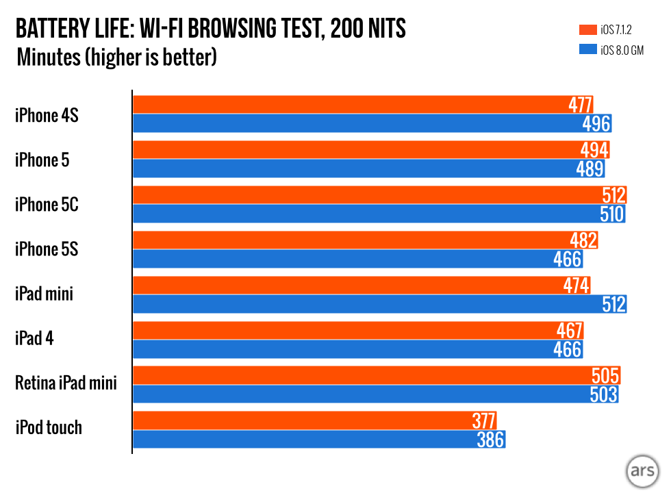


 Loading comments...