Skip to content
Tech

Refinements, additions, and un-breaking stuff: iOS 7.1 reviewed

Apple’s first major iOS 7 update makes the operating system feel whole.

Andrew Cunningham | 259
Time to update! iOS 7.1 is here, and it fixes a lot of iOS 7.0's biggest problems. Credit: Aurich Lawson
Story text

There were about six months between the ouster of Scott Forstall from Apple in late October of 2012 and the unveiling of iOS 7.0 in June of 2013. Jony Ive and his team redesigned the software from the ground up in that interval, a short amount of time given that pretty much everything in the operating system was overhauled and that it was being done under new management. The design was tweaked between that first beta in June and the final release in mid-September, but the biggest elements were locked in place in short order.

iOS 7.1’s version number implies a much smaller update, but it has spent a considerable amount of time in development. Apple has issued five betas to developers since November of 2013, and almost every one of them has tweaked the user interface in small but significant ways. It feels like Apple has been taking its time with this one, weighing different options and attempting to address the harshest criticism of the new design without the deadline pressure that comes with a major release.

We’ve spent a few months with iOS 7.1 as it has progressed, and as usual we’re here to pick through the minutiae so you don’t have to. iOS 7.1 isn’t a drastic change, but it brings enough new design elements, performance improvements, and additional stability to the platform that it might just win over the remaining iOS 6 holdouts.

Performance

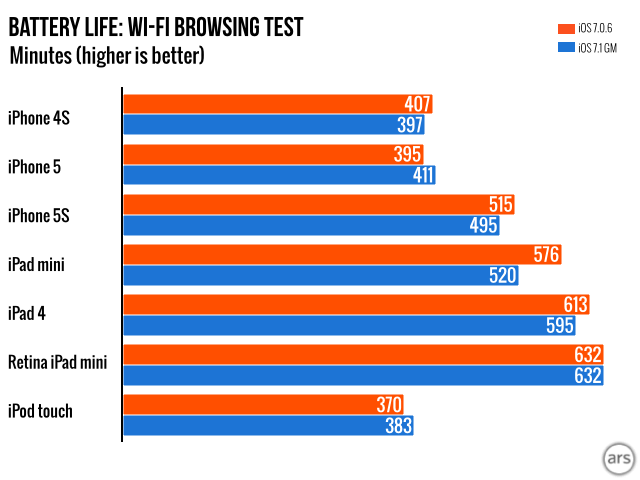
iOS 7.1 doesn’t improve benchmark scores relative to iOS 7, but it still introduces a small but significant change that will make all iOS devices feel much faster. The animation durations that we complained about in the original release have all been significantly shortened, and that by itself is enough to relieve much of iOS 7’s sluggishness. Some of the slower iOS devices used these animations to mask application load times, but on faster hardware, the animations almost always took longer to complete than the app took to start up.

iOS 7.0.3 was a first step toward fixing this issue for people who knew which settings to tweak. Going into the Accessibility Options and toggling “reduce motion” originally just disabled the parallax effect used on the home screen and throughout the operating system, but version 7.0.3 also disabled the sweeping animations used to transition from app to app. In its place was a crossfade effect that was less flashy but demonstrably faster.

iOS 7.0.6 and iOS 7.1 on the iPhone 5. The faster animations make the OS feel zippier. Music credit: “Pinball Spring” by Kevin MacLeod.
iOS 7.0.6 and iOS 7.1 on a first-generation iPad mini. Notice both the faster animations and the revised, cleaner pinch-to-Home animation. Music credit: “Show Your Moves” by Kevin MacLeod.

iOS 7.1 solves this problem for people who don’t tweak their devices’ settings or for people who like the way the animations look but not how they feel. The “reduce motion” setting still kills these animations in iOS 7.1, but the change is now purely cosmetic and offers no performance benefit.

Otherwise, iOS 7.1 remains fluid and usable even on older Apple A5-based devices like the iPhone 4S, fifth-generation iPod Touch, and the original iPad Mini. There are some actions that consistently produce stutters or dropped frames, and you’ll notice a big step up if you move from something with an A5 in it to something with an A7 in it. Still, the experience is significantly better than it is on the iPhone 4 (though even the iPhone 4 behaves better under iOS 7.1, as we’ve examined in this separate post).

Battery life

Note: these scores are not comparable to the scores in the iOS 7.0 review. The test has been modified since then.

In the move from iOS 6.1 to iOS 7.0, we observed a statistically significant drop in battery life—the iPhone 5 was the biggest loser, while everything else was down just a little bit. The move from iOS 7.0 to 7.1 doesn’t make as much of a difference. Our Wi-Fi browsing test measured both small gains and small losses, but most of these scores are different by just two or three percent, which we’d consider to be within the margin of error.

The first-generation iPad mini is the only one to lose a significant amount of runtime in our test—it gets about 10 percent less life out of a single charge. We’ll be running the test again to verify this particular data and will update this article if we see different results. In the meantime, it’s probably safe to say that unless something is wrong with your hardware, you’ll get about the same battery life out of iOS 7.1 that you got from 7.0.

Stability improvements

Apple’s release notes say that iOS 7.1 fixes crashing problems for iPhone 5S users, the same crashes that the company commented on way back in January. It’s rare for Apple to acknowledge these kinds of problems beforehand or to promise fixes ahead of time, so the company must be confident that the problem has been fixed.

What Apple doesn’t mention is that similar crashes have also affected both the iPad Air and Retina iPad mini. The common factor here is the new 64-bit A7 chip, which on these three devices runs a 64-bit build of iOS and 64-bit versions of all of Apple’s built-in apps (and a small-but-growing number of third-party ones). These 64-bit apps can be expected to consume around 20 or 30 percent more memory than their 32-bit counterparts, but the iPhone 5S and both 64-bit iPads both ship with the same 1GB of RAM that their predecessors did.

The results were predictable: crashes on both the iPhone 5S and the 64-bit iPads are almost always associated with low memory errors. Pulling the logs from any given 64-bit iOS 7.0 device reveals at least a few of these crashes—below is the error list from Senior Reviews Editor Lee Hutchinson’s iPhone 5S and a Retina iPad mini on loan from Apple. Both are running iOS 7.0.6.

Retina iPad mini crash log from 7.0.6.
Retina iPad mini crash log from 7.0.6. Credit: Andrew Cunningham
Crash log from iPhone 5S.
Crash log from iPhone 5S. Credit: Lee Hutchinson

Lee’s log shows two low memory crashes in March, and the (intermittently used) iPad shows three since February 24. Anecdotal evidence from Twitter, the Apple Support Communities forums, and other sources suggest that some users are seeing even more frequent crashes than these. Here’s the crash log from my own iPhone 5S, which has been running iOS 7.1 beta 5 since it came out at the beginning of February.

As if by magic, no crashes in 7.1. Credit: Andrew Cunningham

Despite our best efforts to create a set of steps that would consistently crash 64-bit iPhones and iPads, we can’t point to any one specific workflow as proof that things that crash in iOS 7.0 won’t crash in 7.1. But 32-bit and 64-bit devices running the final build of iOS 7.1 and any of the later betas have been remarkably stable. Whatever it was that was causing newer iPhones and iPads to crash and reboot, Apple seems to have straightened it out in the last six months.

UI changes large and small

One of the goals of the iOS 7.0 release was to bring a sense of cohesiveness and consistency to iOS—most iOS 6 apps were products of the same design sensibility, but years of piling new features on top of the original iPhone OS’ foundation resulted in a pile of apps that looked and behaved similarly but not identically. In most cases, iOS 7.1’s changes to the design are minor. In many cases, they’re so small that you’d need to look at the old and new versions side-by-side to even notice. But taken together, they bring a level of polish and refinement to iOS 7 that wasn’t always present in the original release, and some of them even look to the old iOS 6-era design for inspiration.

Keyboard and fonts

One of the first things you’ll notice about iOS 7.1 is the onscreen keyboard. The text on the keys has been made bolder, changing from what looks like Helvetica Neue Thin to Helvetica Neue Light. The gray background and the gray keys have gotten a shade or two darker, which together with the thicker fonts make for a keyboard that’s more contrasty and readable.

Light keyboard in iOS 7.0.
Light keyboard in iOS 7.0. Credit: Andrew Cunningham
Light keyboard in iOS 7.1.
Light keyboard in iOS 7.1. Credit: Andrew Cunningham
Dark keyboard in iOS 7.0.
Dark keyboard in iOS 7.0. Credit: Andrew Cunningham
Dark keyboard in iOS 7.1.
Dark keyboard in iOS 7.1. Credit: Andrew Cunningham
Number pad in iOS 7.0.
Number pad in iOS 7.0. Credit: Andrew Cunningham
Number pad in iOS 7.1.
Number pad in iOS 7.1. Credit: Andrew Cunningham
The iPad keyboards undergo a similar transition. The keyboard in iOS 7.0…
The iPad keyboards undergo a similar transition. The keyboard in iOS 7.0… Credit: Andrew Cunningham
…and the newer, bolder design in iOS 7.1.
…and the newer, bolder design in iOS 7.1. Credit: Andrew Cunningham

The more significant change is to the keyboard’s shift key, which mutated throughout the beta period from one confusing implementation to another until settling on something that more or less works. The shift key can be in one of three states—off, on, or in Caps Lock mode—but in iOS 7.0, it isn’t immediately obvious from looking at the key just which of the three states it’s in. In both the light and dark keyboards in iOS 7.1, a shift key in the “off” position is gray, one in the “on” position is white, and one in Caps Lock mode has a different icon. The Delete key is similarly gray when inactive and white when active, but since your finger will be obscuring the delete key every time you use it, you won’t notice it as much.

Shift on the light keyboard.
Caps Lock on the light keyboard.
Shift on the dark keyboard.
Caps Lock on the dark keyboard.

Whether you think the new shift key is better or just different is a matter of taste. The new behavior is probably less confusing for newcomers, but changing the way the key works mid-stream will mix things up for some people until they get used to it.

Safari address bar in iOS 7.0. It uses a fainter, lighter font.
Safari address bar in iOS 7.0. It uses a fainter, lighter font. Credit: Andrew Cunningham
Address bar in iOS 7.1. Throughout the OS, Apple uses thicker fonts with more contrast.
Address bar in iOS 7.1. Throughout the OS, Apple uses thicker fonts with more contrast. Credit: Andrew Cunningham

The keyboard keys aren’t the only area where iOS 7.1 sports thicker font weights than the 7.0 release. There’s no system-wide font thickening like there was early in the iOS 7.0 betas, but bolder fonts show up in a few prominent places—the address bar in Safari, for example, or the authentication boxes that pop up when you need to enter your Apple ID. Apple’s continued experimentation here amounts to an admission that yes, maybe it did go a bit overboard with the thin, light fonts when it was originally designing iOS 7.

Accessibility options: Apple’s UI sandbox

The Accessibility section of the Settings app is becoming a one-stop shop for people who want to disable some of iOS 7’s more controversial design decisions. It began in version 7.0 with the “bold text” option that made the new thin fonts look decent on non-Retina displays, and it continued with the option to turn the UI animations off in 7.0.3. iOS 7.1 adds a few new ones.

First, Apple throws a bone to people who think that the text-with-an-arrow “buttons” in iOS 7 are more confusing than iOS 6’s button-shaped buttons. The new “button shapes” toggle makes the outline-free buttons into flat, blue-on-gray buttons more reminiscent of the old-style iOS buttons.

With “darken colors” enabled.
With “button shapes” enabled.

The “Increase Contrast” setting has now become three separate settings. “Reduce Transparency” has the same effect as “Increase Contrast” did before—it turns off transparency and translucency throughout the operating system, making the UI a little less glitzy and busy. “Darken Colors” and “Reduce White Point” are two new options, and they do what they say they will. “Darken Colors” darkens the hues of some (but strangely, not many) of the colors in the operating system, and “Reduce White Point” dims the screen just a little bit to take the edge off all the bright white backgrounds. Neither of the latter two options really make a big difference in the way things look, but… there you go.

Apple played with even more UI options in the iOS 7.1 betas—for instance, an option to always use the “dark” iOS 7 keyboard was introduced in Beta 3 and removed in Beta 4. Historically, iOS has shied away from giving users these kinds of UI options, and like the continually shifting font weights and buttons, these options suggest that Apple is still trying to figure out the best way to balance the new design with some of the old functionality. We wouldn’t be surprised to see Apple examine usage data for these features and introduce new, more permanent UI changes in iOS 8.

Sliders and buttons

Here’s what a slider looked like in iOS 6:

And here’s what one looks like in iOS 7 and iOS 7.1:

Power off screen in iOS 7.
Power off screen in iOS 7. Credit: Andrew Cunningham
Power off screen in iOS 7.1.
Power off screen in iOS 7.1. Credit: Andrew Cunningham

The iOS 7.0 slider is a pretty straightforward flattening of the iOS 6.1 design, and it’s one place where the skeuomorphic design of Ye Olde iOS was actually helpful to users. In iOS 6 you had an actual “button” to slide, making it more obvious what you were supposed to do to engage with it. In iOS 7, the right arrow that replaces the button is difficult to distinguish from the “slide to power off” text.

The new slider better translates the intent behind the iOS 6 design—iOS 7.1 loses the skeuomorphic look while retaining a distinct and obvious button. Other small touches make the shutdown dialog more readable. The screen behind the dialog is now heavily blurred so that shapes behind the slider don’t obscure the “slide to power off” text, and the text stands out more from the lighter background. Throughout iOS 7.1, the rectangular buttons imported from iOS 6 have been replaced with circular ones that match up better with the buttons on the new lock screen and phone dialer. None of these are huge changes and none of them will alter the way you interact with your iPhone or iPad, but they all make iOS 7.1 feel more cohesive and intentional than iOS 7.0 did.

Slide to unlock in iOS 7.0. Credit: Andrew Cunningham
Unlock in iOS 7.1. Credit: Andrew Cunningham

Apple tries to make the “slide to unlock” dialog on the lock screen more readable, too, but it ends up being more of a step sideways. The “shine” effect is much brighter and more obvious, but the rest of the time the text is so faint that it’s hard to read against a busy background like the one above. Here’s an alternative version of the “fixed” slider from Beta 5 that blurred busy backgrounds around the “slide to unlock” text to make it more readable—it’s still not the most elegant implementation, but it’s more legible than what Apple ended up going with.

Slide to unlock in iOS 7.1 beta 5. The blurred background was removed in the final release. Credit: Andrew Cunningham

Settings

Passcode settings are more prominently positioned than before. Credit: Andrew Cunningham

As of iOS 7.1, your phone or tablet’s passcode and/or TouchID settings have been moved. No longer buried in the “general” section with two dozen other things, your passcode settings are now a top-level category alongside things like “sounds” and “privacy.” Remember back in September when Apple’s Phil Schiller mentioned that half of iOS users didn’t use any kind of passcode at all? Apple is still trying to get that number up—first it added a passcode prompt to iOS’ first-time setup wizard, and now the passcode settings are much more prominent than they once were.

You can turn the potentially motion sickness-inducing “perspective zoom” feature on and off from within the wallpaper picker.
You can turn the potentially motion sickness-inducing “perspective zoom” feature on and off from within the wallpaper picker. Credit: Andrew Cunningham

Also kind-of-new is the wallpaper picker, which has been moved around a little and now offers the option to turn the “perspective zoom” feature on and off. This prevents the desktop wallpaper from sliding around as you move the phone without completely disabling the animations that the “reduce motion” accessibility option toggles. The icons and notification prompts still move with the phone, but the effect is greatly reduced.

Phone

The phone dialer gets shuffled around quite a bit in iOS 7.1, mostly to replace those flat rectangular buttons with new round ones. The option to add a number to your contacts list has been changed from a line of text to a button—I’m all for replacing nebulous text-label-buttons with actual buttons, but it’s not immediately clear what the new button is supposed to do if you don’t already have some idea.

The phone dialer. “Add to contacts” is now a small button to the left of the number you’re dialing.
The keypad mid-call. “Hide” is no longer its own button, and it’s now sitting in the corner.
Incoming call from some ugly jerk.
Getting another call while already on a call. All of these rectangles have been exchanged for circles.

Calendar

The Calendar app picks up a button that will let you see a list of the day’s events without having to switch from the monthly calendar view. This isn’t a “new” feature; Apple has just restored a calendar view from iOS 6 that was removed in iOS 7.0. If you switch from monthly to daily view there’s a new toggle that will let you scroll through all of your scheduled events at once. You could do this in iOS 7.0 by tapping the Search button, which in iOS 7.1 instantly opens up a search dialog. If you actually want to search through your appointments, iOS 7.1 lets you do it in fewer taps—in iOS 7.0, you had to tap the search button and then tap the search box to bring up the keyboard and start typing; 7.1 just brings up the keyboard instantly.

A new button in iOS 7.1 restores the ability to view the entire month and see the appointments on individual days simultaneously.
A new “list view” button is now used to look at all of your appointments; the feature is no longer hidden in the Search menu.

Camera

The iOS 7.1 Camera app includes an Auto HDR setting on the iPhone 5S and a flash indicator on everything.
The iOS 7.1 Camera app includes an Auto HDR setting on the iPhone 5S and a flash indicator on everything. Credit: Andrew Cunningham

The Camera app gets a couple of handy additions. First up is an “auto HDR” mode for iPhone 5S users that automatically enables the HDR feature when a given scene’s lighting demands it. We’ve seen this in various Android cameras before (including in the Moto X), so it’s nice to see it show up here. When the camera’s LED flash is in “auto” mode, you’ll also see a yellow flash indicator fade into view at the bottom of the screen when the flash is going to fire. Move the camera somewhere brighter, and the flash indicator fades away. It removes some of the guesswork for those situations where you can’t tell if the flash is going to fire or not.

Grab bag

As in iOS 7.0, version 7.1 makes some changes so small that they don’t take much time to explore. These include some further UI tweaks even smaller than the ones we’ve already examined, a few changes to existing features, and a new niche addition or two.

Notification Center, Music, and Weather

A handful of iOS 7’s apps have gotten some tiny, blink-and-you’ll-miss-them changes. If you have no notifications in the Notification Center, the “all” and “missed” tabs will tell you so. The button to dismiss notifications has been enlarged and its colors have been inverted, but the functionality doesn’t change. The Music app gets bolder, more visible “shuffle” and “repeat buttons.” And the Weather app’s icons are now filled in with color rather than being simple line art.

Don’t have any notifications? iOS 7.1 will tell you so.
Don’t have any notifications? iOS 7.1 will tell you so. Credit: Andrew Cunningham
The button to dismiss notifications has been inverted and made a little larger.
The button to dismiss notifications has been inverted and made a little larger. Credit: Andrew Cunningham
The Shuffle and Repeat buttons in the music app get a darker backdrop.
The Shuffle and Repeat buttons in the music app get a darker backdrop. Credit: Andrew Cunningham
The Weather icons are now filled in, making them brighter and bolder.
The Weather icons are now filled in, making them brighter and bolder. Credit: Andrew Cunningham

Siri

If you’re irritated by the lag time between when you stop speaking and when Siri detects that you’ve stopped speaking and responds, you can now press and hold the Home button the entire time you’re speaking and let go when you’re done. Siri instantly stops listening and goes to get what you need, which makes the feature feel more responsive than it did before. Hold the Home button briefly and then let go, and Siri will work the same way it did before. Voices for Mandarin Chinese, UK English, Australian English, and Japanese have also been improved to be “more natural sounding.”

AppleTV channel hiding

Hiding unwanted channels from your Apple TV’s interface is now an option.
Hiding unwanted channels from your Apple TV’s interface is now an option. Credit: Andrew Cunningham

The AppleTV’s version of iOS is still waiting for an iOS 7-style facelift, but in the meantime its iOS 7.1 update gives users the option to hide channels they don’t want. Highlight the channel you’d like to hide and press and hold the “select” button as you would if you were going to move it. When the channel begins jiggling, press the play/pause button on your remote and select “hide this item” to make it disappear from your home screen. As Apple continues to add new AppleTV channels to the interface, the option to get rid of the ones you don’t want will help you keep your screen clear.

CarPlay (or the artist formerly known as “iOS in the Car”)

Apple’s CarPlay is getting a lot of publicity, but it has yet to prove it can succeed.
Apple’s CarPlay is getting a lot of publicity, but it has yet to prove it can succeed. Credit: Apple

CarPlay topped Apple’s release notes for iOS 7.1 and the feature got a big PR push just last week, but the noise surrounding it doesn’t mean that it’s actually going to benefit anybody just yet. It runs only on compatible in-car screens, and so far the only screens it’s compatible with are in ludicrously expensive cars that aren’t even available yet.

We do know one important detail that we didn’t know last week: while some third-party developers like Spotify and iHeartRadio have already announced compatibility with CarPlay, as of iOS 7.1, there is no public SDK or API that developers can hook into. Apple’s developer documentation for the MPPlayableContentManager class used in CarPlay makes it clear that “using it requires a special entitlement issued by Apple” and that “apps without the correct entitlement will not appear on the CarPlay home screen.” In other words, if a developer wants to use CarPlay in any capacity, that developer needs to go through Apple to do it—at least for now.

Without a compatible car, we can’t offer a hands-on impression of CarPlay, and the experience will reportedly differ slightly from car to car depending on the built-in display’s capabilities. Adventurous developers can access some basic functionality in the iOS Simulator that comes with version 5.1 of Xcode. Developer Steve Troughton-Smith, who has uncovered buried CarPlay features in Apple’s developer tools before, can lead you in the right direction if you’re really curious.

iOS 7 arrives

iOS 7.1 is an improvement no matter what you’re using.
iOS 7.1 is an improvement no matter what you’re using. Credit: Andrew Cunningham

Four months separated the release of iOS 6.0 and iOS 6.1. Apple took almost twice as long to give iOS 7.0 its first major update, but the OS has clearly benefitted from the extra development time. Whether you have a phone or tablet, and whether that tablet is brand new or three years old, iOS 7.1 is going to fix something important for you. Its performance and general stability are where iOS 7.0 should have been in the first place.

The update’s design has also made several steps in the right direction, backing down from the light colors and thin lines of the first iOS 7 betas. The thicker fonts, higher contrast, and UI-options-disguised-as-accessibility-settings strike a better compromise between the new design and the old. iOS 7.0 was conceived, coded, and pushed out the door in a short amount of time, and iOS 7.1 looks and feels like a more consistent and coherent version of what we got in September.

iOS 7.1 will probably be iOS 7’s last big update before iOS 8 comes out, assuming Apple sticks to its usual fall release schedule. Whatever new features and design tweaks we see when that happens, iOS 7.1 gives the company an excellent foundation to build on.

The good

  • Improved performance across the board
  • Better stability and fewer crashes, particularly on 64-bit iPhones and iPads
  • Refines iOS 7’s design to make it more readable and usable, and it restores a handful of useful iOS 6-era features
  • Helps to fix the iPhone 4’s performance problems

The bad

  • No major, consistent battery life improvements

The ugly

  • We’ve been waiting for this for six months

Listing image: Aurich Lawson

Photo of Andrew Cunningham
Andrew Cunningham Senior Technology Reporter
Andrew is a Senior Technology Reporter at Ars Technica, with a focus on consumer tech including computer hardware and in-depth reviews of operating systems like Windows and macOS. Andrew lives in Philadelphia and co-hosts a weekly book podcast called Overdue.
259 Comments