
You are using an out of date browser. It may not display this or other websites correctly.
You should upgrade or use an alternative browser.
You should upgrade or use an alternative browser.
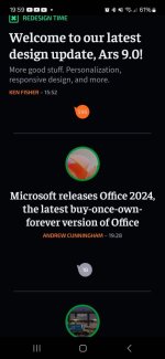
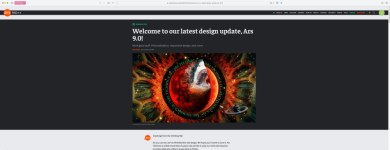
Welcome to our latest design update, Ars 9.0!
- Thread starter JournalBot
- Start date
Gah! I think I just found a bug, which is a big one. If I read an article in Neutron view, it gets marked as read and the headline changes (not enough, but it's visible once you know what to expect). But if I switch back to other views, that "read" status doesn't follow, which is bonkers. The view should have nothing to do with the read status of an article.
Upvote
9
(9
/
0)
Requesting site be usable without JavaScript: Would require view mode switch and links to comments in forum. These were added last redesign, so hoping they can be again. (I know I'm weird in that I subscribe but prefer to browse without JavaScript.)
More specifically, responsive design is part of the problem. The threshold for "full width" rendering is set too high, and thus it hides interface elements that would be useful.
Example: the site is actually mostly usable without JavaScript from a desktop browser because there are buttons to click for each design style. However, on a phone, those extra buttons are hidden, and without JavaScript, there's no way to switch to list view, for example. The phone screen is pixel-wise big enough to show those buttons, but the designer has decided that a much wider window is necessary to show full controls. This could be fixed.
Also, if the link to open comments in the forum weren't just a JavaScript thing, then there'd be everything one need to browse without JavaScript.
Upvote
2
(5
/
-3)
I am just loving neutron star mode. Well done! That is all.
Upvote
0
(5
/
-5)
Where did the article blurbs go?I'm sorry but comments don't work in-line. All of the view modes suck.
I’m here to read. Not choose from clickbait headlines.
Upvote
14
(16
/
-2)
For me the new design is a relief on a big screen iPhone. I have bad eye sight. To read the old design on the phone I had to put it in landscape and then zoom until the text block filled the whole width. Now I can read portrait mode just fine. 3-5 words per line but that is ok.
Upvote
-7
(0
/
-7)
This is an utter Desaster. Fire all the people that were responsible for this 'better user unfriendliness' and bring back the old interface ASAP. This a tech site, that now looks a site that wants sell to perfume.
Upvote
-14
(10
/
-24)
original_mds
Ars Tribunus Militum
Anyone else not seeing a way to edit old posts?
Upvote
-1
(0
/
-1)
This redesign is terrible. Everything is too big. Even playing with the settings can't save it.
Upvote
8
(9
/
-1)
Here's the real truth:Thanks for the reply and explanation. As you guessed, I don't read the forums really at all. Maybe because I find that reading forums on the web sucks compared to using my mail reader which is all keyboard driven. But I do appreciate all your hard work here and the time you took to respond.
Ars readers are special. And I mean that in every sense of the word lol. Though I definitely say it with love.
You guys are the hardcore of the hardcore nerds. (And my people, to be clear.) And that means that we cannot possibly take into account the way you all do things. Because you find your methods, and you stick to them.
Using a keyboard-driven mail reader in 2024? It's not normal! But it is here. It's why we added keyboard navigation to the Neutron Star view.
There's nothing we could do to anticipate some of the feedback we're getting. We always knew there was a "fuck it, we'll do it live" component to this. We gotta hear directly from people.
Upvote
19
(26
/
-7)
Same on all devices I have tried — all mobile. Would be nice if this was both configurable and consistent for comment text, which for me is about the right size except the quote text which is on the tiny side.It's also too big on a modern pro max.
Upvote
1
(1
/
0)
I tried all the view modes but cannot figure out how to tell if I've already read a page. Like the "visited" CSS is deliberately prevented from working like the rest the Internet.
And at 16 pages of comments, I have no idea how to find out if someone else has already brought this up - my apologies if this is redundant.
And at 16 pages of comments, I have no idea how to find out if someone else has already brought this up - my apologies if this is redundant.
Upvote
7
(7
/
0)
So on desktop it looks okish to me, but there are some empty spaces. I guess those are planned for ads, but if so there are no ads right now, so a bit worried about your revenues post UI updates guys.
On mobile, in desktop mode, to me it looks ok and better than before (I am on Chrome under Ubuntu 20.04)
On mobile, in mobile mode, it looks very empty. I attach a screenshot on my S21: I can see 2 headlines at a time, wohoo. I am scrolling like a dog already...
Regarding the commemts sections, I think they render very well on mobile in mobile mode, but just my taste.
Anyway, despite the shitstorm in the comments section, good luck with the next steps. It probably requires some adjustments but I think the foundations are promising, so kudos for the hard work which went into this massive change.
Btw I am in darkmode all along, so not sure how it renders in light mode.
Attachments
Upvote
2
(2
/
0)
Upvote
0
(0
/
0)
Classic mode doesn't make it look like the last version. The previous style was very readable both on a mobile device or a desktop. I'm finding the text very hard to read on a laptop at 1080p, even moving the text size to small doesn't seem to affect the articles, just the forum and comment text. I've been around since 2000 and I know the updates aren't always univerally loved but this one sticks out as a miss.
Upvote
2
(4
/
-2)
Say, the title bar on the Front Page puts the profile menu alllllll the way off to the side on ultrawide monitors...but honestly the forums handle this in a more accommodating way with a maximum width. Would you consider improving the ultrawide monitor Front Page experience in the same way?
Attachments
Upvote
0
(0
/
0)
That's been going on for at least a few weeks now (even before this update). There is some magic timeframe in which you can edit your post, and then after that you're locked out. But no count down timer telling you how much time you have left.Anyone else not seeing a way to edit old posts?
Or maybe I'm BS all of a sudden. I just went back and looked at a post and I can still edit it.
Upvote
1
(1
/
0)
NONE of the view options are as good/clean as the version we had yesterday.
What is with all the whitespace (or black), with such little content in that space? We either get massive text or smaller text, all seemingly in the same giant box. I'm all for modernizing and improving, but frankly, there was probably a good reason that the prior layout hadn't been changed in so long. It was good!
Neutron Star could be good, but I do miss the SMALL pictures that went with the headline. And the blurbs.
Upvote
17
(17
/
0)
Insufficient color contrast on block quote text in dark mode, probably using the light text definition for these:

Upvote
13
(13
/
0)
Wow! It is not. Check out all his capitalization!Is this it? https://meincmagazine.com/logo
(just having fun with the discovery that you can find images this way)
Upvote
-1
(0
/
-1)
I tend to agree, but tbh if subs want to turn off the (now infrequent) Amazon Prime Day deal articles that's more than cool with me.I get it and I assume this was a frequent ask, but the one thing I miss about doing most of my reading in print is stumbling across something interesting that I wouldn't otherwise have looked for. Personalization is great, but its a two edged sword and (in my opinion) it has greatly contributed to fracturing our shared, common experience.
It was a popular request, we added it, and I'm curious to see if people actually use it now.
We listen to feedback, honest!

Upvote
10
(11
/
-1)
Mr.Apoptosis
Smack-Fu Master, in training
My take: (on mobile)
I don't like the classic view, but that's taste I think.
The grid view, it's horrible! Tiny circles with an image in it. A font so large that even a short title takes up three lines.
Super low information density, but it doesn't even lead to a clear page.. My eyes are darting around, trying to see where to look.
The list view is acceptable, most like the old Ars homepage I was used to.
But it's not an improvement, lower information density, more scrolling to go through the same number of items.
Neutron Star is interesting, but a small (square) image for recognition would help. I might switch to this view, if the list view doesn't improve.
My recommendations:
Anyway good to see there's some development in the website, hopefully this is not the end station in this round of design changes.
I don't like the classic view, but that's taste I think.
The grid view, it's horrible! Tiny circles with an image in it. A font so large that even a short title takes up three lines.
Super low information density, but it doesn't even lead to a clear page.. My eyes are darting around, trying to see where to look.
The list view is acceptable, most like the old Ars homepage I was used to.
But it's not an improvement, lower information density, more scrolling to go through the same number of items.
Neutron Star is interesting, but a small (square) image for recognition would help. I might switch to this view, if the list view doesn't improve.
My recommendations:
- Increase information density, less white (black) space.
- No round images! Such an inefficient way to show pictures
- make the font size adjustable
Anyway good to see there's some development in the website, hopefully this is not the end station in this round of design changes.
Upvote
11
(11
/
0)
We'll take all the feedback in, don't worry.
But you're a great example of why we need some time to figure out where the pain points are. We didn't plan around someone bookmarking some other page and never looking at the front page.
If there's a use case we missed that makes sense we can certainly add it.
Following on from a lot of comments, I'm sure many are like me and read Ars at work on their widescreen monitors, and it really doesn't work well in that scenario currently.
Even on a 27" monitor, barely any of the article is visible without needing to scroll down, and the article text is far too narrow for this monitor width/resolution:
With responsive design, I think it should work both ways - not just enhance mobile experience, but also enhance wider screen monitors especially if there is a significant number of the audience that falls into that category.
With my terrible image editing, this is something I think would work much better on widescreen desktops:
This would move the article content much higher up and make it much easier to read. I did slightly widen the text column from 48rem to 64rem, but that was the most my skills could achieve.
But other things such as avoiding unnecessarily wrapping the title would be very welcome too.
Upvote
11
(12
/
-1)
Remember when The Verge did its last redesign? It sucked. I don't go there anymore. This new layout reminds me a lot of that. By all means, add new features but why mess with an already pleasing and familiar layout?
Upvote
14
(14
/
0)
ToBoldlyGoatse
Smack-Fu Master, in training
I had to register an account to add my extremely discontented voice to the choir.
All the new views are awful. I know this is a default response to any layout change on any site, but this one is uniquely terrible. Everything is stupidly huge, loads of empty space, bad font, bad contrast, bad image placement, bad everything. It's so bad I don't think I will be able to continue visiting this site, which is a tragedy, because the content is still great.
I'm pretty skeptical the loads and loads of people complaining will actually amount to any changes, so I just wanted to post to encourage all current subscribers who don't like the new layout to immediately cancel their subscription. Go ahead and resubscribe eventually, especially if they listen and give us an option to revert to an old view or a more information dense view. But the only way to communicate with for profit entities is with your dollars. I'd also encourage non-subscribers to enable their ad blockers until these changes are reverted.
If I get banned for advocating this, oh well. The site is dead to me as long as it looks this ugly. Sad times.
Upvote
1
(7
/
-6)
"Always" since the new forum launched, yes.Have article page comments always been in an iframe?
Seems like some of the design issues (like disparate font sizing) may be related to how the iframe is styled.
The user font settings thing people are finding is for your forum account, it wasn't intentionally buried, nor does it relate to the front page. I don't know how/if it affects the front page comments, it might.
Upvote
0
(0
/
0)
OK, last one for now, this time with pictures. Looks like user preferences are not properly checked on first load of the comments section. I emptied cache and cleared cookies, closed Firefox, reopened Firefox, browsed to Arstechnica.com, logged in.
Clicking a comment bubble on a dark-mode front page brings me to a light mode left-aligned comment page. The fact that privacy badger and uBlock both show a nonzero count of blocked elements probably means that I was getting the non-subscriber view with ads.

Reloading that page brings me to a dark-mode centered comment page, which is the intended view, with only one blocked element (cdn.jsdelivr.net).

Clicking a comment bubble on a dark-mode front page brings me to a light mode left-aligned comment page. The fact that privacy badger and uBlock both show a nonzero count of blocked elements probably means that I was getting the non-subscriber view with ads.
Reloading that page brings me to a dark-mode centered comment page, which is the intended view, with only one blocked element (cdn.jsdelivr.net).
Upvote
3
(3
/
0)
nimelennar
Ars Tribunus Angusticlavius
It's been mentioned at least once, a few pages before yours, but yeah, this is also my primary complaint.I haven't seen this mentioned, but how come going from one page of the comments to the next dumps me at a seemingly random spot in the comments? I would prefer it going to the top of the new comments page, and I could understand it going to the bottom, but jumping to some random spot in the middle??
If I had to guess, it dumps you on the new page exactly how far you'd scrolled down the previous page, so if the new page is longer, you end up in the midst of a bunch of comments, and if it's shorter, you end up below the comment section entirely.
Apart from that, I've only tested it on mobile, but yeah, having the font so much bigger in the article than the comments is a bit jarring.
For the front page:
- Thanks for fixing the comment button taking me to the Most Read instead of the comments. That was annoying.
- The only differences between "Grid" and "List" on mobile are grey background (instead of black), small round images instead of big ones (but the space that the big one would have occupied is still reserved as whitespace), and Grid seems more curated, while List is chronological. The first and third wouldn't seem to warrant their own separate view, and the second is just a terrible choice: if you're going to reserve the spot for that image, just show us the image.
- I'd like to join in on the "more density" request, for at least one of the "Grid" or "List" views. It feels like the choice of the shrunk-down, rounded images for the Grid view is so that it can be smashed off to the side to save space, but I would think that (a) that would better describe a "List" view, and (b) you're not actually doing that.
- Finally, for Neutron view, there seems to be some free space at the left side, beneath the Section icon. Is there any way to squeeze a "Go to comments" speech balloon button there (without a number, if necessary)? Honestly, Neutron seems by far my favourite, but not having a comments button is a deal-breaker.
Thanks for all the hard work you put into the redesign!
Upvote
8
(8
/
0)
Aurich said they're looking into changing that so it should conform better with the rest of the siteSay, the title bar on the Front Page puts the profile menu alllllll the way off to the side on ultrawide monitors...but honestly the forums handle this in a more accommodating way with a maximum width. Would you consider improving the ultrawide monitor Front Page experience in the same way?
Upvote
2
(2
/
0)
is it possible to change the behavior on the mobile Neutron homepage so that when I click on an article, it takes me directly to the full content instead of first showing a long excerpt with a link to the full article? I’d prefer a single-click to access the full article
Upvote
15
(15
/
0)
In the preceding version on the front page, after logging in, if I clicked on the W in a circle (first letter of the username I assume) it would drop down a list of 5 threads I had posted to, ordered I think by most recent post (by anybody) to that thread. If I clicked on a thread it would open it in the last location where I was reading (not the last where I posted). Now it drops down a list of "so and so responded to you in (article name)". If I click on one of those it takes me to the response, which might be many pages further along then where I last read. I don't see a way to navigate to "last place you read" at all.
Is there some way to get the previous behavior back? There are threads that I keep reading that I don't post to again, and they will be shoved way, way, way down this list. Perhaps split the difference by collapsing all the events currently shown referring to one thread under that thread name? Like so:
Elon's Head Explodes (5)
ArsTechnica New Web format(6)
Dinosaurs caused their own extinction by annoying volcanoes (1)
(and two more)
If the user clicks on the thread name it goes to the last read position, if the user clicks on the number it opens a drop down menu or a second page that looks like this:
John Doe responded to your post (2024/10/2 19:00)
Jane Doe responded to your post (2024/10/2 08:00)
(plus 3 more)
and clicking on (or selecting from the drop down list) one of those will go to that position.
Upvote
4
(4
/
0)
All of the modes are bad on mobile. I prefer being able to read 4 or 5 headlines on my screen. Too much scrolling.
Upvote
18
(18
/
0)
Switching to fully responsive was brave… I think it is not quite worked out yet, but good luck! Ars is a harsh audience, so hopefully your folks are not too bothered by the complaining. We’ll get used to it.
With that out of the way, some complaining!
Neutron view is almost useable on an iPhone, we just need another setting to reduce the size of the headlines font. It is about 2x too large.
It would be nice if the line spacing was adjustable. It seems to be 1.5 spacing currently, which is pretty sparse? Honestly it reminds me of a middle-school book report. Ars deserves at least college formatting!
Neutron view on iOS Safari says “press L” when you expand an article. Probably that’s a leftover desktop feature or something?
Actually IMO it would be nice if the article just opened right up, rather than requiring a second press to get the full article. I guess you guys will have internal metrics though. My bet: approximately nobody will expand an article halfway and then not click to read the rest of it.
Good luck! And sorry if somebody brought this up already. 16 pages of complaining is too much to read.
Upvote
11
(11
/
0)
With the new layout I can't see if I've been to that article page before.  No alternate color.
Oh well, I'll just have to view all previous recent articles to see if anything gets familiar as I'm reading it.
No alternate color.Oh well, I'll just have to view all previous recent articles to see if anything gets familiar as I'm reading it.
Upvote
7
(7
/
0)
You've only had an account for 4 years, so I don't know how long you've been reading Ars. But the last redesign we did was iirc 2016, so 8 years ago.Remember when The Verge did its last redesign? It sucked. I don't go there anymore. This new layout reminds me a lot of that. By all means, add new features but why mess with an already pleasing and familiar layout?
People said the exact same thing then. And the time before, and time before, etc. All 6 times over the last 20 years I've heard the same basic comment.
Every time it's the old design was better. Because it was familiar. And then they get used to the new one they said they didn't like, and we change it and it was great. Rinse and repeat.
That doesn't mean there aren't actual issues, or that we aren't seeing good feedback. It's okay to suggest things or complain, and we are listening.
But also, we've done this many times, and we know that we always get the same feedback every time. People don't like change.
Part of my job now is to sort through the feedback, take into account good suggestions, and also discard a certain amount of knee jerk reactions. It will take time for people to adjust. And, we'll fix things too.
I think we'll get to a good place, and keep adding new features people will like.
Upvote
-8
(14
/
-22)
garygregory
Seniorius Lurkius
Awful IMO, on Android with Firefox: front page: less content per screen, so much space between everything. Sad for me. Maybe it's to make it OK to have larger ads.
Upvote
7
(7
/
0)
Not much does anymore. Split the screen. Why have one browser window when you can have two side by side with twice the readability?Following on from a lot of comments, I'm sure many are like me and read Ars at work on their widescreen monitors, and it really doesn't work well in that scenario currently.
Upvote
1
(2
/
-1)
- Status
- Not open for further replies.