
You are using an out of date browser. It may not display this or other websites correctly.
You should upgrade or use an alternative browser.
You should upgrade or use an alternative browser.
Meet Hyperlight, Ars Technica’s new, even brighter “Light” mode
- Thread starter JournalBot
- Start date
biohazard918
Ars Praetorian
Thanks, I hate it lol. I won't be destroying my oled monitor with this but I hope whoever asked for this is happy.
Upvote
128
(138
/
-10)
I know particularly for readers with astigmatism that the light on dark elements were a little rough, hope this helps anyone who struggled with that. It's too bright for me personally, but we did test it with people who had issues with the Day & Night mode and they found it very helpful.
Happy to take any further feedback.
Happy to take any further feedback.
Upvote
209
(210
/
-1)
New slogan:
Ars Technica, so receptive to feedback we even cater to masochists!
Kidding aside, options are always good so thanks for the work!
Ars Technica, so receptive to feedback we even cater to masochists!
Kidding aside, options are always good so thanks for the work!
Upvote
149
(150
/
-1)
I love it. Will the forum be getting a similar theme so that comments don't suddenly turn the background grey?
Upvote
21
(22
/
-1)
Post content hidden for low score.
Show…
Add Dark Reader on top of their dark mode:I look forward to the upcoming Vanta dark mode, where everything is the darkest dark possible.
Brightness: Off
Contrast: +50
Sepia: Off
Grayscale: +40
Absolute perfection.
Upvote
33
(34
/
-1)
Neutron star dark mode for me. It's strange but it allows me to be able to read the headlines in a passive objective manner.
Upvote
22
(22
/
0)
We just have to ask harder. And we shall receiveth.I look forward to the upcoming Vanta dark mode, where everything is the darkest dark possible.
Upvote
13
(14
/
-1)
Black hole black for me. The only radiation I wish to recieve in my eyes is Hawking radiation.Neutron star dark mode for me. It's strange but it allows me to be able to read the headlines in a passive objective manner.
Upvote
80
(80
/
0)
Yes, it will always be black, that's just core to the Ars brand.On mobile (Android, firefox) the ars banner is still black, is that intentional?
We're happy to make the content light, but I don't think we need to scrub every pixel of black away.
Upvote
74
(75
/
-1)
Glad to hear it, thanks for subscribing and supporting us.Thank you! This is just what I was asking you to build!
Upvote
31
(31
/
0)
Well, good luck to you Hyperlight Drifters out there, I'll abstain.
I will say that visually, it looks better than Day & Night does, to me. But I don't plan on using either.
I will say that visually, it looks better than Day & Night does, to me. But I don't plan on using either.
Upvote
9
(9
/
0)
Sometimes I wonder if people who NEED dark mode to live just don't know how to adjust the brightness on their monitor. If I had my brightness cranked to 100 in the dead of night, I too would be desperate to dark mode the entire internet.
Upvote
-19
(33
/
-52)
“System” for the win.
Now if only every site/app with a dark mode would have that option…
Now if only every site/app with a dark mode would have that option…
Upvote
25
(25
/
0)
Further feedback? Successive iterations have taken this design from great looking but with some aggravations and bugs to great looking on all surfaces with unprecedented customizability and a reliable implementation.I know particularly for readers with astigmatism that the light on dark elements were a little rough, hope this helps anyone who struggled with that. It's too bright for me personally, but we did test it with people who had issues with the Day & Night mode and they found it very helpful.
Happy to take any further feedback.
I haven't heard any forum talk but congratulations on nailing the avatar notification icon problems--it seems to be working reliably now (at least for me) outside the native forum. No more "undef".
Edit: Doh! Spoke a little too soon. Safari 18.1.1.
Re Edit: Going to home page makes it work again.
Upvote
17
(17
/
0)
My main monitor rarely goes above 80 nits (about 27% brightness, in its specific case). It's only cranked when consuming media. I find dark mode more readable for most use-cases. (Even in daylight.)Sometimes I wonder if people who NEED dark mode to live just don't know how to adjust the brightness on their monitor. If I had my brightness cranked to 100 in the dead of night, I too would be desperate to dark mode the entire internet.
Though I do like light mode in some specific use-cases (very small text, or fast-moving text like a large chat group).
Upvote
18
(19
/
-1)
Always love to see accessibility baked in regardless of whether or not it targets me.
Upvote
69
(69
/
0)
Bad Monkey!
Ars Legatus Legionis
I look forward to the upcoming Vanta dark mode, where everything is the darkest dark possible.
I'm down for this, but only if they call it "Smell The Glove".
Upvote
13
(15
/
-2)
Can't speak for anyone else, of course, but I've got the brightness on my monitors shifted pretty far down already and the color balance fiddled with as well. I still use dark mode for most things. Otherwise I find myself squinting at the monitor. I've always been sensitive to light, loud noises, etc. Too much sensory input apparently fries my circuits.Sometimes I wonder if people who NEED dark mode to live just don't know how to adjust the brightness on their monitor. If I had my brightness cranked to 100 in the dead of night, I too would be desperate to dark mode the entire internet.
Upvote
29
(29
/
0)
muddledzen
Ars Centurion
I actually really like it. As someone mentioned above, I have astigmatism issues that make some dark modes hard to read - but a lot of times I also find 'light' mode BLINDING (looking at you Microsoft apps)... even though you call it 'hyperlight', all of the grey works best for my eyes.
Appreciate the choices!
Appreciate the choices!
Upvote
30
(30
/
0)
Thanks for this! Just switched to it, and it looks great.
For those wondering why I'd want something like this - I love the aesthetic of Dark Mode. It looks great. I used it for a while. And then I realised that I was using the monitor for longer periods.
I consciously switched back to light modes so that I would be forced to take regular breaks. It's been successful in that regard. It's just a shame that many companies/organisations seem to put much more effort into designing their dark modes than their light modes, as the dark ones are usually much better looking...
So thanks again to Ars for delivering this!
Upvote
14
(16
/
-2)
Perhaps, but writing from personal experience, I like things dark everywhere when I can get it. My kids on the other hand leave every light on and crank the brightness on their phones to what are painful levels for me to look at. Even with monitor brightness turned down, and Night Light mode activated in my OS, websites without a dark theme hurt my eyes--especially in the early morning and later in the evening. Thankfully Ars accommodates.Sometimes I wonder if people who NEED dark mode to live just don't know how to adjust the brightness on their monitor. If I had my brightness cranked to 100 in the dead of night, I too would be desperate to dark mode the entire internet.
Ironically these same people wear sunglasses everywhere and the sun doesn't bother me. So I think it may have to do with the quality of the light as well, and not just the quantity (i.e., brightness).
Upvote
21
(21
/
0)
Thanks, this is really nice! I keep my desktop monitor brightness at about 30%, so dark text on paper white is very pleasant. On my phone, reading the screen in sunlight is only possible in light mode.
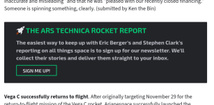
@Aurich When the new themes first came out, I asked for more contrast in the newsletter subscription box. (It can be seen in the weekly rocket report.) Thank you for addressing that; It's now super-easy to tell it apart from the article text! However, in Hyperlight (and to a lesser extent, in Day and Night), it sort of stands out too much. Could it also be lightened or lightness-inverted in the lighter or lightest modes?
For reference, here are the old-old and the new newsletter subscription boxes side-by-side.
edit: I see your reply to kerbaldroptest. Does it make a difference that the newsletter box is more integrated into the content than the header bar is? The comments section has several examples of distinct text areas that are not light text on dark background (the editing field, quoted text).
Not related to the themes, I have two other bug reports / compatibility requests:
1. One of the reflow layouts (the second-narrowest one, which has "Sections", "Forum", the theme, and the user menu) doesn't have the search button anywhere, not even in the Sections menu or at the bottom of the page.

The search button reappears if you force the site narrower (hamburger menu layout) or wider ("Sections", "Forum", theme, search, user). It's just the one layout that's missing Search.
2. In Firefox's reader mode, the newsletter subscription box no longer has a title at the start of it.

It used to have the title show up in reader mode's text.

Funny enough, Chromium's reading mode shows the title but none of the text.

Could these be made consistent with the full site, showing the title and text? I know that' mucking about with browser behavior / compatibility, but it would be nice.
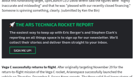
@Aurich When the new themes first came out, I asked for more contrast in the newsletter subscription box. (It can be seen in the weekly rocket report.) Thank you for addressing that; It's now super-easy to tell it apart from the article text! However, in Hyperlight (and to a lesser extent, in Day and Night), it sort of stands out too much. Could it also be lightened or lightness-inverted in the lighter or lightest modes?
For reference, here are the old-old and the new newsletter subscription boxes side-by-side.
edit: I see your reply to kerbaldroptest. Does it make a difference that the newsletter box is more integrated into the content than the header bar is? The comments section has several examples of distinct text areas that are not light text on dark background (the editing field, quoted text).
Not related to the themes, I have two other bug reports / compatibility requests:
1. One of the reflow layouts (the second-narrowest one, which has "Sections", "Forum", the theme, and the user menu) doesn't have the search button anywhere, not even in the Sections menu or at the bottom of the page.
The search button reappears if you force the site narrower (hamburger menu layout) or wider ("Sections", "Forum", theme, search, user). It's just the one layout that's missing Search.
2. In Firefox's reader mode, the newsletter subscription box no longer has a title at the start of it.
It used to have the title show up in reader mode's text.
Funny enough, Chromium's reading mode shows the title but none of the text.
Could these be made consistent with the full site, showing the title and text? I know that' mucking about with browser behavior / compatibility, but it would be nice.
Attachments
Last edited:
Upvote
13
(15
/
-2)
 )
)How much more black could it be?I'm down for this, but only if they call it "Smell The Glove".
Upvote
5
(5
/
0)
artvandelayIIII
Ars Tribunus Militum
I actually find that light mode saves me battery life on my laptop. How? I find that at the same brightness level, light mode feels subjectively like it's brighter, so I turn the screen level down. On my MacBook Air, writing in a moderately lit indoor setting I will put the brightness ~50-60% in dark mode. If I switch over to light mode, I may drop that down to ~25-40%.
Upvote
1
(6
/
-5)
Came here to say this.thank you, I love it!
A few times over. I mean it.
Upvote
5
(5
/
0)