Skip to content
Questioning Android Q

Android Q Beta 2, a deep dive

Android’s Bubbles feature can actually completely replace the notification panel.

Ron Amadeo | 107
Credit: Android
Credit: Android
Story text

Android Q Beta 2 is out! Despite the plethora of bug warnings from Google, I flashed it on my daily driver and am back to report on some things. Beta 2 gives us a whole new feature to play with called “Bubbles,” lots of little changes, and frustratingly slow development on Android’s gesture navigation system.

Of course everything is a work in progress, and there are plenty of bugs and weird design quirks. We’re still going to bring attention to them now, though, in the hope that they get cleaned up before release. Let’s dive in!

Bubbles—Messaging-app feature or crazy notification-panel replacement?

Pictures of Android Q Beta 2.
Press the bubble button and you will spawn a bubble.
Pictures of Android Q Beta 2.
Bubbles get scoped behind a permission.

The headline feature of Android Q Beta 2 is “Bubbles,” which is a multitasking UI that bears a striking resemblance to the old Facebook “Chat Heads” feature. Apps pop up in floating windows and can be minimized into a little floating circle. Android supports this at the OS level, so any app can be a bubble. Google suggests using this for messaging apps, note apps, directions, and anything else you might want to keep at hand while you move around your phone.

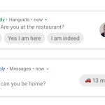
Bubble support isn’t applied to apps automatically—each individual app would need to be updated by the developer specifically to support bubbles. Since Android Q Beta 2 just came out, right now zero apps support bubbles. Scratch that—one app supports bubbles: Google’s Bubble sample app. It was mentioned briefly in Google’s blog post, but you get it here on GitHub, compile it in Android Studio, and send it to your Android Q phone. The result is the above messaging app that lets you talk to animals.

The Dog says “woof,” the Cat says “meow,” and overall, Bubbles is a standard messaging app. The magic comes in from the button in the top-right corner of the app, which lets you spawn a bubble. Just like the old Chat Heads feature, here the bubble holds a tiny version of a messaging app. You can drag the bubble around the screen, and tap on it open or minimize the tiny applet. To close a bubble, just drag it to the bottom of the screen.

Google’s sample app will auto-reply to your messages after five seconds, with the idea being you can send a message from the full screen UI, go to the home screen, and in five seconds, the app will spawn a new bubble all its own. This could get annoying if abused by apps, so bubble usage is locked behind a permission. The first time an app creates a bubble, you get an “allow” or “deny” permission attached to the pop-up UI, and in the app settings you can change the bubble setting on-demand. For the most part, bubbled apps stay out of your notification panel. The first time a bubble pops up, you’ll get a duplicate notification in the panel, but if you interact with the bubble, the notification goes away.

Android Q is a beta, and there are some bugs. First, by default, bubbles appear at the bottom of the pop-up UI, toward the bottom of the screen. This is good for reachability, but when you open the keyboard, the bubbles and the UI don’t move upward to make room for the keyboard like every other app does, so the keyboard covers them. For now, you can use a workaround developer command that forces bubbles to open at the top of the screen and leaves room to type. Second, bubbles are supposed to show contact pictures, but that feature doesn’t work in this Beta yet. Google’s blog post specifically notes that icons are “disabled in Beta 2” for whatever reason.

The third problem I’ve noticed is that the open bubble UI renders below the notification panel but will capture touch interaction above the notification panel. So you have to close a bubble if you want to use the notification panel.

Forcing Bubbles

Pictures of Android Q Beta 2.
Forcing Google Hangouts into a bubble just shows the notification UI. By comparison, Google’s bubble UI mockup is a lot more complicated.
Pictures of Android Q Beta 2.
Making everything a bubble is strange and interesting.

Now, about those developer commands. 9to5Google found a bunch of experimental options that change the way the bubbles feature works. If you install the Android developer tools, plug your phone into a computer, enable debugging, and do some command-line work like “adb shell settings put secure experiment_autobubble_messaging 1,” you’ll get a few levers to change how the bubble system works. By default, bubbles need support from apps, but you can force either all messaging apps into bubble or—the really crazy option—force all notifications into a bubble.

So now we have two different behavior patterns for bubbles: 1) apps with specific bubble support (only the sample app right now) and 2) apps we forced into a bubble. Apps with bubble support can create a UI specifically for the bubbles and will stay around until you close. Apps we forced into a bubble just throw the existing notification UI into a bubble and close whenever the notification would normally close. For some apps, this means the bubble is persistent. For others, this means the bubble closes after replying to a message, which means they don’t work very well.

Comparing the notification UI in a forced bubble app versus the bubble UI in Google’s blog post gives us a bit of an idea of what Google wants developers to build for the feature. Where something like a Hangouts notification just has a “Reply” button at the bottom, the Bubble UI is considerably more complicated, with a text field, a send button, and options for attachments like from the camera or gallery. The messages don’t look like notifications either and have colored backgrounds just like the real app UI, rather than the simpler picture+text block layout of a notification.

In the latest Android Q blog post, Google mentioned that it “built bubbles on top of Android’s notification system to provide a familiar and easy-to-use API for developers.” The fact that forced bubbles just are notifications shows how close these two features are. If you force all apps into bubbles, you effectively replace the notification panel with the bubble interface. That is certainly an interesting idea. Is there any Android form factor where the bubble UI makes more sense than a pull-down notification panel? Cars? VR? TV? I’m not sure.

Present and future bubbles

Pictures of Android Q Beta 2.
This is not an Android Q bubble. This is just the Google Phone app implementing a custom version of the same idea.
Pictures of Android Q Beta 2.
Google’s other floating UI windows:YouTube picture-in-picture and Google Maps mini map. Can we get these all unified under the bubble UI?

This isn’t the first time we’ve seen the chat heads-style bubble UI from Google. Today, the Google Phone app has a custom “bubble” implementation during a call. If you start a call and switch out of the app, it will spawn a floating circle that looks just like Android Q’s bubble UI. Tapping on the bubble would open a menu with the usual call options. The phone app was definitely a prototype for bubbles, but now there is an official way to do this in Android.

In a way, bubbles feels like an evolution of the “picture-in-picture” UI introduced in Android 8.0 Oreo. Today, you can already have small, floating windows from YouTube and Chrome videos as well as a floating mini map from Google Maps. It would make a lot of sense to move these features to the bubble UI. Then you could have all that floating picture-in-picture goodness, along with the ability to minimize it into a bubble when you needed it out of the way for a moment. I really hope that is the plan.

Google mentioned the bubble UI would be good for “notes,” “translations,” “tasks,” and “arrival times,” but we don’t yet know what any of those “portable UIs,” as Google calls them, would look like. Apps like Google Keep already have a perfectly good miniature UI via the Android home screen widget, do we just slap that in a bubble and call it a day? There are already a few “Floating Widget” apps in the Play Store, so there is some demand for the idea. Android 9 Pie added the “Slices API,” which hasn’t seen much use yet, but Google says the API will eventually be “one reusable API for presenting remote app content.” It would make sense then, for developers to write a small UI for Slices instead of widgets, and then this slice can be presented as a widget, a bubble, and a notification.

Not new, but effective

Overall, the Chat Head bubble concept isn’t new, but I think as a system-wide multitasking UI, it works pretty well. It allows you to carry an app around from screen to screen and gives you a means to minimize it without losing it, which is really lacking from the current picture-in-picture UI.

For important apps that you absolutely want to hear from, the pop-up bubble is also a good way to notify the user. I think it might even be handy to allow a very select group of high-priority apps to pop-up a bubble in the “open” position. I could imagine a nice animation where the bubble appears and a half-second later a message shoots out of it. For important contacts, I would be OK with seeing the text right away, maybe in a compact form, and then tapping anywhere else on the screen would close it. So far I don’t think Android Q has anything like this, though.

Notifications

Pictures of Android Q Beta 2.
Music notifications get working seek bars! Is it just me, or does this kind of look like Winamp now?
Pictures of Android Q Beta 2.
There is a new battery icon in the status bar. It’s easier to read, but doesn’t match the other icons.
Pictures of Android Q Beta 2.
There are two big notification options here. Swipe settings and notification assistants.
Pictures of Android Q Beta 2.
Pick a swipe direction, but only one swipe direction.

My favorite beta 2 feature might be the new seek bar that appears in a media notification. Right below the usual song info and controls, media notifications get a bit taller in beta 2 to make room for an animated, tappable seek bar that works just like it does in the real app. Under the seek bar, you get two times: the left side is your current position, and the right is the total song length. As a pleasant change of pace for new versions of Android, a lot of apps actually already support this! Google Music works fully, and other apps like SoundCloud show a seek bar, but you can’t interact with it.

In the status bar, there’s a new battery icon, which is a departure from the existing style. The battery icon uses a new, outlined icon artwork, with dark gray (or white, depending on the background) for the filled-in part and full transparency for the empty part. The old battery icon—and the Wi-Fi and cell signal icons—use dark gray for the filled-in part and a semi-transparent light gray for the empty part. These should all look the same, so I would expect to get new styles for the Wi-Fi and cell icons soon.

Settings -> Notifications has a few new options. Android Q beta 1 changed the way dismissing notifications worked: before, you could swipe them away in either direction, but beta 1 made the unilateral decision to only allow swipes to the left to dismiss the notification. I didn’t like the chosen swipe direction, and now in beta 2 you can pick in which single direction you would like to dismiss notifications.

Being able to pick which direction dismisses a notification is an improvement, but I think this whole new system is flawed. The reason you can only swipe in one direction is so that swiping in the other direction reveals buttons to block or snooze a notification. These options existed in previous versions of Android, but you had to access them by slowly swiping a notification to either side, which would reveal the options. If you went too far, you would dismiss the notification. I can see how some people might want to access Snooze or Block and accidentally dismiss the notification, but I think this “slow, but accessible” method from the previous version was perfect.

Snooze and Block

Snooze and Block were rarely used options, so making them harder to access was fine. Meanwhile, I dismiss notifications a hundred times a day. Dismissing a notification is probably the single most common action taken on an Android phone. For something you need to do so often, the versatility of dismissing in both directions, depending on which hand the phone was in, was great. Block and Snooze are not important enough to take away a dismissal direction. Nothing belongs on the same level as dismissing a notification.

Google seemingly wants people to use the “snooze notification” feature more with this UI change, but if that is really the goal, Google should work on fixing Snooze first. I will say the same thing I said when it was first implemented: the existing time options of “15 minutes – 2 hours” are all way too short. Google knows what a good snooze feature looks like—just copy the implementation in Google Inbox (RIP).

Inbox’s snooze feature was on a whole different time scale, with options like “Later today,” “Tomorrow,” “This weekend,” and “Next week.” Most importantly, you could also just pick an arbitrary date and time in Inbox. These are options I would actually use for notifications. If a work-related message comes in late at night, I want to deal with it in the morning. If I have a meeting next week, I want the notification to pop-up again on the day of the meeting. Android’s current maximum time of “2 hours” just isn’t useful. If I need a notification in the next 2 hours, I will just leave it in the notification panel.

Notification Assistants

Credit: Ron Amadeo

There is something new in Android Q called a “Notification Assistant,” and a new page in the settings lets you assign an app to this feature. For now, the only option is the default “Notification Assistant” app that comes with Android Q. Android already has an API called a “Notification Listener Services” that lets you remotely manage your notification panel, which is great for things like smart watches. A message that pops-up for Notification Assistant sounds similar to the existing Listener Service, saying that Notification Assistant can read, modify, dismiss, and interact with notifications.

Google’s official docs shed a little more light on the feature by saying “Unlike notification listener services, assistant services can additionally modify certain aspects about notifications (see Adjustment) before they are posted.” These “Adjustments” include notification ordering behavior, snoozing a notification, text replies, and contextual actions. Those last two are the big deal: Notification Assistant can inject its own buttons into existing notifications. Google briefly experiment with this when it launched the “Reply” app, which would add machine-generated reply buttons to your notifications. It was a Notification Listener Service, but because that API can’t modify notifications, it had to hide all your existing notifications, duplicate all your notifications under the “Reply” app, and then it could add buttons. This was really janky, and the Notification Assistant API sounds like a more supported way to do this.

Android 9 Pie specifically added support for these machine-generated Smart Reply buttons, (which, by the way, are finally going live this week) but the Notification Assistant API takes this a step further and adds support for any button—just patch the functionality in later with an app. We saw one of these non-smart reply use cases in the first Android Q beta. I was mystified by the appearance of URL buttons below my messages that contained URLs, and it sounds like an early version of this was to blame.

Gesture Navigation: Still bad, thinking about getting better

Pictures of Android Q Beta 2.
Up top we have the default navigation; on the bottom is a new design that looks more like an iPhone.
Pictures of Android Q Beta 2.
Apps still don’t draw in the navigation bar area.

Android’s gesture navigation launched with Android Pie as a hot mess. Google changed the standard navigation bar from “Back, Home, Recent Apps” to “Back, Home, [blank space].” Instead of pressing the Recent Apps button you could swipe up on the home button for Recent Apps, or you could swipe to the right to open Recent Apps and scroll through apps.

It was a strange, ugly, lopsided implementation that was two-thirds buttons and one-third gesture. It didn’t make any sense and didn’t have any advantages. Half-implementing something as a non-default option—like Google did in Android Pie—is fine. But making it mandatory—like Google did on the Pixel 3—is not fine.

In Android Q, gesture navigation is a bit different. You can now swipe right on the home button to switch to the previous app, and then swipe left to go to the app you were in before. This happens without even entering the Recent Apps interface—the screen just slides over. For right now, this is really buggy. Sometimes you’ll get flickering. While you’re swiping apps left and right, a Google Search bar will appear in the navigation area, which looks really odd. This is actually the Google Search bar that lives in the top of the app drawer. It should only appear with a long swipe up on the home button, but it’s jumping the gun a bit.

Google looks like it’s working on the amount of space the gesture bar takes up, too. On Android 9 the gesture system takes up just as much space as buttons, so it doesn’t have any advantages to it. But a hidden command-line setting found by XDA Developers will show an iPhone-X style gesture line at the bottom of the screen. This really doesn’t work yet. Turning it on means there’s no way to trigger “Back” or “Home,” so all you can do is switch apps. Android apps still don’t draw in this area though, so it isn’t saving space yet. Google appears to be headed in that direction, though.

It’s alarming that there are now two horizontal gestures and neither one is “Back.” In an early Android Q build that leaked before Beta 1’s release, you could swipe left on the home button to go back. If we’re going to do gesture navigation, then we need to really do it and come up with gestures for each of the three navigation buttons. By the time Android Q comes out, Pixel 3 owners will have gone an entire year with half-implemented gesture controls, so I really hope Google gets it right this time. If it won’t be finished by then, at least give Pixel 3 owners an option to turn off gesture navigation.

Grab Bag

Pictures of Android Q Beta 2.
Press that new button at the bottom of the volume panel and you’ll get a huge volume panel.
Pictures of Android Q Beta 2.
Screenshots are no longer notched and rounded.
Pictures of Android Q Beta 2.
You can now use two SIMs at the same time!
Pictures of Android Q Beta 2.
Wi-Fi toggle suggestions.
  • A button at the bottom of the volume controls will now open a huge volume control panel. Android has done this exact UI before in a much more compact form.
  • Screenshots aren’t notched and rounded anymore like they were in the first beta. They are back to being rectangular no matter what funky shape your screen it.
  • In Beta 1 we saw some work toward a themeable phone, with a selectable accent color and font. XDA discovered that Beta 2 comes with a “Pixel Themes” APK that bundles up the existing customization functionality into a separate app, which is certainly interesting. Maybe someday we’ll get switchable, selectable UI skins, and someday you’ll be able to flip a Samsung phone from TouchWiz (or whatever it’s called this week) to stock Android. A guy can dream.
  • Android Q now natively supports “Dual Sim Dual Standby (DSDS)” which lets dual SIM phones use two networks at once. Android 9 only supports switching between two networks. On a Pixel 3, some people have been able to do this by activating the built-in eSIM and using a physical SIM card for the second carrier. I could go through the motions for this, but Google Fi wouldn’t get a signal for the eSIM. Fi support told me Android Q was not supported. You can set a default SIM for data, SMS, and calls.
  • If Wi-Fi is off, you’ll get a Wi-Fi toggle in the suggestions. Turn it on and you’ll get a list of Wi-Fi SSIDs right in the main settings.

See you at Google I/O!

The Android Q release schedule.
The Android Q release schedule. Credit: Google

That’s about it for this version of Android Q. The next beta is due out in May, which usually means a release during Google I/O. In the past, this version has come with no shortage of new features, since Google has a chance to brag about them on stage. I/O 2019 starts May 7, and we’ll be there to cover it, and Beta 3, live from the Shoreline Amphitheatre in Mountain View, Calif.

Listing image: Android

Photo of Ron Amadeo
Ron Amadeo Reviews Editor
Ron is the Reviews Editor at Ars Technica, where he specializes in Android OS and Google products. He is always on the hunt for a new gadget and loves to rip things apart to see how they work. He loves to tinker and always seems to be working on a new project.
107 Comments