
You are using an out of date browser. It may not display this or other websites correctly.
You should upgrade or use an alternative browser.
You should upgrade or use an alternative browser.
Welcome to our latest design update, Ars 9.0!
- Thread starter JournalBot
- Start date
He did say "spearheaded" ;PAs someone who's been definitely unreasonably upset by the new design:
You're a moron and this is misogyny, stop being a fucking tool. It wasn't "spearheaded by a woman" and there isn't anything "feminine" about it. You couldn't define it so if you tried.
So yeah you'll get flak for your nonsense logic and frankly transparent misogyny. You're not being smart or clever, you're not "willing to speak up when others won't." You're. Just. Plain. Stupid.
What the redesign feels like, as yet another Western (check and see for yourself) gravitation towards slimmer and emptier design as if web design were one of those 500$ entrees with 5% of the dish actually occupied by (meticulously arranged) food.
It's not like I don't expect to like the content Ars is posting and will post. But having to scroll thru its appearance for the actual content is definitely something I don't look fwd to dealing with anymore.
Upvote
7
(7
/
0)
Request: Please avoid using a fullscreen blur overlay for the search box?
A simple box near the search button will not only be less jarring and more aesthetic it would be closer to where the cursor already is and it won't obscure content that we might want to reference as we search (for example old articles relevant to the content on the screen)
A simple box near the search button will not only be less jarring and more aesthetic it would be closer to where the cursor already is and it won't obscure content that we might want to reference as we search (for example old articles relevant to the content on the screen)
Upvote
4
(4
/
0)
+1 sub next week (paycheck)I mean, yes, subs get more stuff. Of course they do. I'm not going to apologize for that lol. Please, subscribe, we want you to subscribe. We're offering perks to subscribers!
Subscribers are a huge lifeblood to us. The more people who subscribe the better off we are. Depending on ads sucks.
[...]
Aurich you need to be a little more ... upfront and articulate about the fact that the sub is only 25$ a YEAR. That's the price of a coffee cup per MONTH.I'm not going to argue with people about ad blockers. If you've been visiting Ars for years with your ad blocker on consider supporting us by subscribing instead.
You will get no ads, but better than the blocked way. You will get no trackers, your privacy is safe. You can still run Ublock or whatever else you feel like on top of your sub if it makes you feel better.
We're giving you new features like Neutron Star, and story filtering, and we'll keep adding more.
The % of people who block ads at Ars is very high, and it hurts us a lot. I utterly respect not wanting to see ads, but our $25 a year subscription offers that and more, and it the best way to support our work.
Hearing/reading unspecified 'sub' conjures typical 10-25$ per month prices.
Last edited:
Upvote
11
(11
/
0)
If you're talking about the difference between design philosophies from Japanese and Chinese websites, they use ideographic written languages which are a very different reading experience. Even back before the trend of "slimmer and emptier" they were substantially different. And, in my opinion, a worse experience for reading and navigating when viewed in English than a Western design.He did say "spearheaded" ;P
What the redesign feels like, as yet another Western (check and see for yourself) gravitation towards slimmer and emptier design as if web design were one of those 500$ entrees with 5% of the dish actually occupied by (meticulously arranged) food.
View attachment 92377
It's not like I don't expect to like the content Ars is posting and will post. But having to scroll thru its appearance for the actual content is definitely something I don't look fwd to dealing with anymore.
Denser isn't inherently better and these design changes aren't driven entirely by aesthetics. There's actual research behind how people read and use websites that gets incorporated.
Upvote
2
(3
/
-1)
Post content hidden for low score.
Show…
I won't be replying to every comment, I just don't have the time to respond to everyone. But I did want to single this one out for a reason.Overall, I like it. I like the bigger fonts, much easier for my old eyes. One improvement I would suggest is to make the view mode a parameter to the URL, so I can bookmark the site with the view mode set to list. I browse 100% in private windows and the way it's implemented now (as a POST), there's no easy way to automatically select the List view on each visit.
We will, within reason, try and accommodate as many people as possible. We're listening, we're taking notes.
But I just want to be blunt about one thing: anyone who's doing their own thing that's somewhat 'extreme' by normal standards, like turning off javascript, browsing only in incognito windows, whatever else? Those are your calls, and we can't work around your choices.
If you don't want to stay logged in to have your preference stick that's totally your call. We have provided a method for making it stick to make it convenient for everyone, and if you don't want to use it that's on you.
Right now we don't have a way to fix preferences per device, we don't use cookies for it at all. Maybe if we add that it will fix issues like this, I don't know. Happy to have it be a positive side effect. But we can't prioritize these edge cases.
Upvote
3
(9
/
-6)
Thanks for including the logs, that's helpful.Someone mentioned they were having issues with the comments loading loading slowly, and I'd never seen it, until it happened just now. I l got a whole bunch of cookie warnings and an iframe timeout message in the log. Loaded another another comments from an article and it loaded pretty much instantly. In both cases it was a comments thread I hadn't yet visited at all, arrived from hitting the comments bubble on the article. A lot fewer warnings and whatnot in the logs from the working page, though both had this error message
Failed to load ‘’. A ServiceWorker intercepted the request and encountered an unexpected error. service_worker.js:81:8
FireFox 130 on Windows 10
Log from normal page.
Code:Content-Security-Policy: Ignoring ‘block-all-mixed-content’ because mixed content display upgrading makes block-all-mixed-content obsolete. how-londons-crystal-palace-was-built-so-quickly ‘src’ attribute of <script> element is empty. how-londons-crystal-palace-was-built-so-quickly:1361:20 [iframe-resizer] v5.3.1 (GPLv3) iframe-resizer.parent.js:20:13732 [iframe-resizer][Parent] GPLv3 License Version This version of iframe-resizer is being used under the terms of the GPL V3 license. This license allows you to use iframe-resizer in Open Source projects, but it requires your project to be public, provide attribution and be licensed under version 3 or later of the GNU General Public License. If you are using this library in a non-open source project or website, you will need to purchase a low cost one time commercial license. For more information visit https://iframe-resizer.com/pricing. iframe-resizer.parent.js:20:330 This site appears to use a scroll-linked positioning effect. This may not work well with asynchronous panning; see https://firefox-source-docs.mozilla.org/performance/scroll-linked_effects.html for further details and to join the discussion on related tools and features! how-londons-crystal-palace-was-built-so-quickly Failed to load ‘’. A ServiceWorker intercepted the request and encountered an unexpected error. service_worker.js:81:8 Content-Security-Policy: Ignoring ‘block-all-mixed-content’ because mixed content display upgrading makes block-all-mixed-content obsolete. how-london’s-crystal-palace-was-built-so-quickly.1503347 This page uses the non standard property “zoom”. Consider using calc() in the relevant property values, or using “transform” along with “transform-origin: 0 0”. how-london’s-crystal-palace-was-built-so-quickly.1503347 Layout was forced before the page was fully loaded. If stylesheets are not yet loaded this may cause a flash of unstyled content. preamble.min.js:4:74 Cookie warnings 2 Cookie “_gd1728307528761” does not have a proper “SameSite” attribute value. Soon, cookies without the “SameSite” attribute or with an invalid value will be treated as “Lax”. This means that the cookie will no longer be sent in third-party contexts. If your application depends on this cookie being available in such contexts, please add the “SameSite=None“ attribute to it. To know more about the “SameSite“ attribute, read https://developer.mozilla.org/docs/Web/HTTP/Headers/Set-Cookie/SameSite how-london’s-crystal-palace-was-built-so-quickly.1503347 Cookie “_gd1728307528761” does not have a proper “SameSite” attribute value. Soon, cookies without the “SameSite” attribute or with an invalid value will be treated as “Lax”. This means that the cookie will no longer be sent in third-party contexts. If your application depends on this cookie being available in such contexts, please add the “SameSite=None“ attribute to it. To know more about the “SameSite“ attribute, read https://developer.mozilla.org/docs/Web/HTTP/Headers/Set-Cookie/SameSite how-london’s-crystal-palace-was-built-so-quickly.1503347
Log from slow loading page
Code:Content-Security-Policy: Ignoring ‘block-all-mixed-content’ because mixed content display upgrading makes block-all-mixed-content obsolete. halls-of-torment-is-diablo-cranked-up-to-50000-kills-hour This site appears to use a scroll-linked positioning effect. This may not work well with asynchronous panning; see https://firefox-source-docs.mozilla.org/performance/scroll-linked_effects.html for further details and to join the discussion on related tools and features! halls-of-torment-is-diablo-cranked-up-to-50000-kills-hour [iframe-resizer] v5.3.1 (GPLv3) iframe-resizer.parent.js:20:13732 [iframe-resizer][Parent] GPLv3 License Version This version of iframe-resizer is being used under the terms of the GPL V3 license. This license allows you to use iframe-resizer in Open Source projects, but it requires your project to be public, provide attribution and be licensed under version 3 or later of the GNU General Public License. If you are using this library in a non-open source project or website, you will need to purchase a low cost one time commercial license. For more information visit https://iframe-resizer.com/pricing. iframe-resizer.parent.js:20:330 Failed to load ‘’. A ServiceWorker intercepted the request and encountered an unexpected error. service_worker.js:81:8 Content-Security-Policy: Ignoring ‘block-all-mixed-content’ because mixed content display upgrading makes block-all-mixed-content obsolete. halls-of-torment-is-diablo-cranked-up-to-50-000-kills-hour.1503346 This page uses the non standard property “zoom”. Consider using calc() in the relevant property values, or using “transform” along with “transform-origin: 0 0”. halls-of-torment-is-diablo-cranked-up-to-50-000-kills-hour.1503346 Layout was forced before the page was fully loaded. If stylesheets are not yet loaded this may cause a flash of unstyled content. preamble.min.js:4:74 Cookie warnings 7 [iframe-resizer][xf_thread_iframe] No response from iFrame The iframe (xf_thread_iframe) has not responded within 5 seconds. Check @iframe-resizer/child package has been loaded in the iframe. This message can be ignored if everything is working, or you can set the warningTimeout option to a higher value or zero to suppress this warning. iframe-resizer.parent.js:20:330 Cookie “YSC” will soon be rejected because it is foreign and does not have the “Partitioned“ attribute. JdQweTEsOUE Content-Security-Policy: Couldn’t process unknown directive ‘require-trusted-types-for’ JdQweTEsOUE Layout was forced before the page was fully loaded. If stylesheets are not yet loaded this may cause a flash of unstyled content. markup.js:250:53 Partitioned cookie or storage access was provided to “https://www.youtube.com/embed/JdQweTEsOUE?start=0&wmode=transparent” because it is loaded in the third-party context and dynamic state partitioning is enabled. Cookie warnings 17 This page is in Almost Standards Mode. Page layout may be impacted. For Standards Mode use “<!DOCTYPE html>”. 1944570 Layout was forced before the page was fully loaded. If stylesheets are not yet loaded this may cause a flash of unstyled content. markup.js:250:53 This page is in Almost Standards Mode. Page layout may be impacted. For Standards Mode use “<!DOCTYPE html>”. 1072640 Layout was forced before the page was fully loaded. If stylesheets are not yet loaded this may cause a flash of unstyled content. markup.js:250:53 This page is in Almost Standards Mode. Page layout may be impacted. For Standards Mode use “<!DOCTYPE html>”. 1944570 This page is in Almost Standards Mode. Page layout may be impacted. For Standards Mode use “<!DOCTYPE html>”. 1944570 Layout was forced before the page was fully loaded. If stylesheets are not yet loaded this may cause a flash of unstyled content. markup.js:250:53 Layout was forced before the page was fully loaded. If stylesheets are not yet loaded this may cause a flash of unstyled content. markup.js:250:53 Partitioned cookie or storage access was provided to “https://store.steampowered.com/widget/1944570” because it is loaded in the third-party context and dynamic state partitioning is enabled. Partitioned cookie or storage access was provided to “https://store.steampowered.com/widget/1072640” because it is loaded in the third-party context and dynamic state partitioning is enabled. Partitioned cookie or storage access was provided to “https://store.steampowered.com/widget/1944570” because it is loaded in the third-party context and dynamic state partitioning is enabled. Partitioned cookie or storage access was provided to “https://store.steampowered.com/widget/1944570” because it is loaded in the third-party context and dynamic state partitioning is enabled. This page is in Almost Standards Mode. Page layout may be impacted. For Standards Mode use “<!DOCTYPE html>”. 1944570 This page is in Almost Standards Mode. Page layout may be impacted. For Standards Mode use “<!DOCTYPE html>”. 1944570 Partitioned cookie or storage access was provided to “https://store.steampowered.com/widget/1944570” because it is loaded in the third-party context and dynamic state partitioning is enabled. Partitioned cookie or storage access was provided to “https://store.steampowered.com/widget/1944570” because it is loaded in the third-party context and dynamic state partitioning is enabled. Layout was forced before the page was fully loaded. If stylesheets are not yet loaded this may cause a flash of unstyled content. markup.js:250:53 Layout was forced before the page was fully loaded. If stylesheets are not yet loaded this may cause a flash of unstyled content. markup.js:250:53
Edit: Jason thinks it was just a timeout, might try and increase the window.
Last edited:
Upvote
5
(6
/
-1)
People can hate on this design all they want, I've put up with plenty of comments without saying a word or taking any action. But that kind of sexism isn't welcome here.Thanks for the personal insults, I should have anticipated it. That was a drunken post and certainly doesn't get my whole point across.
I would be delighted to have more women on our staff providing their feedback, and nobody gets to imply the ones we have are somehow inferior in some way. It's weird. Take a break, and maybe don't post drunk.
Upvote
23
(23
/
0)
This post is weird, and I'm not going to get into this with you, but I'm going to ask you once to dial it back.They're defending it because they have parasocial relationships with the staff here. They're friendly and so it feels like they're defending community.
FFS people are posting user scripts to fix the problem. That is sad.
It actually just occurred to me that this is probably all intentional. Ars knows their reader base will do things like provide fixed CSS.
Why bother hiring competent staff when you can just do a shit job and let the community fix it?
It's the Condé Nast version of Bethesda's "let the modders fix it."
This is an intentional beta release, they knew it'd be buggy as shit and rushed it knowing it would piss off the community. Know they'd do the hard work of debugging and finding root causes. Just look at the dialog of these threads...people are doing what SHOULD be paid work. It's a back and forth just like you'd see a developer working with a designer in the real world.
Aurich, know it or not but you're exploiting the community you claim to care about. This ain't an open source project but you're taking help as if it were. You're getting paid subscribers to spend time fixing your release. It doesn't matter if they "want to." It's still exploitation with extra steps and a pretty bow. Do better.
Anyone can have personal thoughts in these comments, but that doesn't mean you can make it personal with us or anyone else.
Upvote
15
(16
/
-1)
Just looked up Irlen syndrome. Sorry we're creating stress for you, we'll see what we can figure out for people who are struggling.I have Irlen syndrom and would really appreciated light mode being actually light mode as scrolling through grid view with the tiles having a dark background and light text is really painful
Ars has strong roots in our dark mode, it's how we originally started (dark only!), and I wanted to bring more of that into this design to honor it. But I have heard the comments from people with various vision issues that it's creating problems, and that was never the intention.
It felt like a reasonable design choice, nobody thought small batches of text would be hard for anyone, and no one on staff had any issues. But we're always trying to be conscious of stuff like this, including color blindness, so we'll figure out a solution.
Upvote
14
(15
/
-1)
I'm clearly buying too expensive coffee.+1 sub next week (paycheck)
Aurich you need to be a little more ... upfront and articulate about the fact that the sub is only 25$ a YEAR. That's the price of a coffee cup per MONTH.
Hearing/reading unspecified 'sub' conjures typical 10-25$ per month prices.

Appreciate your support.
Upvote
7
(8
/
-1)
As a person working on display tech...I assumed it would've been fixed so I held off, but maybe it isn't apparent to everybody (or is intentional, but please don't let it be intentional)..
The dark mode background color is off compared to the other colors; it's using a warmer dark variant while the rest of the dark colors use a cooler variant. It's driving me nuts.
rgb(22,21,18) as the page background with rgb(35,36,40) as the highlight background just looks awful to me on every one of my screens.
View attachment 92222
Just reversing the R & B in that is SO much better IMO (so it'd be 18, 21, 22).
View attachment 92221
I can inform that on two of my screens it's hard to see (first glance much ado about nothing), but on one of my wider-gamut displays at some profiles, I see the unbalance.
I don't know if this was a casual color picker action or if an intentional design choice, but casual color picking (on most non-localdimmed LCDs) has a way of amplifying subtleties on certain locally dimmed or OLED wide-gamut displays at certain gamma curves / tone maps.
The darker blacks of some modern displays seems to cause some display makers shift gamma curves and tone maps to make the intermediate dark shades show better, and the wider dynamic range often shows subtle color tints In grays much better.
So I seem to see subtle shades better whenever an HDR OLED is running in color-saturated SDR mode. (Alas, a default on many new OLED monitors, since he newness some of them dont yet have fully optimized SDR within HDR)
The color swap is harmless to the lower gamut dispalys (even I cannot tell on a quick glance), but your suggestion does indeed noticeably improves the wide gamut displays running in saturated SDR tone map modes. This may also conceivably apply when the person has a heightened color sensitivity.
For those without nextgen displays, QA/extended testing can be done by screenshot and then juicing the saturation in a paint app to see how it looks on saturation-enhanced displays and/or the ultra color sensitive.
So it's very display dependent, with a secondary effect by a human's color sensitivity.
Last edited:
Upvote
4
(4
/
0)
I don't find it comfortable to use/read inline commenting. I go to the older comment view (not the forum)Not sure what you mean here? It's identical on every page.
So, no paginationJust scroll all the way to the bottom and hit the Load More button.
I just noticed I didn't get any notifications of replies
Last edited:
Upvote
0
(0
/
0)
You're getting paid subscribers to spend time fixing your release. It doesn't matter if they "want to." It's still exploitation with extra steps and a pretty bow. Do better.
It's worse, I don't want to but the content is currently locked away from me behind an appallingly unusable interface.
Upvote
-2
(2
/
-4)
Maybe I can help provide debug data on the "Undefined" problem?Thanks for including the logs, that's helpful.
I opened DevTools on a blank tab, opened arstechnica, no error, but when I clicked my icon, I got an error at the same time as Undefined. Allow me to share the error as a code block:
Code:
/civis/account/alerts-popup?_xfWithData=1&_xfResponseType=json&_xfToken=:1
       Failed to load resource: the server responded with a status of 400 ()Understand this error
Corresponding screenshot:
Expanding the error shows this:
Opening VM37:9 shows this code:
Code:
(async function anonymous(__self,scope
) {
with (scope) { __self.result =
      panel = $el.parentElement.parentElement.parentElement;
      if (triggered || panel !== event.detail.panel) {
        return;
      }
      triggered = true;
      alerts = await (await fetch('/civis/account/alerts-popup?_xfWithData=1&_xfResponseType=json&_xfToken=')).json();
      // Set alerts count badge
      alerts_unviewed= alerts?.visitor?.alerts_unviewed?? 0;
      badge = document.getElementById('alerts-count-badge');
      badge.innerHTML = alerts_unviewed;
      if (alerts_unviewed > 0) {
        badge.classList.remove('hidden');
      } else {
        badge.classList.add('hidden');
      }
     }; __self.finished = true; return __self.result;
})
Any assistance I can offer on this probably worthy debug session?
<strange-theory>I know that strange edge cases can occur only occurs with distant CDN's because I have seen some companies miss in QA testing because of a weird edge case that didn't happen domestically but only happened distantly / internationally where there was some weird CDN issue when one thing is cached but the other is not, or something is cached-before-the-other. I don't know if this is part of it, just wildly speculating weird edge cases.</strange-theory>
EDIT, it happened again -- after I closed and reopened browser completely. Weird. In this run, I copied an additional error I forgot to copy and paste:
Code:
{
"status": "error",
"errors": [
"Security error occurred. Please press back, refresh the page, and try again."
],
"errorHtml": {
"content": "\n\n\n\t<input type=\"hidden\" class=\"wpconnect_url\" value=\"https://meincmagazine.com/civis/account/alerts-popup?_xfWithData=1&_xfResponseType=json&_xfToken=\" />\n\n\n<div class=\"blockMessage\">\n\t\n\t\tSecurity error occurred. Please press back, refresh the page, and try again.\n\t\n</div>",
"title": "Oops! We ran into some problems.",
"js": [
"https://cdn.arstechnica.net/civis/js/themehouse/styleswitch/global.js?_v=241fa251"
]
},
"visitor": {
"conversations_unread": "0",
"alerts_unviewed": "0",
"total_unread": "0"
}
}
Last edited:
Upvote
6
(6
/
0)
Wild longshot theories:
My website accidentally had a race condition between two CDN-type firewalls. Imunify360 vs CloudFlare.
My hosting service has an antimalware firewall that sort of doubled as a partial CDN or challenge-page provider or whatever interfered. But I also had CloudFlare paid plan too.
1. What happened was an asian user got a challenge-response in ideographic language (by antivirus CDN) and then CloudFlare CDN cached that damn challenge message.
2. A user in Brazil got this strange cached asian-language challenge message that was consequently traced to the antivirus CDN service my webhost service was using, and my CDN cached that other CDN's challenge message.
3. Ugggg.... Why would certain countries get wrong-language challenge pages?
After a lot of tracing...it was an Imunify360 challenge page that was cached by CloudFlare. So a firewall-vs-firewall interaction.
Same thing MIGHT happen to HTTP error codes getting cached temporarily.
With the dangers on the web, host providers start adding more protection (including antivirus/antimalware things) we frequently run into chained CDN, that sometimes.... catches somebody else's HTTP error code (missing page, bad redirection, wrong 400 status code, etc), and it ends up getting served randomly to other people.
I wonder if it this sorta strange thing is also happening here? Probably not... but it was one of the hardest staging->production debugs!
An example is the Imunify360 / Webshield hosting-service firewall, which occasionally created a problematic interactions with aggressive cache-expires settings at CloudFlare. Challenges by a firewall can be cached by a downstream CDN, and possibly cached HTTP error codes too (at least temporarily). I fixed it by forcing CloudFlare to respect my sites' original HTTP's expires headers, rather than overriding them, and that fixed things right up (after half an hour later, when all the bad cached stuff expired).
Maybe this is not the problem, but in this Advanced Web Protection era, we have new weirdnesses when running sites. This makes production pre-testing harder since this is not currently debuggable in staging because we don't have a 100-country fleet of beta testers intentionally trying to get the firewalls & CDN's to glitch one-in-a-thousand behaviours. Ugggg.
Related:
Since the damage was already done; one form of self-recovering practices is letting all the antivirus and CDN's respect the sites' original expires headers that was blanket site-wide. In this sense, the next HTTP request to hit my site, automatically cache-busted the earlier bad cached stuff at all other URLs at my site (eventually -- at least over the course of half an hour). Learning 202 Advanced Cache Busting, a skill I didn't think I need to learn. To do so, I had to disable all the cache-expires overrides any firewalls or CDNs were doing, and let my .htaccess have control over that specific element. CDNs can still cache, but the original browser cache expires headers were now respected. Eventually, that cache-busted all the bad challenge page cached earlier, over the course of the next half an hour. Remember, for Google SEO, some of my headers allowed the browser to cache static content for a whole week, which was tough to cache-bust -- I even let the browser do a full week cache of some known static .html files (longtime old pages are unchanging), and unfortunately the same URL was instead the challenge page cached at CloudFlare that also did the cache expires header override.
Even when the CDN fixed itself, the weeklong browser cache kept loading the browser cached challenge page. So browser locally cached a CloudFlare cached challenge page originally emitted by a Imunify360 antivirus firewall. That's why the Brazilian user saw a weird chinese challenge page that would not go away even after non-shift-refresh, and after I force-flushed the CloudFlare cache. The most difficult thing I had to cache-bust; once the user visited a different URL of the same site, it cache busted everything, and then going back to the original URL worked....
Hopefully this isn't a wild goose chase, but "Undefined" disappearing when going to a different part of Ars (possible cachebust behavior), and going back to the same page, Undefined disappearing. So I wonder, if a loosely roughly similar weird cache interaction is happening, even if not identical. it was one of those big-time "production-only bugs" that totally stumped me for days.
This 2020s-era glitch is definitely not something you normally encountered in the 2000s or 2010s.
- FIrewall/CDN cached HTTP error codes and/or cached challenge pages.
- Secondary: Failure to run a challenge page, e.g. a challenge page can be unavailable for an ajax or inline image request (e.g. 400 instead of a challenge page)
My website accidentally had a race condition between two CDN-type firewalls. Imunify360 vs CloudFlare.
My hosting service has an antimalware firewall that sort of doubled as a partial CDN or challenge-page provider or whatever interfered. But I also had CloudFlare paid plan too.
1. What happened was an asian user got a challenge-response in ideographic language (by antivirus CDN) and then CloudFlare CDN cached that damn challenge message.
2. A user in Brazil got this strange cached asian-language challenge message that was consequently traced to the antivirus CDN service my webhost service was using, and my CDN cached that other CDN's challenge message.
3. Ugggg.... Why would certain countries get wrong-language challenge pages?
After a lot of tracing...it was an Imunify360 challenge page that was cached by CloudFlare. So a firewall-vs-firewall interaction.
Same thing MIGHT happen to HTTP error codes getting cached temporarily.
With the dangers on the web, host providers start adding more protection (including antivirus/antimalware things) we frequently run into chained CDN, that sometimes.... catches somebody else's HTTP error code (missing page, bad redirection, wrong 400 status code, etc), and it ends up getting served randomly to other people.
I wonder if it this sorta strange thing is also happening here? Probably not... but it was one of the hardest staging->production debugs!
An example is the Imunify360 / Webshield hosting-service firewall, which occasionally created a problematic interactions with aggressive cache-expires settings at CloudFlare. Challenges by a firewall can be cached by a downstream CDN, and possibly cached HTTP error codes too (at least temporarily). I fixed it by forcing CloudFlare to respect my sites' original HTTP's expires headers, rather than overriding them, and that fixed things right up (after half an hour later, when all the bad cached stuff expired).
Maybe this is not the problem, but in this Advanced Web Protection era, we have new weirdnesses when running sites. This makes production pre-testing harder since this is not currently debuggable in staging because we don't have a 100-country fleet of beta testers intentionally trying to get the firewalls & CDN's to glitch one-in-a-thousand behaviours. Ugggg.
Related:
Since the damage was already done; one form of self-recovering practices is letting all the antivirus and CDN's respect the sites' original expires headers that was blanket site-wide. In this sense, the next HTTP request to hit my site, automatically cache-busted the earlier bad cached stuff at all other URLs at my site (eventually -- at least over the course of half an hour). Learning 202 Advanced Cache Busting, a skill I didn't think I need to learn. To do so, I had to disable all the cache-expires overrides any firewalls or CDNs were doing, and let my .htaccess have control over that specific element. CDNs can still cache, but the original browser cache expires headers were now respected. Eventually, that cache-busted all the bad challenge page cached earlier, over the course of the next half an hour. Remember, for Google SEO, some of my headers allowed the browser to cache static content for a whole week, which was tough to cache-bust -- I even let the browser do a full week cache of some known static .html files (longtime old pages are unchanging), and unfortunately the same URL was instead the challenge page cached at CloudFlare that also did the cache expires header override.
Even when the CDN fixed itself, the weeklong browser cache kept loading the browser cached challenge page. So browser locally cached a CloudFlare cached challenge page originally emitted by a Imunify360 antivirus firewall. That's why the Brazilian user saw a weird chinese challenge page that would not go away even after non-shift-refresh, and after I force-flushed the CloudFlare cache. The most difficult thing I had to cache-bust; once the user visited a different URL of the same site, it cache busted everything, and then going back to the original URL worked....
Hopefully this isn't a wild goose chase, but "Undefined" disappearing when going to a different part of Ars (possible cachebust behavior), and going back to the same page, Undefined disappearing. So I wonder, if a loosely roughly similar weird cache interaction is happening, even if not identical. it was one of those big-time "production-only bugs" that totally stumped me for days.
This 2020s-era glitch is definitely not something you normally encountered in the 2000s or 2010s.
Last edited:
Upvote
3
(3
/
0)
I do not have the time to read all 45 pages—so far—of comments, but I have the following observations:
- I have not seen it commented, but I'm a bit of an Ars completionist, and I miss the "Next Article" and "Previous Article" buttons. (Maybe I'm missing something obvious?) I understand this might no longer work, given the option to deselect certain categories, but I would rather click next on the rare article I don't want to read than have to constantly return back to the home page and figure out where I left off.
- Please restore different link colors for visited pages. Combined with my first point, it takes more effort for me to read than before.
- I don't mind the larger text. It is trivial in a modern browser to Cmd± or Ctrl± to resize.
- I haven't found a relevant example yet, but I'm hoping the new design finally fixes the crushed X-height that used to happen to accented lower-case text.
- Still waiting on IPv6.

Upvote
7
(8
/
-1)
This is a general argument. I'm specifically arguing that Ars is not benefiting from such a "western" sparsification. Citing the actual research means nothing if it doesnt include specifically what Ars was and is now.If you're talking about the difference between design philosophies from Japanese and Chinese websites, they use ideographic written languages which are a very different reading experience. Even back before the trend of "slimmer and emptier" they were substantially different. And, in my opinion, a worse experience for reading and navigating when viewed in English than a Western design.
Denser isn't inherently better and these design changes aren't driven entirely by aesthetics. There's actual research behind how people read and use websites that gets incorporated.
Upvote
3
(3
/
0)
Thanks.After a few days, I'm starting to work out how I feel about the new site design. I didn't like it at first, but I do appreciate the work that went into it and the way @Aurich has been responding to the many comments.
EDIT: This comment originally said I had a problem with reading the new site, but only on my iPad because of the font size. Almost immediately after posting, I realised I had set the Safari settings to a relatively high zoom factor. I think I must have done this because I found the previous site settings too hard to read. Going back to 100% makes the new version fine! Or at least, OK enough that I don't have any serious issues with it - I'd still like the see the home page List mode a bit more compact, but I'm not going to get excited about that. Apologies to anyone who saw the original version of this comment.
And this post is a good reminder, iOS remembers your zoom settings per site.
So first off, make sure you have them at normal first to see how things feel, if you were zoomed before it's gonna feel funny now as noted above. And then, if you want to adjust it from there it will "stick" for you.
But if we make any adjustments later keep in mind you might need to reset to see it 'normal' again before adjusting as you want to.
Upvote
3
(4
/
-1)
The easiest answer to this is we do not have the resources to A/B test an entire website with people.This right here. Why wasn't this A/B tested with a full open forum for discussion BEFORE just launching it? When decisions impact people, the people it impacts should be made part of the process.
Regardless of whether or not it would be a good idea or not it's outside our capabilities. Just to keep reminding people, there are two people managing all of this. Me, and our tech director Jason. We are the absolute definition of lean and mean.
I think we do a kick ass job with minimal resources, I'm proud of our work. But we don't have a huge team and servers etc to run two entirely separate websites that people can go back and forth between.
Upvote
9
(12
/
-3)
Ah, okay, that's helpful to see, thanks. Logging this.(Replying to this one again so you can track back the issue)
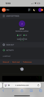
I got a screencap that highlights the "undefined" activity issue fairly dramatically:
View attachment 92262
You'll notice in this case I actually had a 1 on my user icon in the upper right because @lucubratory quoted my post above, but I had to click on "Show all" to actually see it.
Upvote
4
(5
/
-1)
The color swap is harmless to the lower gamut dispalys (even I cannot tell on a quick glance), but your suggestion does indeed noticeably improves the wide gamut displays running in saturated SDR tone map modes. This may also conceivably apply when the person has a heightened color sensitivity.
In my case, I'm able to replicate on all my displays: My color-calibrated ancient Dell monitors, my somewhat older but newer than the Dell gaming monitor, and even my cheap-ass System76 Darter Pro's screen
It doesn't help that I am super color-sensitive; always have been (was great back in the old CRT days - I calibrated monitors by hand at the newspaper I worked at), and I tend to forget that not everybody sees colors like me.
Upvote
4
(5
/
-1)
After a literal decade of readership, this has finally driven me to create an account and decry this.
RIP, I genuinely thought ars was different from the modern sludge.
I had two daily info dense sites to read on the bus, ars and slashdot, now I have one.
May you rest in venture capital, consider this a pyre for the extremely talented and technical writes who have committed to this site over the decade.
May you avoid being the next anandtech.
Upvote
-6
(5
/
-11)
Slashdot is a great example of why we're never going to flow our text full width to your browser, this is just painful.

And so pointless, it doesn't even fit more information on the page, it just wrecks legibility for no reason at all.

And so pointless, it doesn't even fit more information on the page, it just wrecks legibility for no reason at all.
Upvote
-5
(6
/
-11)
I think then providing screenshots (or videos) of the upcoming design changes and asking for feedback based on that would’ve gone a long ways toward mitigating the frustration of users.The easiest answer to this is we do not have the resources to A/B test an entire website with people.
Regardless of whether or not it would be a good idea or not it's outside our capabilities. Just to keep reminding people, there are two people managing all of this. Me, and our tech director Jason. We are the absolute definition of lean and mean.
I think we do a kick ass job with minimal resources, I'm proud of our work. But we don't have a huge team and servers etc to run two entirely separate websites that people can go back and forth between.
If nothing else, the information density** really needs to increase. The mobile site is nigh unusable with how little info is presented on the homepage (especially in landscape view).
With that being said, the people complaining to the point that they are planning on leaving the site are way, way overreacting (and honestly many are just down right trolling with their level of vitriol). While you can count me among the many frustrated users, I do have confidence that most of the issues will get resolved on some level. But it still needs be said that it feels like the entirety of the Ars readership are being used as beta testers.
*ETA to fix typo. Had destiny in for density… though I kinda liked “information destiny”

Last edited:
Upvote
10
(10
/
0)
I assumed it would've been fixed so I held off, but maybe it isn't apparent to everybody (or is intentional, but please don't let it be intentional)..
The dark mode background color is off compared to the other colors; it's using a warmer dark variant while the rest of the dark colors use a cooler variant. It's driving me nuts.
rgb(22,21,18) as the page background with rgb(35,36,40) as the highlight background just looks awful to me on every one of my screens.
View attachment 92222
Just reversing the R & B in that is SO much better IMO (so it'd be 18, 21, 22).
View attachment 92221
I am way more motion-sensitive than color-sensitive, so I'm a lot slower at adopting wide color gamuts and HDR than adopting high refresh rates. But it's nice that I can have both HFR and HDR together now.In my case, I'm able to replicate on all my displays: My color-calibrated ancient Dell monitors, my somewhat older but newer than the Dell gaming monitor, and even my cheap-ass System76 Darter Pro's screen
It doesn't help that I am super color-sensitive; always have been (was great back in the old CRT days - I calibrated monitors by hand at the newspaper I worked at), and I tend to forget that not everybody sees colors like me.
For any site designers at Ars, here's a color-sensitivity-amplified version of your screenshots (achieved via extreme saturation adjustment in a paint program to simulate color sensitivity and/or wide gamut displays amplifying subtle shades).
Saturation-amplified, plus a brighten, for web developers working on most common LCD displays / more subdued photoshop calibrations / etc -- to amplify effects seen by either color-sensitive people like you or by certain displays that stretch SDR gamut to HDR colorspace in default settings.
Ironically, I can't see it on most Mac displays (iMac 5K, MacBook M1 LCD, etc) but I see it on an OLED attached, in its default oversaturated mode during SDR. It definitely looks better in this case with the RGB's swapped. Probably a harmless change given it only affects certain people and/or certain displays.
Apple does indeed calibrate the SDR subset on HDR pretty well, but this isn't consistent across all screens.
Last edited:
Upvote
6
(6
/
0)
I agree. Currently, the ultimate destiny of all information is to eventually be forgotten. It deserves a better destiny!If nothing else, the information destiny really needs to increase.
Upvote
8
(8
/
0)
Narrower is usually much nicer, but it's not a universal comfort preference.On sites which flow text I adjust my browser width to something comfy for me. Which can be wider or narrower than for other people.
Some researchers (I think someone named Dyson in a mid 2000s paper) in a study of screen reading, found out that some users prefer wider columns on screens at the time, because it depended on individual reading styles.
Some speed readers were longtime trained on long serial lines, and could read wide columns faster because they were trained that way (much like someone was trained on a DVORAK keyboard or such).
I prefer medium-width layouts, but I often like to use Wikipedia's Wide setting and resize the window accordingly to suit preference. The site I have, however, does use a narrower line length but still slightly above average (and still wraps if you narrow browser window width).
EDIT, found the paper -- written by Mary C Dyson in year 2004. (Not to be confused with the famous Esther Dyson)
"The results showed that the number of characters per line affects reading rate with the longest line read faster" (text at end of page 6, or page labelled 382, since it was a part of a larger journal).
However, most users preferred the comfort of narrower columns.
(Aside: Incidentially, the paper covers speed readers. That's damn interesting about speed reading! Did not know that. I'm a longtime speed reader benchmarked with a reading speed of 800 words per minute, and my farsightedness afforded more peripheral vision, so this may have influenced my line length preference. Comfort reading and speed reading are two different things, creating different preferences. I definitely find narrower columns more comfortable but I also always noticed it hindered my reading speed from my specific flavour of speed reading training in past. Comfort-vs-speed aren't often co-existent guidelines. This clearly explains why I read faster with wide text due to my old-era-speedreading training techniques).
Newer modern speed reading training techniques sometimes use short replacing-in-place text instead, and makes you read faster on narrow screens (e.g. phone speedreading apps). But old desktop speed reading systems (1990s era) used long lines, so possibly that is where some of my yesteryear geek speed-reading training came from.
Clearly an exception to the rule, but understand why Wikipedia (while default to wrapped lines), offers optional wide modes, and some other sites like mine don't do that but still offers a slightly wide mode optimized to fit the width of 800x600 tablets with only slight margins at 100% scaling, basically optimized to look nice and full without much whitespace at 800x widths. Makes it nice to have ads at 1024x widths and beyond, or scaled 1920x widths. (Although an obsolete SVGA mode, some tablets report 800x, and it just looks nice with two side by side browser windows, and will responsively narrow nicely if you resize narrower)
That being said, I do NOT like Slashdot's godawfully ugly default wide approach myself (agree with Aurich), but am glad that Wikipedia's compromise of optional wide mode exists (agree with Wikipedia) as if I don't like the width, I can simply temporarily toggle that quickly in just two clicks.
Last edited:
Upvote
12
(12
/
0)
I'm totally willing to try and find solutions or options for people. But there are limits, we are not Wikipedia. Nothing about Wikipedia is really relevant to what we do.
We simply cannot operate like they do. If we could be a business that didn't have to think about ads and ran purely on subscriptions and/or donations it would be different.
If we had a "wide mode" it would likely be subscription only. Not to gatekeep or paywall, but because practically speaking when we don't have to take ads into account we're more free to try things.
Upvote
8
(11
/
-3)
(Fair fair, just trying to scientifically trace why I, and some other geeks, a slight aberration to the rule)
Did you fix the Undefined? The Ars undefined seems gone for me on all my devices today, but the litmus test will be an overnight test -- since my first visit to Ars after a long device idle, seems to be a contributory cause.
Supplemental datapoint:
IIRC, it seems to only happens if my first action of the specific browser in the morning is clicking my profile icon, so I'll repeat that tomorrow and report back if the Undefined comes back. Especially in a long-idle tab. Since surfing the site by several pages first seems to fix it automatically, making this problem not-noticed by all. This may be why it probably affects the most eager forum-posting subscriptors worse than the average site-surfer.
Upvote
0
(0
/
0)
No, I've logged it but we haven't changed anything yet.(Fair fair, just trying to scientifically trace why I, and some other geeks, a slight aberration to the rule)
Did you fix the Undefined? The Ars undefined seems gone for me on all my devices today, but the litmus test will be an overnight test -- since my first visit to Ars after a long device idle, seems to be a contributory cause.
Supplemental datapoint:
IIRC, it seems to only happens if my first action of the specific browser in the morning is clicking my profile icon, so I'll repeat that tomorrow and report back if the Undefined comes back. Especially in a long-idle tab. Since surfing the site by several pages first seems to fix it automatically, making this problem not-noticed by all. This may be why it probably affects the most eager forum-posting subscriptors worse than the average site-surfer.
We don't know how widespread that issue is.
Upvote
0
(1
/
-1)
It has taken my some time to come to the conclusion on this change to the interface has made this site basically unusable on my desktop laptop. The huge amount of dead space on the sides combined with the insanely large font has made it feel like looking at my phone when reading it. That really is unacceptable. I do understand that things change and I am a old curmudgeon but at this point I regret to say I have canceled my sub and will no longer be visiting ars. I wish you the best you have continued to have impressive reporting for years which is pretty much unheard of on the web and that has not changed but you have made reading it unworkable so I am leaving.
Upvote
3
(7
/
-4)
I just noticed this undefined issue. Searched and found this post so I’m sharing it here. I have 3 notifications but they don’t appear under activity.No, I've logged it but we haven't changed anything yet.
We don't know how widespread that issue is.
Attachments
Upvote
2
(2
/
0)
Rather late to the party, and I really didn't read any previous posts (too many, and probably very very few relevant for ME )
So let me state upfront that I am totally accepting that my experience might suck terribly, and that it won't be fixed for the most part. Because, apart from on my laptop, I'm visiting Ars primarily (95% of the time) from a first generation iPad Mini retina (2014..) I'm running behind dozens of iOS and Safari versions, unable to update. Chrome is also installed, but I believe that just uses the Safari engine, so no difference at first sight...
So most of the new design looks pretty shitty on this device (many article pics not showing up, colors of fonts etc not playing nice in places, responsive layout problems etc etc), and probably few to no options to rectify any of it.
However, I vowed to use this iPad until it falls apart, so I'm pretty flexible about less-than-optimal-stuff that I accept, as long as I can do what it's all about: READING and COMMENTING.
In that respect, there's one fairly CRITICAL problem that needs (and CAN) be addressed:
A very lowtech direct link to the relevant discussion thread on the forums.
The previous design already had the problem that on older devices like mine, the "inline" comments thread simply didn't work. But it DID provide an extremely basic link that pointed to the forum thread. That part of the site DID (and still does) work correctly.
So please reinstate that extremely basic extra direct link... I will thank you forever! Because ANYTHING below the "VIEW COMMENTS" (including the "FORUM VIEW" link), is simply not showing. The only way around, is to keep a tab open with the forum, and each time manually browse to the correct thread (not easy to locate... especially if the title changed)
A second thing that somewhat impairs me at the moment, is that article text seems to fall back to a rather small size "Times New Roman" in my "frozen" Safari and Chrome browsers.
I don't see any obvious options to do something about this "on device". I can pinch-zoom, but then I have to constantly swipe left/right because the paragraphs are wider than the screen. I tried "reader" mode, which helps for the text, but it turns out that it mostly only shows the beginning of an article, and the first add or whatever, blocks the rest. I'm not a web designer, so no idea if you have some type of control over what a very old browser would use, but it would be NICE if the "fallback font" would be somewhat bigger, or fixing "reader" mode.
Other than that, the number that represents the comments-count, is shifted far to the left in my browser, such that it falls outside the "bubble". This makes it unreadable. Not a showstopper, but a bit of an eye-sore that is hard to avoid.
Hoping some of this can be fixed/mitigated. I accept that it will never look RIGHT/GOOD on that ancient iPad.
)So let me state upfront that I am totally accepting that my experience might suck terribly, and that it won't be fixed for the most part. Because, apart from on my laptop, I'm visiting Ars primarily (95% of the time) from a first generation iPad Mini retina (2014..) I'm running behind dozens of iOS and Safari versions, unable to update. Chrome is also installed, but I believe that just uses the Safari engine, so no difference at first sight...
So most of the new design looks pretty shitty on this device (many article pics not showing up, colors of fonts etc not playing nice in places, responsive layout problems etc etc), and probably few to no options to rectify any of it.
However, I vowed to use this iPad until it falls apart, so I'm pretty flexible about less-than-optimal-stuff that I accept, as long as I can do what it's all about: READING and COMMENTING.
In that respect, there's one fairly CRITICAL problem that needs (and CAN) be addressed:
A very lowtech direct link to the relevant discussion thread on the forums.
The previous design already had the problem that on older devices like mine, the "inline" comments thread simply didn't work. But it DID provide an extremely basic link that pointed to the forum thread. That part of the site DID (and still does) work correctly.
So please reinstate that extremely basic extra direct link... I will thank you forever!
Because ANYTHING below the "VIEW COMMENTS" (including the "FORUM VIEW" link), is simply not showing. The only way around, is to keep a tab open with the forum, and each time manually browse to the correct thread (not easy to locate... especially if the title changed)A second thing that somewhat impairs me at the moment, is that article text seems to fall back to a rather small size "Times New Roman" in my "frozen" Safari and Chrome browsers.
I don't see any obvious options to do something about this "on device". I can pinch-zoom, but then I have to constantly swipe left/right because the paragraphs are wider than the screen. I tried "reader" mode, which helps for the text, but it turns out that it mostly only shows the beginning of an article, and the first add or whatever, blocks the rest. I'm not a web designer, so no idea if you have some type of control over what a very old browser would use, but it would be NICE if the "fallback font" would be somewhat bigger, or fixing "reader" mode.
Other than that, the number that represents the comments-count, is shifted far to the left in my browser, such that it falls outside the "bubble". This makes it unreadable. Not a showstopper, but a bit of an eye-sore that is hard to avoid.
Hoping some of this can be fixed/mitigated. I accept that it will never look RIGHT/GOOD on that ancient iPad.
Upvote
6
(6
/
0)
Well I reluctantly fixed the typo, “information destiny” has a fun ring to itI agree. Currently, the ultimate destiny of all information is to eventually be forgotten. It deserves a better destiny!

Upvote
4
(4
/
0)
Does that include after selecting "View Comments"? If I open an article, I see:ANYTHING below the "VIEW COMMENTS" (including the "FORUM VIEW" link), is simply not showing.
before selecting the comments bubble or "View comments". After doing so, even while the comments are loading it almost immediately adds:
which provides the link to the Forum view.
It's not there when you load the story - only after clicking on either the bubble or "View comments". HTH!
Upvote
0
(0
/
0)
That said, I do have one question. Is "fixed width" that doesn't spread to fill the whole available horizontal space actually desirable to people? Is that really true? If so, why?
Speaking just for myself, no, that would be a bad experience on my monitor. I would prefer a little wider than the current max width, however.
On sites which flow text I adjust my browser width to something comfy for me. Which can be wider or narrower than for other people.
Yep, that's how sites used to operate and it's how sites like Slashdot still operate, but it's not a friendly experience for most people.
I just found the toggle width button. That's a nice compromise, @Aurich !
Whaaa? I don't see that, would you mind expanding on this or providing a screenshot? Maybe subscription-only?
I'm running behind dozens of iOS and Safari versions, unable to update.
You probably know this, but just in case you don't, that iPad is a security nightmare. For your safety I hope you are not logged into an Apple/iCloud account, a password manager, a Google account, or anything else of any importance.
Upvote
1
(2
/
-1)
- Status
- Not open for further replies.