Skip to content
Tech

The Nokia Lumia 900 review

The Nokia Lumia 900 has the weight of two technology behemoths and Windows …

Casey Johnston | 225
Credit: Photograph by Casey Johnston
Story text

The Nokia Lumia 900 has the weight of two big names on its shoulders. It’s Nokia’s big re-entry into the US market; it’s also the flagship Windows Phone Mango in this country. In anticipatory articles, you can hardly find the term “Lumia 900” separated from the word “premium.” The phone is as important as the Samsung Galaxy Nexus was to Android 4.0 Ice Cream Sandwich and as, well, every new iPhone is to iOS.

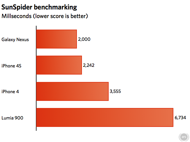
The phone was recently announced at the two-year contract price of $99, a tag usually applied to new mid-range or old high-end phones (even more recently, AT&T announced the Lumia 900 will be free online for new customers). But the implication is that the low price is meant to attract attention to an OS that has yet to win a significant chunk of the market. It’s not a reflection of the handset’s quality. Because of this, we largely compare the Lumia 900 to the two flagship phones of the other two major OSes, the iPhone 4S with iOS and the Galaxy Nexus with Android 4.0. The iPhone 4 also makes a brief appearance, since it has the same list price as the Lumia 900.

As our review will show, the new hardware can hold up against both of these more expensive phones, and Nokia’s total package deserves to be taken seriously. Still, the OS has some maturing to do compared to the other two platforms. Power users for whom price is less of a factor will find much to admire here, but they still may not be won over when it comes to getting the best handset, period.

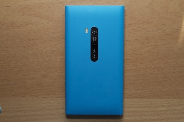
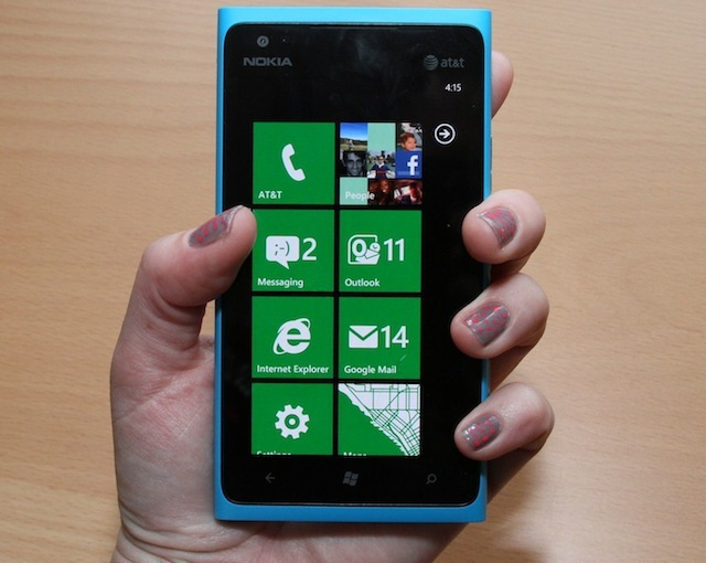
Hardware: girl, look at that body

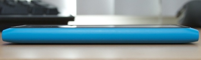
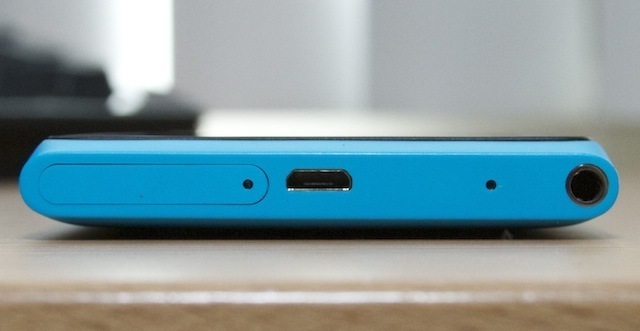
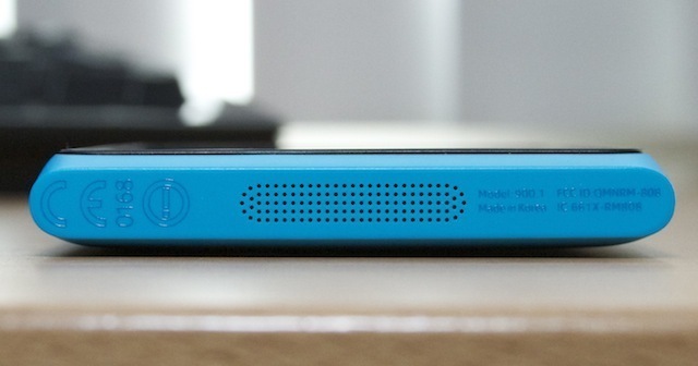
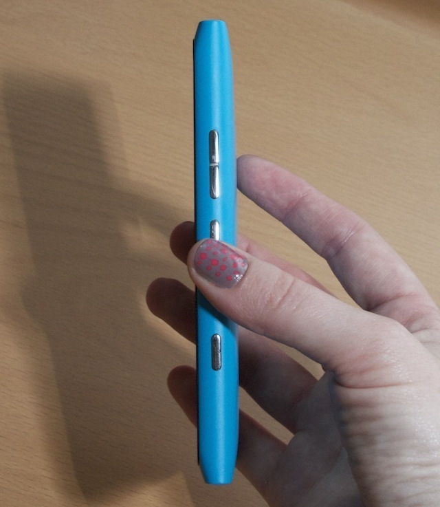
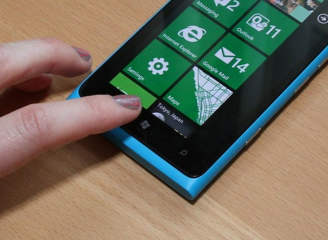
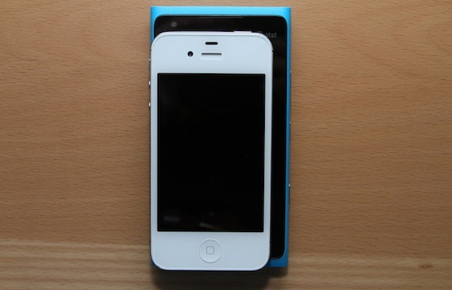
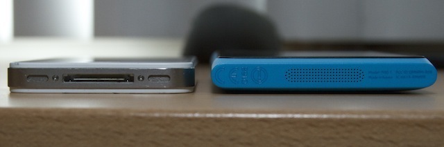
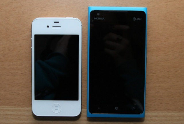
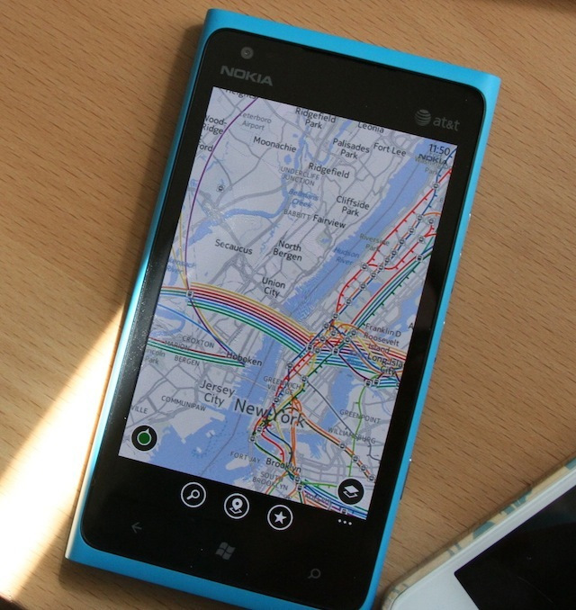
The Lumia 900 has a 4.3-inch 800×480 resolution Clear Black AMOLED display embedded in a unibody polycarbonate shell, rounded on the long sides and squared off at the top and bottom. The polycarbonate body has a velvety, slightly rubbery feel to it, making it easy to hold. Due to the screen margins and casing overhang it feels bigger in hand than you might expect of a 4.3-inch-screened phone. As a point of reference, the Galaxy Nexus measures 67.9 millimeters wide to the Lumia 900’s 68.5 millimeters, despite the Galaxy Nexus having a 4.65-inch screen. The Galaxy Nexus is also less than a centimeter longer, meaning the Lumia 900 is hardly any friendlier to a jeans pocket.

The Lumia 900 is not pushing the limits of thinness at 11.5 millimeters, but frankly, that’s OK. The pursuit of a thin body at the expense of functionality has lately become a circus we wish manufacturers would stop participating in.

The Lumia 900 has three buttons arranged along its right hand side: a volume rocker, a sleep/power button, and a camera button. A headphone jack, microUSB port, and SIM slot are placed on the top. A single speaker is on the bottom edge, and the standard Windows Phone keys are placed below the screen (back, home, and search).

The Lumia 900’s buttons, from left: camera, sleep, volume rocker.


The top of the Lumia 900, from left: SIM slot, microUSB port, headphone jack

The bottom of the Lumia 900 with its speaker/microphone grate.

The placement of the sleep button seemed odd to us during our first hands-on at CES, but our suspicions that it would be easier to press have been confirmed; a button centered on the long edge is easier to press with your left forefinger or right thumb than one on the top edge. However, it does mean those fingers have to find somewhere else to sit while you’re using the phone. The buttons have decent tactile feedback and aren’t too stiff, though the halfway-press on the camera button used to focus to the lens can be difficult to feel.

The Lumia 900’s single speaker is pretty quiet, even at the loudest volume setting. Many phones trade volume for distortion, which the Lumia 900 is likely avoiding by setting the volume limit low, but it can be hard to hear without the volume turned all the way up. As for the other sound components, call quality on the Lumia 900 is perfectly fine. There’s no noticeable difference from the iPhone 4S.


An iPhone 4S next to the Lumia 900

The phone also has haptic feedback. It’s used very sparingly though, mostly when the three soft keys are pressed. The feel of it is gentle and short, but solid. We looked through the settings and there doesn’t seem to be a way to extend the vibrations into more usage cases, such as for the keyboard.

As for storage, the Lumia 900 comes with a flat 16GB—unexpandable, unupgradeable. As apps get bigger and photo libraries expand over the course of the next two years (the standard length of a phone contract), that size limit would start to chafe us.

The back of the Lumia 900 with its Carl Zeiss 8-megapixel camera. Scratches accumulate pretty easily on that chrome plate.

The camera

Since Nokia seemed to pay special attention to the quality of the Lumia 900’s camera (Carl Zeiss, f2.2 aperture, 28mm focal length) we took it on several photo-taking trips and tried it out in a wide variety of settings. The 8-megapixel camera is centered on the back of the phone, which seems more in the interest of aesthetics than practicality (my fingers were all up on it while using the phone). Next to the Carl Zeiss lens is a dual-LED flash.

In Windows Phone, the process of taking pictures can be a little cumbersome. Users have the option of using tap-to-focus, which will auto-snap a picture some variable amount of time after the tap. They can also use the camera button, which will auto-focus on a half-press and snap the picture when pressed all the way down.

The problem with tying the shutter to the tap-to-focus is that it can be hard to time pictures, especially since the lapse varies depending on the lighting situation. Being able to focus with the camera button is nice, but you don’t get to choose what the camera is focusing on. While there are only a few situations that will be hampered by this divide, our problem could be solved by including a setting that lets us untie the shutter from tap-to-focus.

Lumia 900 left, iPhone 4S right

Lumia 900 left, iPhone 4S right

That said, the camera seems to maintain focus at varying distances better than, say, an iPhone does. It also doesn’t have to do an exaggerated re-focus every time you move it. The camera has a separate macro focus setting, but we had little luck using it to improve our shots. The Lumia 900 is no powerhouse at minimizing the time between shots, though it is prompt, with a lapse of around one second depending on the lighting situation. The iPhone 4S usually takes about half that, while the Galaxy Nexus is well known for having next to no lag between pictures.

While we had to work a little harder to get a good shot and were initially dismayed by the appearance of the Lumia 900’s photos on its screen, the pictures actually turned out quite well, at least in good lighting. They can even stand up to the iPhone 4S’s, in many scenarios.

Lumia 900 left (setting auto-triggered flash), Lumia 900 without flash center, iPhone 4S right

Lumia 900 without flash left, iPhone 4S right

We noticed the flash seems to trigger in inappropriate situations when the phone could take a perfectly fine picture without it. In the photos of the rainbow mannequin, the flash-less photo appears a bit more washed out, but it was serviceable and more color-accurate.

Low-light situations are where the difference between the Lumia 900 and the iPhone 4S cameras emerge. The Lumia 900 was desperate to trigger a flash on the tabletop hockey game in a dim bar, but the situation couldn’t really benefit. The setting produces noise in both photos at the top right corner, but the Lumia 900’s is more exaggerated, with noise throughout and an unrealistic blue cast to the picture.

Lumia 900 left, attempt to use Lumia 900 macro setting center, iPhone 4S right

We tried out the macro setting in the Lumia 900 on a few occasions, but it did little to produce a good macro shot. Even at moderately close ranges, the phone couldn’t bring the subject into as good a level of focus as the iPhone. We don’t expect much from a phone on this count—not even the iPhone is great at macro—but the lack of success here is a bit disappointing.

Overall, the camera is good. Admittedly, it’s easier to take good pictures in well lit scenarios in general, but the level of detail the camera can capture and the focus it can maintain are great in wider shots. In closeups and dim scenarios, though, it stumbles.

The display

As we mentioned, the Lumia 900’s screen is 800×480 pixels. Statistic-wise this pulls back on the reins of pixel density progress. It’s an area where, if I may take this metaphor too far, Android and iOS phones have been charging ahead. But the Lumia 900, like other Windows Phone handsets, eschews the PenTile displays that many Android handsets sport. PenTile screens have some merit—lower power consumption and better rendering in some tasks—but they render text poorly. Because the Lumia 900 has regular RGB subpixels, it displays text beautifully in a large range of sizes, especially in the OS and applications. This doesn’t cover the range of functionality needed, though, as we will explain later.

A comparison of font rendering in the iOS Kindle app vs. the Windows Phone Kindle app

At its brightest, the Lumia 900’s screen appears a bit warm compared to the bluer-hued iPhone 4S’s display, but the color isn’t noticeable when it stands alone. There are only three basic settings for brightness (low, medium, high) and the difference between them appears minimal in all but the lowest of light settings. As promised by the screen’s subtitle, ClearBlack, the blacks are nice and inky. In the OS, the screen is all but indistinguishable from the black bezel. We noticed some difference in blacks rendered outside the OS, like in the browser; perhaps websites aren’t even able to tell the phone to go to the right depth of black.

The physical glass of the screen is noticeably not oleophobic, so the Lumia 900’s screen holds onto grease and fingerprints like crazy. Fingerprint grease slicks can accumulate to the point that light coming from the screen underneath strobes. The grease buildup gets so rich and plentiful, you could identify a murder suspect from these fingerprint impressions. We forget sometimes oleophobic screens are even a feature on newer phones, but its absence from the Lumia 900 is glaring.

The Windows Phone user interface

We already did an extensive review of this OS, Windows Phone Mango, in October. But given that all eyes are on this phone and we can’t separate the experience from the software, there are some elements that bear addressing.

There’s no denying that the OS looks great. From the transitions to the screen arrangements, Microsoft paid a lot of attention to the look of Windows Phone. On the surface, it creates a very polished product. The menagerie of flipping and changing tiles on the home screen make you want to interact with them. These are one of the information-dense parts of the OS design—a feature that, unfortunately, many elements don’t share. More on this later.

Out of the box, the OS is more ready to use in some ways than even the iPhone. Twitter and Facebook integration, as well as integration for Windows apps, are as accessible as filling out a quick form in settings. No app downloads are necessary. You can see all of your contacts from Outlook, Twitter, and Facebook by selecting the People tile, and from the Me tile, you can post statuses to those services. (We should note that many Android phones come with social services preinstalled, but they are not always fully functional.)

iOS recently added better Twitter integration, but unlike Windows Phone, there’s no route to the service itself. You can send a tweet from Windows Phone with no app install. Of course, by not installing an app, you miss out on many of the basic and sophisticated functionality that more dedicated services add, but we appreciate that the integration is there.

However, we do question the validity of putting yet another layer on top of our social services with the People or Me tiles. For instance, when someone posts an Instagram photo to Tumblr and then tweets it or posts it to Facebook, I’m already working through three social stratifications. Perhaps, on this count, we should start hating the player and not the game.

In terms of sociality, we deeply appreciate the existence of threaded messaging in Windows Phone. If there’s an heir to the webOS threaded-messaging crown, Windows Phone is it. This is one of the few webOS features that inspired ardent passion in us, with its ability to integrate texts, Facebook messages, and IMs into a single window. The Messages app has partial functionality here, and can thread together texts, Facebook messages, and Windows Live Messenger messages. We’d love to see the scope broadened to things like AIM and Twitter DMs.

Threaded messages on Windows Phone

That said, the OS isn’t without polish problems or minor difficulties. Landscape orientation sometimes seems half-baked, with buttons that stay portrait-oriented next to the horizontal keyboard. The phone is also a bit finicky about scrolling. Because the screen is so big and the range of my thumb is comparatively small, my horizontal swipes are often slightly diagonally downward (instead of working the joint to make the swipe straight, I keep my thumb straight). Android and iOS have never had a problem interpreting this slightly downward, mostly horizontal, somewhat lazy swipe as I intend it, but the Lumia often reads as “scroll down” instead of “swipe across.” This creates a lot of mistakes in an OS where there is so much swiping left and right to do.

Design hiccup: why is that button still reading in portrait orientation?

Another conscious design choice that got on our nerves is the way the status bar with battery life, time of day, reception, and other indicators is often hidden when not on the home screen, even in simple native apps. Designers appear to be able to choose when that information displays, but when it does it has no background of its own and displays right over the app content. These are little things, but we do notice.

We also feel the notification system bears mentioning in light of the extensive systems in place on iOS and Android. Android was the first OS of the three with good notification management: from one dropdown menu, you could see everything that was going on on the phone. iOS followed suit last year with the Notification Center, which has really granular options for what you see notifications for and how you see them. Windows Phone pops notifications on the lock screen for a limited range of events (getting a text message is one of them), and you can swipe across them to dismiss. That’s it. It will also display calendar events for the day on the lock screen. It’s a useful reminder, but the OS needs to play catchup in other notification measures.

Internet Explorer on Windows Phone

The browser is, unfortunately, one of the phone’s weaker points, relatively speaking. This is one of the few aspects of the phone we are able to benchmark. We did so with Sunspider 0.9.1 and some of the graphical tests on the Microsoft-provided IEtestdrive.com.


The Lumia 900 has an alarmingly high score on the JavaScript benchmark Sunspider, regularly scoring around 6800ms. That’s over three times slower than the iPhone 4S and Galaxy Nexus, and almost double that of the iPhone 4. On IEtestdrive, the iPhone 4S received better scores in all parameters of the two graphical tests we tried.

The iPhone renders our homepage in consistent fonts throughout…

…but the Lumia 900 uses two different case sizes when it should be one size.

The browser is based on IE9, the desktop version of which has won a lot of praise. But the browser on the Lumia 900 does sometimes feel janky when it comes to text rendering. Mobile browsers resize text and alter page layouts in some subtle ways in an attempt to ensure greater readability. IE 9’s algorithm has some oddities not found in Safari’s approach. For example, on the Ars front page, the text excerpts below a headline will appear in two different sizes depending on whether there is a picture next to them or not. Mobile Safari does change the text size of these excerpts, so the layout is different than that seen by desktop browsers, but it keeps the sizes consistent. It looks much better. As much as we generally don’t like mobile sites, their simpler designs cause far fewer problems for Internet Explorer’s resizing algorithm, resulting in a much more consistent appearance.

We also have some quibbles with the interface design for the browser, namely that tabs are buried two clicks deep. A third-party browser, UC Browser, adds a second bar to the interface that provides one-click access to tabs as well as a forward button (something else Windows Phone IE lacks) and a home button.

Those issues and the benchmarks aside, we found that the Lumia 900 actually loads pages fairly quickly. It doesn’t beat the iPhone 4S at loading any of our test pages, by any means, but at least beats out the iPhone 4 while on WiFi.

Nokia-created apps

Nokia is bringing a trio of apps to the US to go along with the launch of the Lumia 900. They don’t come pre-installed, but are available as free downloads: Nokia Maps, Nokia Transit, and Nokia Drive (a GPS app that can provide turn-by-turn directions).

The Nokia Drive app allows users to view maps in both 2D and 3D views. Scrolling around in 3D is fast, pulling and pushing new streets and landmarks to and from the horizon line. However, both views can be a bit sluggish to zoom in and out. The speed and distance traveled displayed by the app are fairly accurate. That this app exists at all, and for free, is another nail in the coffin of dedicated GPS devices.

On the surface, Nokia Maps isn’t too different from regular old Google Maps. It can display satellite, map, and traffic views. Its public transport display is superior to Google Maps, displaying the subway lines in New York by their color and even showing the various entrances to a station, which are sometimes not so obvious on the street level. The app is a bit ponderous in zooming in and out even while on WiFi, but serviceable.

One of Nokia Maps’ more interesting features is its ability to display “popular places” within the map frame you’re viewing at that moment. Tiny bubbles appear across the surface of the map with identifying icons inside (a mask for theaters, a bar stool for bars). You can tap them on the map to bring up the name, address, and an “about” page with the website and e-mail address if provided, as well as other nearby locations. Alternatively, a pull-up menu will list the locations found, and they can be sorted by category on a second screen. The suggestions aren’t exhaustive, so you won’t find the coolest places on Nokia Maps, but they’re not sparse, either.

Nokia Maps also offers the ability to store mapping data in the phone itself, which is useful if you’re going somewhere that you’ll need navigation but won’t have access to data—abroad, for instance, or anywhere in New York City. You can download maps by the state in the US (New York is 108MB) or by the country (the whole US is 1.8GB).

Nokia Maps: better subway information than Google Maps.

The information for a location in Nokia Maps

Nokia Transit provides a HopStop-like service that finds you routes on public transportation from one location to another. Only certain cities and services are supported, and some didn’t seem to work correctly—the service told us there was no way to get from the Metro North Poughkeepsie train station to Grand Central Terminal in New York City, even though Metro North is supposed to be one of the supported services. The app also only seems to work if you select one of its suggested locations based on the information you’ve entered; it won’t guess for you.

The timetable for various subway lines in Nokia Transit

The process for one journey in Nokia Transit

For easier queries, though, Nokia Transit will provide all available options on a time grid meant to show you how long each route will take and when it will allow you to arrive there. It also shows the relative amount of time spent on each train and how much walking you’ll have to do. Extra options are displayed as you scroll to the right. While the display is unusual at first glance, it conveys much more information than other similar public transport services in a very visual way. Though the app is a bit slow, the amount of information it can provide is useful.

The Windows Phone approach to design and information density

Overall, there are two general issues with Windows Phone that penetrate to different levels depending on the scenario: its subtlety and its density. Neither of these issues are major, but they are noticeable. When trying to charge a market with two far more developed and familiar properties, they matter.

Overly subtle design is not a new problem in mobile platforms: a usability study from May 2011 showed that many content-based iOS apps were difficult to navigate because the methods of direction and interaction simply were not clear from the interface. Users were too often expected to guess which parts were scrollable, tappable, or swipe-able. Since the navigation is touch-based, perhaps designers simply assume we will drag our fingers around on the screen and poke and prod to see which directions the apps respond to. In a sense, they take the “intuitiveness” of a touch interface one step too far. A good touch interface needs, for instance, visual cues to show you how to interact with something before you touch it.

The situation with Windows Phone reminds us, fittingly, of the recent Windows 8 Consumer Preview. That has been knocked a bit for making certain crucial access points too subtle; for instance, the hidden start button. Microsoft recently clarified that the Windows 8 release will include a tutorial, but Windows Phone currently doesn’t have any kind of intro.

In some of its design and native apps, Windows Phone occasionally assumes too much. Take the Calendar app as an example. At launch, swipes between our agenda, day schedule, and so on are horizontal swipes, consistent with navigation in many other apps. When we switch to month view, we have to swipe vertically to see the next or previous month, but there’s no visual indicator that this is the case. Someone could go on using this phone for weeks or months before realizing they can see months other than the current one. It’s not a life-ruiner, by any means, but the interface doesn’t make the availability of more information clear, and it’s not alone.

For the density part, the apps and settings of Windows Phone hew closely to the OS’s spacious design principles, but sometimes at the cost of making information accessible. Often apps split too much between too many menus, requiring several swipes to access all of the options. In other cases, the large fonts that characterize the OS take up too much valuable screen real estate.

The headers in the Outlook app, for instance, have a lot of breathing room. It makes the layout look nice, and choosing to display your contacts’ names in the largest font, twice the height of the rest, rather than the subject or snippets of content presumably makes you feel popular and keeps it people-centric. But I generally care just as much, if not more, about the subject and content preview than the sender, which are grayed out compared to the sender’s name.

In Mail on iOS, you can customize the font and the number of lines of the message preview, but Windows Phone provides no such options. Because of all the white space and large font, and the inability to fix that through settings, I can skim less of my e-mail at once, requiring more scrolling to go through it all. These information-sparse design cues extend to many of the third-party apps we tried, including Yelp and Twitter, where screen real estate often seems wasted by big fonts and white space.

These two topic listings…

…could probably be combined.

This information density issue is even on display from the get-go with the home screen, though it took us an extended period of usage to realize it. From wake, the home screen displays six full icons and two more on the bottom with names cut off. Presumably we would know what they are, since we set the screen up, giving us a total of eight (nine, if you count the camera accessible via the camera button). By contrast, iOS can display 16 apps on its home screen, plus four pinned along the bottom for a total of 20. Android varies depending on the OS version and any UX from the manufacturer, but it’s usually closer to iOS’s numbers, if not higher.

Not only is this a low limit for the number of immediately accessible apps, the problem compounds. A full scroll on Windows Phone’s home screen gets you access to eight more apps, for a total of 16 within one swipe; on iOS or Android, you have at least 32 at the same level of depth. In three screens, Windows Phone provides 24 apps, iOS and Android 48, and so on.

Apps are organized in a second pane to the right of the home screen, where everything you’ve downloaded and installed is listed alphabetically. The list can’t be arranged any other way, meaning if there’s an app you use regularly that begins with an unfortunate letter (example: Yelp) and it’s not in your top 8 or 16, you’ll be doing quite a bit of scrolling to get at it, whether it’s on the home screen or in the alphabetized list (though it’s worth noting that once you collect enough apps, the OS will add an alphabet of jump buttons to the screen, so you can get to the letter you want quickly).

We don’t doubt that Windows Phone’s setup has some basis in realistic usage; perhaps research shows that most people spend a big chunk of their time on 8 apps or fewer. This may also be a normal user/power user divide, and maybe the 8-app trend is more characteristic of the first-time smartphone buyer that the Lumia 900 is targeting in a sidelong sort of way.

But for our part, we found ourselves doing quite a bit of scrolling and swiping to get where we needed, not only inside the apps, but outside of them. It’s not egregious from a physical exertion standpoint, but all of the motion compounding together can start to make navigation tiresome. In OS design on the order of a 4-inch screen, there’s a balance to be struck between visual appeal, usability, and density. Windows Phone is heavy on the first two, but significantly lighter than either iOS or Android on the third.

Battery life

The battery life of the Lumia 900 is another point of pride on Nokia’s part. It clocks in at 1830mAh, which is on the large side for a smartphone battery. Nokia estimates it gets around seven hours of talk time with that. We didn’t test talk time specifically, but tried out some general use cases and video playback scenarios.

When we took the phone out for a spin on AT&T’s 4G LTE, we started using the phone just after 7am with the following settings: brightness was at medium, volume was off, vibrate was on, e-mail checks were set to happen every 30 minutes, WiFi was on but not always connected, GPS was on, and Bluetooth was off. Throughout the day we used the phone at a moderate-to-heavy intensity: a scant few minutes of tethering in the morning, some texting, e-mail reading, some browsing, a couple of app downloads, and the occasional two-minute handling session by curious passersby. With this level of usage, the phone gave us a “critically low” battery warning at 6:38pm, for just under 12 hours of stop-and-go use.

Next we tried two video tests. In the first, WiFi, 4G, and GPS were on, Bluetooth off, e-mail checking was on, brightness was set to medium, and volume set to 20/30. While playing movies with these settings, we were able to get 7 hours and 50 minutes out of it.

Last, we tried turning the “battery saver” setting on, which turns off e-mail checking and prevents apps from running in the background. We cranked the volume up to 30/30 in this case, only because 20/30 seemed almost unusably quiet for movie-watching. The setting changes didn’t make much of a positive difference, but the volume taxed the battery a little more. We got 7 hours and 40 minutes total out of the battery.

This is pretty healthy performance for a smartphone, besting the Galaxy Nexus in similar tests, but the iPhone 4 and 4S crank out about 3 more hours of video and several more hours of general use. iPhones also have an often-overlooked ability to charge the battery to 80 percent in an hour, but the Lumia 900 charges at steady pace and over a few hours: it took ours nearly 4 hours to go from 0 to 100 percent.

Conclusion

As a smartphone, the Lumia 900 is more than competent, and a better choice than many Android phones out there for the same price (if you aren’t tied to the ecosystem). On design, it certainly wins against most Android phones, even higher-end models, and it bests many on features.

Compared to the similarly priced iPhone 4, the Lumia 900 is a better choice, hands down. Of course, the iPhone 4 is two years old by now, so that’s not much of a contest.

The ecosystem can’t entirely be ignored as a factor in this decision. Microsoft is building the Windows Phone Marketplace quickly and investing a lot in developers and boot camps to get them involved, but the app count on the Marketplace is still low compared to iOS and Android. With Windows Phone’s one to two percent market share, it must be hard to convince developers to invest. Presumably, the success or failure of the Lumia 900 has a large role to play here—another pressure to add to its debut.

Comparing the Lumia 900 to the higher-end Android phones and the iPhone 4S is trickier. If it comes down to price, the Lumia 900 is certainly a good deal at $99. But then, all phones are subsidized over the course of a contract, so a difference of $100 becomes negligible over 24 months of payments. Because it’s feature-rich for the price, the Lumia 900 could hit home with the first-time smartphone buyers Nokia and Microsoft want, though we wonder how quickly the OS design subtlety will get to them. Then again, they may never notice.

If you don’t need to take cost into account and are a power user looking for the best phone in terms of performance and design, you’re probably going to walk on from the Lumia 900 to greener iOS and Android pastures. Not because of the interface subtlety—interface design isn’t a problem for smartphone vets, and there’s not much they won’t be able to figure out by trial and error. Information density can be overlooked, but not as easily. A few fixes in Windows Phone could go a long way to bringing it up to par with iOS and Android in that respect. As of right now, it’s still a little too much form over function to beat them at the game they invented.

The Good

  • The polycarbonate case is sturdy, has good form and texture
  • Solid battery life
  • Screen is pretty and saturated with a good level of detail, and better for outdoor viewing
  • Free Nokia travel apps are surprisingly useful
  • The phone overall is quick and responsive, with fluid transitions

The Bad

  • Speaker is a little quiet
  • Camera’s indoor and closeup shots can be rough, and flash sometimes triggers when it doesn’t really need to
  • Takes a long time to charge the battery to 100 percent
  • Browser makes the non-mobile Web look kind of ugly

The Ugly

  • Windows Phone OS design is information-sparse compared to iOS and Android—not a huge problem itself, but spread across the entire UI and apps as an aesthetic, it makes us hesitate

Listing image: Photograph by Casey Johnston

Photo of Casey Johnston
Casey Johnston Freelancer
Casey Johnston is the former Culture Editor at Ars Technica, and now does the occasional freelance story. She graduated from Columbia University with a degree in Applied Physics.
225 Comments