Skip to content
Tech

The iPod gets a makeover: a review of the iPod nano and iPod classic

There are new iPods in town, and Ars puts the new iPod nano and iPod classic …

Clint Ecker | 0
Story text

The beat went on

iPods iPods iPods! That was the theme of Apple's September 5 event, titled "The Beat Goes On." And as expected, what came out of the event was all sorts of iPod news: the shuffles got new colors, the iPod touch (touchscreen iPod) made its debut, and Apple updated its old standbys, the iPod classic and iPod nano. This review focuses on the latter two in the list, because they both saw the same general changes to physical design and also use the same new UI.

We will go over the physical differences of each iPod separately first and then address the UI as a whole.

Third-generation iPod nano

The original iPod nano was the thinner, flash-based, plastic replacement for the top-selling iPod mini, but Apple soon changed that to the anodized aluminum casing of the iPod mini just a year later with its second-generation nano.

Apple has continued its pattern of releasing a brand new nano redesign every September since 2005 with the third-generation nano, nicknamed the "nano fatty," "fat nano," and just about every other insulting name people can think of to describe those who are… heftier than others. Indeed, when the rumors of the fat nano originally broke, no one wanted to believe it. "That is the ugliest iPod I have ever seen," one of our staffers commented upon seeing the leaked pictures. But Apple released it anyway—much to some customers' horror—complete with a new UI and video capabilities.

Out of the box

The nano comes in the classic plastic case, complete with all the accessories iPod owners have come to expect: standard iPod connector, dock adapter, headphones, and a little booklet.

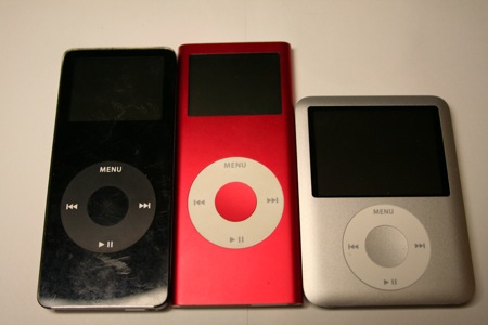
Apple has radically altered the look of the nano from its previous iteration. It has lost 0.75 inches in height (now only 2.75 inches tall, down from 3.5 inches from the first and second generations), and has gained almost an entire half-inch in width (2.06 inches wide, compared to 1.6 inches from the older nanos). It has, however, maintained the same thinness as the previous nano model, at 0.26 inches thick. See, the nano isn't fat; it's just big-boned!


First, second, and third-generation nanos

A bigger screen 

That nearly half-inch in gained width isn't all for naught—80 percent of that additional width is represented in the nano's screen. The new nano now sports a full 2-inch color LCD, up from the 1.6 inch displays of its two predecessors. The nano is now video-capable, too, with a 320×240 resolution screen at 204 pixels per inch. Upon first hearing this announcement, many users recoiled. "Why would you want to watch video on such a tiny screen?"

But in fact, the screen isn't that bad. Once we got engrossed in watching a movie or TV show, the smallish size of the screen didn't distract us. (We will warn you, though, that 16:9 video is exceptionally small on the nano.) In fact, we think that overall, video on the nano is roughly on par with watching video on a traditional iPod (classic) screen, which was the largest (and only) video-capable iPod on the market previous to the announcement of the iPod touch and the new iPod nano. The iPod nano is now only a half-inch smaller than the screen on the iPod classic.


5G iPod on top, 3G nano on bottom

The jury is still out on whether this was a wise design move by Apple or not. Many observers quickly decided that the new nano design was not only fat and ugly (it probably got picked on at the playground, too), but that it was too fat to be comfortable in the hand when compared to the older nanos. At least a regular-sized iPod has the height and heft advantage to feel substantial enough, but the fat little nano was short, light, and no longer stick-like.

An iPod in the hand…

We have to agree that the new nano feels a little more awkward to handle than the previous nanos—it's not impossible to handle by any means, but it just isn't as comfortable. The slim profile of the nano lends itself well to the taller, thinner, stick-like design. But if Apple made the new nano any taller while maintaining its increased width for the screen, it would just be an slightly smaller iPod classic—not very nano at all. We're sure this was a conundrum that the nano's product designers grappled with for quite some time, but it appears that the desire for a larger screen won out.

The other physical changes to the nano are relatively small and subtle, in our opinion. Apple has eliminated the plastic pieces at the top and bottom of the nano's aluminum casing and made it entirely metal (save for the screen and the click wheel, of course). The edges of the face curve slightly down to meet the back piece of the case so that the front is no longer entirely flat. All the corners are now rounded as well.

Apple has also moved the location of the hold switch to the bottom of the nano, joining the 30-pin iPod connector and audio jack. Previously, only the connector and audio jack were on the bottom with the hold switch on the top, and for those of us who have grown used to using our nanos while sleepwalking, this change could take some time to get used to. The hold switch is also no longer oblong and plastic—it's now metal and circular and has lost its "Hold" label.


Port porn, left to right: hold switch, iPod connector, audio jack

iPod classic 

The extent of the physical changes to the new iPod classic are much less than they are for the nano. That said, there are a few small alterations to the new iPod classic that we'd like to detail in brief. The new iPod classic 80GB is slightly thinner than the previous generation's 30GB model by approximately 0.02 inches (0.5mm). However, the manner in which the device's metallic facade is smoothly rounded toward the edges gives one the sense that this version is even thinner than the numbers say.

Rather than featuring a thin, transparent, plastic layer extending the entire length of the device, covering the LCD entirely, the new iPod classic, due to the metallic nature of its casing, has a super-small but noticeable, seam between the LCD face and the casing. Whether or not an extra layer of protection is placed over the LCD to keep it from scratching is unknown, but our experience so far leads us to believe that there is, as we have yet to see any appreciable damage. The front face of the iPod classic is also now a matte black instead of the shiny black in the 5G and 5.5G iPods.

Finally, the ancillary exposed bits of plastic, such as around the sync port, hold slider, and headphone jack, now match the color of the front facade of the iPod. In previous versions, black iPods had white plastic around these ports and the hold slider was metallic to match the mirrored rear casing.

Is that a new UI, or are you just happy to see me?

The most dramatic change in these two products is the new user interface. Put simply, there is now an abundance of context and attention to detail found at almost every level of the navigation hierarchy. In most of the higher-level menus, the actual menu items are relegated to the left half of the screen. Highlight the Music menu choice from the home screen, and you see images of your collection's album art panning, zooming, and fading on the right half of the screen. The left-placed menu casts a shadow on the contextual information/images found on the right, contextual information that explains the currently selected menu item is displayed in the settings section, and the two halves of the screen slide together from the edges to meet at the center when exiting Cover Flow mode.

The rest of the user interface—those parts where you're browsing through the specifics of your music library—look very similar to that of the iPhone.

Let's look at how browsing your library by album is now different. Rather than a drab listing of each album in alphabetical order, the iPod classic displays each album's title in bold along with its associated album art to the left and the artist's name in a normal font weight and smaller size immediately below. This is, at first blush, not that amazing, but after a day's use of the classic, it becomes very apparent that this is the superior way to browse your music. While I'm obviously a fan of all the music on my iPod, I do not necessarily know which artist is associated with which album. At any given moment, I may not remember which artist produced the album "Alight, Still…" and, as a result, might pass it up. On the iPod classic, I'm shown a photo of the album art, in this case featuring the artist herself, and shown "Lily Allen" in a simple, compact display.

Contextual information is everywhere on the new iPods. There is context at the lower levels, showing album art next to each entry where applicable (albums, podcasts, audiobooks), information about the artist of a particular song or album, the number of artists and albums in a genre, the number of podcast episodes, and if there exist any unplayed items, and so forth.

There is another level of context and novel use of the split-screen real estate to be found in the extras and settings sections of the new iPod. The extras section of the iPod is the home of the miscellany—anything that doesn't belong in the iPod's core competencies is found here. Thus, we see things like clocks and alarms (which have been separated), stopwatches, notes, contacts, and calendars.

Most of those functions have static icons, like a pair of dice for games, explaining their purpose. The clock item, however, shows an animated clock displaying the current time and date, and the calendars item shows an iPhone-esque interpretation of the venerable iCal icon, displaying the current date along with the time. The stopwatch, like the clock, now updates its icon in real time on the right-hand side of the screen, making excellent use of the dual-paned screen and packing it with information—while not appearing too busy.

The new settings section uses the right hand side of the screen to either explain what each option does (along with a useful icon) or display a graphical or textual representation of what each setting is currently set at. This means that for most things, checking the settings no longer necessitates clicking on the item, only selecting it.

Perhaps the best use of this in the settings section is for the EQ settings:

In addition to all these changes, there are other surprising additions and updates. In past versions of the firmware, you could obtain a textual status report on how full your iPod was from the settings menu. This information is still present but is displayed in a manner nearly identical to the colored status bar in iTunes:

Finally, it looks as if some iPhone widgets have found their way into the new iPod firmware in both the "Reset your iPod" and "Audiobook Speed" sections:

Games

Gone from the new iPhones are the games of Parachute, Brick, Music Quiz, and what you knew as Solitaire. In some instances they've been replaced with flashier equivalents: Klondike for Solitaire, iQuiz for Music Quiz, and Vortex sort of replaces Brick. Where is our Parachute replacement, Apple? Okay, okay, I've never actually met anyone who plays Parachute at all, let alone on a regular basis, so I can see why Apple would drop it.

For the most part, these new games have been available for purchase from the iTunes Store for a while now, and they're fine. Game play is okay, and "points" seem to have been eschewed in favor of (virtual) monetary winnings in both iQuiz and Klondike. The only problem I see with the new iPod and games are these:

  • You currently cannot buy any new games for your new iPod. All
    of the games in the iTunes Store will only work on the older 5G iPods
  • Your purchased games will not play on your
    new iPod classic. I can see breaking this on the iPod touch, but why on
    the iPod classic? Ostensibly, the hardware is equal or superior to the
    previous generation; what would necessitate making everyone's games
    purchases obsolete? I can only guess that future firmware updates will fix this. Either 6th-generation iPods will become able to
    play 5th-generation games, or Apple will have to fracture that section of
    the site into two sections for each generation.
  • A notice on
    the iTunes Store states: "COMING SOON: Tetris, Ms. PAC-MAN and
    Sudoku will soon be compatible with the iPod nano (video) and iPod classic." This is great, but it sounds like each game needs to be
    ported to a new platform. If your favorite game is Sims Bowling, I
    wouldn't be holding my breath.

Cover Flow

Perhaps the most hyped new feature of the iPod classic and nano is the inclusion of Cover Flow. We've all become fairly familiar with Cover Flow—something that was developed by a member of our own forum community—as it has become Jobs' hobby to find new and exciting ways to incorporate it into every nook and cranny of Apple's product line. For the uninitiated, Cover Flow is a graphical method of browsing your music, with each album displayed as cover art while the albums before and ahead of it displayed askew and slightly in the background.

Many have found it to be extremely useful in iTunes and even more so on the iPhone, but does it make sense on a processor- and input-limited device like the iPod classic and nano?

We tested Cover Flow as much as we could, and discovered that, while a valiant effort, the iPod's hardware is simply not up to par to support something this graphically intensive. It's obvious that the engineers had to tone down or eliminate antialiasing to get this far, and while it's more or less faithful to the original, the jaggies, sluggishness, and latency of scrubbing through your library just doesn't cut it for this seasoned iPod user. If the experience of Cover Flow on the iPhone is a 10, we would rate this implementation at 4 or 5.

I’m feeling a tad sluggish

So, we have some sluggishness in Cover Flow, and there seems to be a renewed level of attention to detail in this release of the iPod, but for some reason, a small—but perhaps important—metric seems to have been ignored or marginalized. What first seems to be limited to a flashy new feature soon begins to exhibit itself elsewhere on the iPod. The sluggishness felt in Cover Flow has somehow infected the rest of the operation of the iPod classic and nano. Since its launch, the iPod has been known for its lightning-quick and spartan interface, and while the graphical and contextual flourishes detailed above are very useful and nice-looking, something about them is affecting the tradition of excellent UI efficiency on the iPod.

Within the first minute of using the new iPod classic and iPod nano, the sluggishness was perceptible and somewhat annoying. Coming from using previous iPods over many generations that maintained a very consistent user interface experience, we were very aware of the difference. Users who are new to the iPod may not find this delay to be noticeable or annoying; we did.

The delay seemed difficult to quantify but felt "about a second or so longer." More than anything, however, was the feeling that something wasn't quite the same as it used to be. So, we decided to see if it were possible to time these differences and confirm our suspicions about the new UI.

To that end, we chose a few metrics and timed them with a stopwatch. We performed each task on both the previous generation of iPod (5.5th generation) and on the new iPod classic (6th generation) multiple times (in excess of three times, but less than ten for each generation of iPod). The results were timed with a handheld stopwatch, and the average time was recorded for each generation.

We first tracked the amount of time it took for the iPod to boot from a dead standstill. This is a metric that will rarely affect iPod users as the system keeps itself in standby as much as possible. That said, we thought the results were interesting enough to disseminate:

What we're seeing here is nearly a doubling of the boot time of the iPod. The reason we believe this to be interesting is because it is most likely a result of the increased demand put on the latest generation of iPods. In most of our operations of the iPod classic, we saw a noticeable delay, and this is exemplified more than anywhere else in these boot times.

The second task we timed was the process of getting from the main menu to a playing song. We chose the fastest possible method (besides simply hitting play) as we wanted to time the responsiveness of the UI and menu system. We approached this task in two ways. In each we moved from the main menu, to music, to playlists, to the first playlist, and then to the first song, resulting in our chosen song playing. We used two different methods of timing this. The first time, we acted as a normal user would, waiting for the menu to finish animating before hitting the center button again to move on. What most novice iPod users don't realize, however, is that if you know you just want to move on to the next item without viewing the next menu, you can mash the center button as fast as possible to move on.

This is important as it lets us see if the delay we perceive is a result of UI delay or some other issue that results in overall sluggishness in the operating system of the new iPods.

What we see here is that the new sixth generation iPod, when allowing the menu animations to complete (how most people operate when they aren't exactly sure what the next menu will contain, or where they'd like to go) takes, on average, an extra second or two to complete, nearly 45 percent longer than the previous models. While one or two seconds might not seem like a lot, and it's spread out over a few menu transitions, it can become quite annoying for someone who is used to the speed of the previous model.

Apple hyped up the inclusion of Cover Flow in the new iPod nano and iPod classic. Indeed, it was one of the biggest points that Steve Jobs hit in his presentation, and it was the predominant theme of the invitations sent to the invitees. Unfortunately, the performance of Cover Flow, especially when a large iPod library is present, feels like you're wading through molasses.

In addition to being extremely sluggish, the feature takes a good one to three seconds to load most times, and sometimes even longer. We have no doubt that incremental hardware and firmware improvements will alleviate most of this behavior, but for now, it's a bit confounding.

Miscellany

Durability-wise, there is nothing new about the materials used in the third-gen nano and the sixth-gen classic that wasn't already covered in our second-gen nano review. The anodized aluminum that Apple uses is extremely durable and scratch-resistant, and even the screen is significantly more scratch-resistant than older models with full plastic front casings. We have been using our classics and nanos naked (without cases) for some time now, and neither have any scratches on the casing or the screen.

As for battery life, Apple advertises the third-gen nano at up to 24 hours of audio playback and up to 5 hours of video playback on a full charge. We got almost exactly 24 hours of audio playback, which was the same result we got from the 2G iPod nano. Using all the default player and brightness settings and playing various TV shows back-to-back on an average listening volume, we actually got more than the advertised video playback: just a hair under 6 hours (5 hours and 58 minutes). This, as we all know, can vary wildly depending on what settings you're using, volume, brightness, and position of the moon, so your mileage will definitely vary.

TV (no longer) out

One important feature (or lack thereof) to note on both iPods is
that Apple appears to have disabled the video-out capabilities of the
iPod classic and the iPod nano that were previously available through
the audio jack and the 30-pin dock connector. Originally detailed by iLounge,
selecting the "TV Out" option from the iPods' menu elicits no
response, leaving customers unable to play video content on their TVs as they have been able to in the past.
"Presently, the only apparent way to turn this feature on is if you
connect your iPod to a device with an Apple authentication chip built
in," writes iLounge. And naturally, Apple authentication chips are only
available in Apple products and a select handful of third-party iPod
accessory makers.

New component-out video cables for the iPods are available online, but this change won't sit well with people who were previously used to having this functionality open to them. If you own a lot of third-party iPod accessories that make use of the iPods' video functionalities, it's safe to assume that many of them will no longer work. 

Again, not only is the video out through the audio jack disabled, video out through the dock connector is also disabled for many third-party products. Keep this in mind if you have a lot invested in these things. 

Internals

Both the new iPod nano and the iPod classic seem to have had their hardware redesigned in order for Apple to support their new firmware's UI. According to the tear-downs performed by iFixit, it looks like nearly every major chip on both devices have been replaced with Apple-branded equivalents. This shouldn't come as a huge surprise to many people, as in all of our previous reviews since the original iPod nano, we've been noting a marked increase of Apple-branded components in their products (whereas previously, almost everything was an off-the-shelf chip). Not only does this make it very hard to discern which chip does what, it also makes it very difficult to determine which manufacturer was the original designer and developer of each component.


Let's play "spot the Apple reference!"
(image courtesy of iFixit)

What this means is that while it's not necessarily a fact that Apple has radically altered the platform their music devices are running atop of, it does indicate that the company may be licensing the designs from its partners, making tweaks necessary to the bottom line and its design guidelines and having those customized chips produced for only the iPod.

Sound quality

To our nonaudiophile (but musically trained) ears, the second- and third-generation iPod nanos sounded exactly identical when playing the same songs at the same volume with the same equalizer settings (none) through the included Apple earbuds. The same applied to the fifth- and sixth-gen iPods (classic). Based on this and the trend from previous iPod reviews, we are making an educated guess that this will be the case under most headphones and that nothing about the audio codec has changed significantly—if at all—between the nano generations and classic generations.

Conclusion

We believe that Apple introduced the iPod classic so that it wouldn't have to kill off the traditional iPod style just yet. It's also the only game in town if you have a massive music collection and want to be able to take most or all of it with you. The scroll wheel and the massive storage capacity have long since become trademarks of the iPod. However, the iPod classic can't go through too many more revisions without radically changing how the device functions, and so we expect this to be among the last "major" updates to the player—the vestigial tail, so to speak. Apple may not kill off the classic within the next year, but we believe that within the next few years, the iPod touch will dominate and the classic will eventually be gone.

As for the nano, it appears as if Apple is driving the nano into the current iPod classic market with its new design, wider screen, and video capabilities. While certainly imperfect to those who loved the old nano design, it's also not bad once you get over your grieving and stop comparing the two. The third-generation iPod nano is essentially a brand new iPod that unfortunately shares the "nano" name, and we wouldn't be surprised to see it eventually take the place of the traditional iPod.

As for the new split-screen interface… well, it's hard to say. We like how it looks. Color pictures everywhere! But it's slow—very noticeably so, although this is worse on the iPod classic than the iPod nano. If there is any major downfall to either of these devices, it has to be the sluggishness of the UI, and we can only hope that Apple will figure out some way in the future to speed things up a bit.

When we reviewed both the 2G iPod nano and the 5.5g iPod, we gave each of them a solid eight. In our opinion, while the new UI is an improvement on the classic iPod UI, the resultant sluggishness is a major downer. Therefore, we're knocking a point off of the scores from the previous-generation devices.

Added 9/13/2007: Due to a very unfortunate series of events, our 6G iPod ended up getting run over by a semi-truck while inside of a backpack. No, unfortunately, we did not set it up—the incident was part of a hit-and-run accident that involved a bicyclist (Clint Ecker). The good news, aside from the fact that no one was hurt, is that the iPod appears to still function normally and nothing is cracked, although the screen now displays lines all over it while remaining readable. Some of you were disappointed that we left the "stress tests" out of this review, but now you have them.

VII
iPod nano

Pros:

  • Now video-capable
  • Video-watching is pretty tolerable
  • UI delivers lots of useful contextual information and eye candy

Cons:

  • UI is slow as molasses
  • Video-out crippled
  • Size and shape a tad awkward for old-school nano enthusiasts
  • Can't play purchased 5.5G iPod games

VII
iPod classic

Pros:

  • Massive amount of storage space available
  • UI delivers lots of useful contextual information and eye candy
  • Familiar form factor
  • More durable front face (metal instead of plastic)

Cons:

  • UI is even slower than the iPod nano
  • Video-out crippled
  • Can't play purchased 5.5G iPod games
0 Comments

Comments are closed.